What does everyone think? I think community icons (similar to user avatars that we already have) make sense, but I’m torn about banners (for both communities and users) , as they might look very strange with all the different possible themes users could use. What do you think?
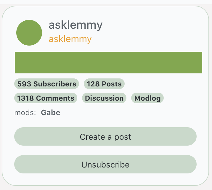
I like the icons and banners idea for some visual variety. :) Perhaps the banners could go under the community name in the sidebar to avoid problems with theming. Perhaps something like this?
I like this idea, looks clean.
I like this except for the banner… but I have yet to see a good example of a site that does top banners really well.
Yeah, they tend to be kind of distracting I find. I also like the way communism.lemmy.ml does it, where there’s a small banner in the description in the sidebar which is where I got the inspiration from originally. :)
Ya I agree, that one looks really good and clean, just putting a banner in the sidebar like that.
I think they might look strange at first but I think it’s a good idea and we’ll adjust and be better for it.
How about we finish the milestones first before tacking on more features?
Also if anyone has some examples of sites that do a top banner well, post some pics / links.
Maybe one of the Parallax scrolling style ones, as long as it doesn’t push down the content too much.
deleted by creator
Site and community banners often look ugly to me, and push down all the important content on the page. If we did have some, I’d want to do it in a way that wouldn’t push down all the content, and that would work with both light and dark themes.
I think both would look great. No idea of what the design should be, but icons and banners would definitely help create an identity for each community.
Yes but sub-priority. IMHO priority is federation among lemmy instances. If the move is intended to draw more testers, it is OK to do that now.
I’d argue against it.
I feel that banners got really abused and they are almost never useful. I think minimalism emphasizes on federation aspect of Lemmy, as in yes you’re on lemmy.dev/c/photography but you could easily be on foo.bar/c/photography and they are equally powerful communities just with different members/moderation.
I’d say it would be better to give sidebar more power instead. It would provide customization for identity while not diminishing the above points.
That being said going back to community’s front page is a bit hard. So some sort of extension to
lemmytitle that takes you back toc/whateverwould be very convenient.I throw my lot in for minimalism.
Such is the way of the Buddha.
deleted by creator
Dang, looks pretty good.