

From the-federation.info:
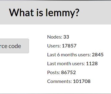
There is also lemmy-stats-crawler:
"crawled_instances": 18,
"failed_instances": 7,
"total_users": 17671,
"total_online_users": 118,
From the-federation.info:
There is also lemmy-stats-crawler:
"crawled_instances": 18,
"failed_instances": 7,
"total_users": 17671,
"total_online_users": 118,
As an end user, the backend feels great (no clunky errors like Reddit or Ruqqus), but the UI has issues. I think if the goal is more (active) users, UI improvements are the lowest hanging fruits to get there.
imo the UI feels much cleaner than the new reddit UI and much more modern that the old reddit UI. I would like to be see some kind of compact mode though, especially for mobile.
I’m def up for seeing ideas / ways I could tweak the layout to make it more clean and compact. I’m not really a UI person, outside of just copying the styles of my favorite apps… like this UI is modeled mostly after boost for reddit.
I mainly use redreader for Reddit, I don’t think I have ever used boost. I like it and find it easy/simple to use.
It has a main menu, where you can select the community.
Here is what it looks like.
Main menu/front page:
R/all:
R/Linux
Hamburger menu options:
Sort menu options:
i’m sure you could fork the source code and adapt it to lemmy :)
saidit did this and it looks like it would be simple.
I have never thought about this, but now that you mention it, I could see a compact mode being a nice addition. Yeah, I think you are right. I have no problems whatsoever with the current mode, but there is a lot of free space around that could be potentially shrunken for a pretty compact UI.
Have a look at my comment here that shows what the redreader app looks like. It is a compact Reddit app: https://lemmy.ml/post/83539/comment/83464
Thanks for the heads-up. Yes, that is exactly what I am talking about. Would be nice to have an option to have something compact like this.
There was compact mode. Add
.compactto the end of URL. Not sure if it’s still alive though.Yeah for sure the UI needs some improvements. The moderation actions are really awkward (they are weirdly positioned text, and the reason boxes are not well aligned either; also you can’t uncollapse them), on mobile the icons search, notifications and all that are vertically distributed instead of horizontally, comments are not marked as read when replied to, the search bar sometimes doesn’t expand properly, when searching remote stuff I almost always have to go forwards and backwards a page for it to show up, on mobile the community’s sidebar shows between post content and the sorting options, etc
Now that I think of it, I really should open issues for all this hehe
Do it!
Doing it! :3