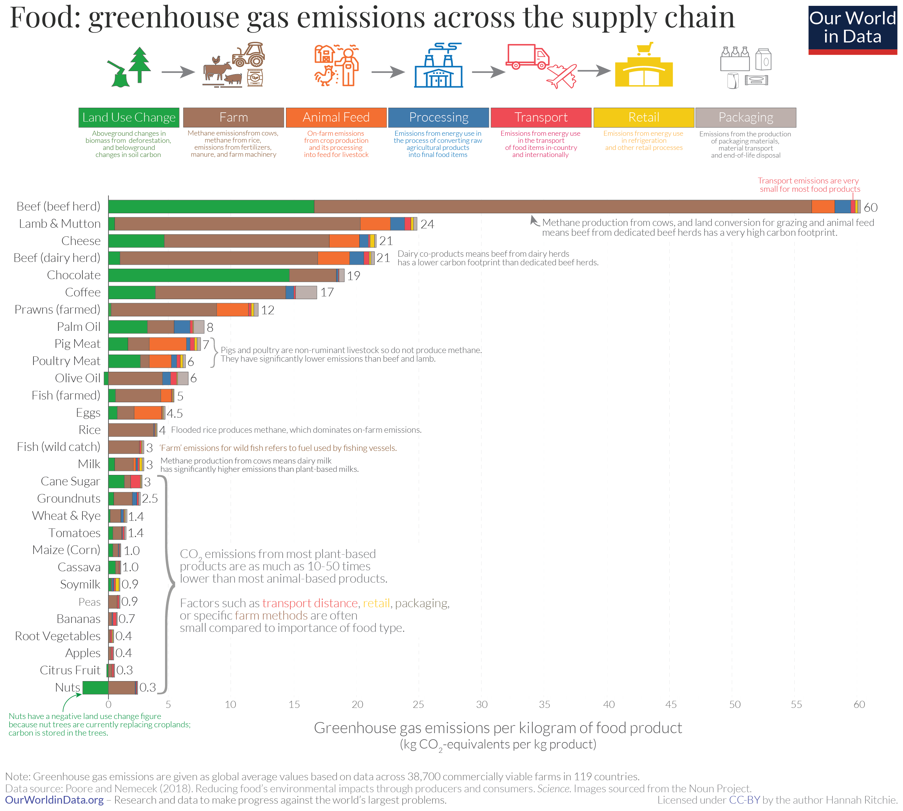
Interesting. Would be nice to see a version with kJ of nutrition on the x-axis, instead of kg of food. For example I’d wager a kg of bananas is a lot more nutritionally valuable than a kg of peas.
Also, it sounds like they have data for 119 countries. They could produce different graphs which are meaningful for the consumers of different countries (at least for the biggest countries). I’m interested in the impact of my diet as a cook in the EU. The global average is also interesting, but it doesn’t guide my behaviour.
If you’re interested, it would be pretty easy to look up calories per kg on each of the foods and translate the graph. My bet is that coffee will be the worst on the chart if you convert them.
Very true, that’s why it would pencil out to be awful. Basically no caloric value. If your question is ‘How do we feed ourselves with the lowest carbon impact?’ then the question of how many calories does become important (and maybe you just take nonfood luxuries like coffee off the chart).
I agree with you both. But I can’t think of a better metric. emissions per kg is definitely not appropriate. Maybe “How do we feed ourselves with the lowest carbon impact?” is the right question, so calories/Joule is a good measure. Otherwise you use some other food-quality measure, where coffee would be at the bottom and maybe potatoes or avocados would be at the top. Probably such a measure already exists.


Interesting. Would be nice to see a version with kJ of nutrition on the x-axis, instead of kg of food. For example I’d wager a kg of bananas is a lot more nutritionally valuable than a kg of peas.
Also, it sounds like they have data for 119 countries. They could produce different graphs which are meaningful for the consumers of different countries (at least for the biggest countries). I’m interested in the impact of my diet as a cook in the EU. The global average is also interesting, but it doesn’t guide my behaviour.
If you’re interested, it would be pretty easy to look up calories per kg on each of the foods and translate the graph. My bet is that coffee will be the worst on the chart if you convert them.
That’s not exactly the best metric for these crops. People don’t drink coffee for calories.
Very true, that’s why it would pencil out to be awful. Basically no caloric value. If your question is ‘How do we feed ourselves with the lowest carbon impact?’ then the question of how many calories does become important (and maybe you just take nonfood luxuries like coffee off the chart).
I agree with you both. But I can’t think of a better metric. emissions per kg is definitely not appropriate. Maybe “How do we feed ourselves with the lowest carbon impact?” is the right question, so calories/Joule is a good measure. Otherwise you use some other food-quality measure, where coffee would be at the bottom and maybe potatoes or avocados would be at the top. Probably such a measure already exists.