Looks paced and conservative, which is apropriate for a project so central to human knowledge accessibility. Looks good to me!
is this the redesign that people are actually going to love? :thinking face: :thinking face:
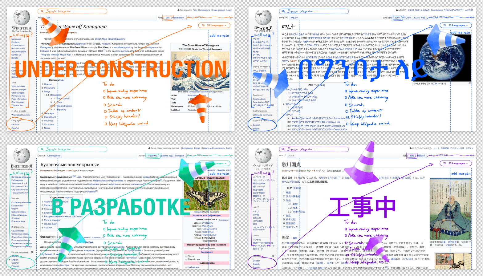
Not bad, here’s the list of changes.
Our second change introduces a maximum line width to our content on pages where reading is the focus, such as article pages and discussion pages. Research has shown that limiting the width can lead to better retention of the content itself, as well as a decrease in eye strain.
I’ve gotta be honest… I can’t believe that this isn’t already a thing on most web pages. This knowledge is there since… and I’m not exaggerating… multiple hundred years. My SO back then studied communication sciences, and typography was a part of this. So there are people who know this and learned this within their field, but none of them seem to work for the design of internet pages.
I’m always using the webbrowser in non-miximized size. I’m using a comparatively slim window size for this very reason. It’s awful to read so long lines.
Is this why newspapers had thin columns?
That is one of the reasons, but newspaper columns are particularly thin, and the reason for that might be that they can better embed ads in between those thin columns.
It’s awful.
Collapsing the sidebar doesn’t really collapse anything, just hides the navigation. What’s the point of that? None.
Why the living hell does any webpage think that scrunching the text into the middle part of the page makes it better? The smartphoneification of web pages is an absolute cancer that needs to end. Do people think this is easier to read? People must have ADD if they can’t keep their attention on a line of text longer than a few words. There’s less space for tables, charts, and inlined images and other things which will limit articles in a major way.
This is complete insanity and I insist that they at least give me an option to keep the old way.


