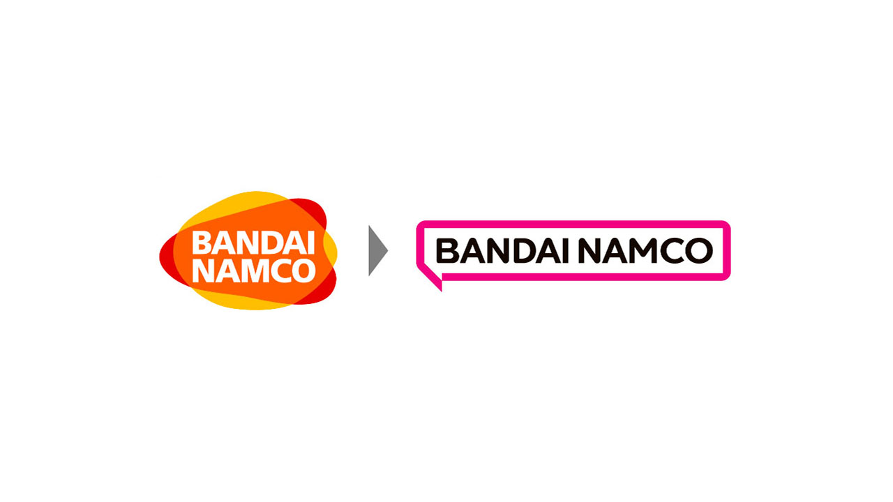
A downgrade tbh, and this isn’t coming from a pair of nostalgia lenses. It’s literally just a flat textbox with the company’s name. From afar it looks like Kraft’s logo (tbh the previous one looks like the old Lays logo from afar as well, but i’d argue that its rounder shapes made it slightly distinguishable).
The logo lost all its playfulness… I wonder what was the cause for this bad decision
someone pays a company millions of dollars to “redesign the mission statement and CI” and they come up with some minimalist garbage and an explanation why you should use this garbage:
The new logo’s speech bubble motif, “Fukidashi” in Japanese, expresses the potential of the brand to connect with people around the world and inspire them with amazing ideas. The speech bubble also represents Japan’s manga culture that has become so popular everywhere.


