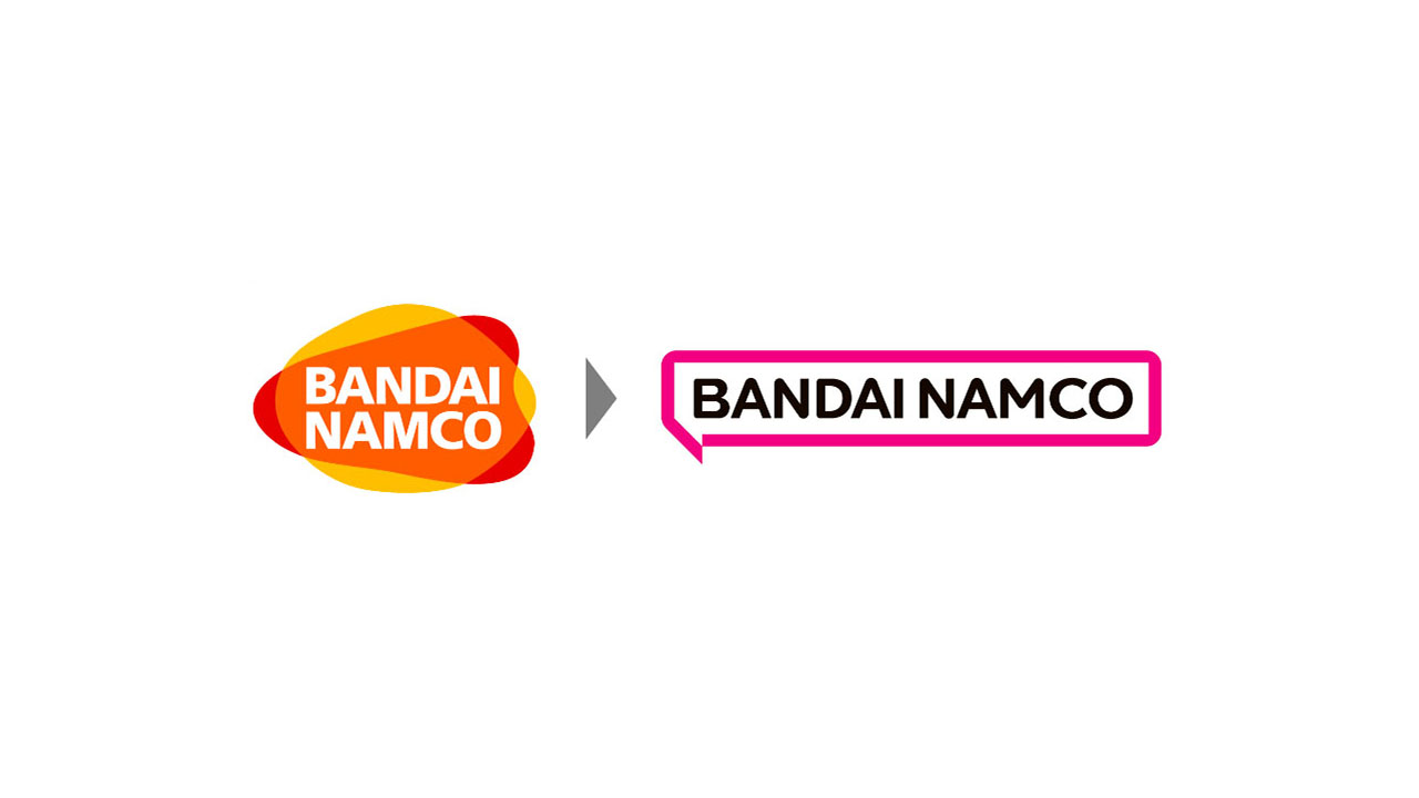
Bandai Namco Group has announced a new mission, vision, and logo, which plan to be implemented starting in April 2022. "With intense competition in today's rapidly changing global market and…
A downgrade tbh, and this isn’t coming from a pair of nostalgia lenses. It’s literally just a flat textbox with the company’s name. From afar it looks like Kraft’s logo (tbh the previous one looks like the old Lays logo from afar as well, but i’d argue that its rounder shapes made it slightly distinguishable).

A downgrade tbh, and this isn’t coming from a pair of nostalgia lenses. It’s literally just a flat textbox with the company’s name. From afar it looks like Kraft’s logo (tbh the previous one looks like the old Lays logo from afar as well, but i’d argue that its rounder shapes made it slightly distinguishable).