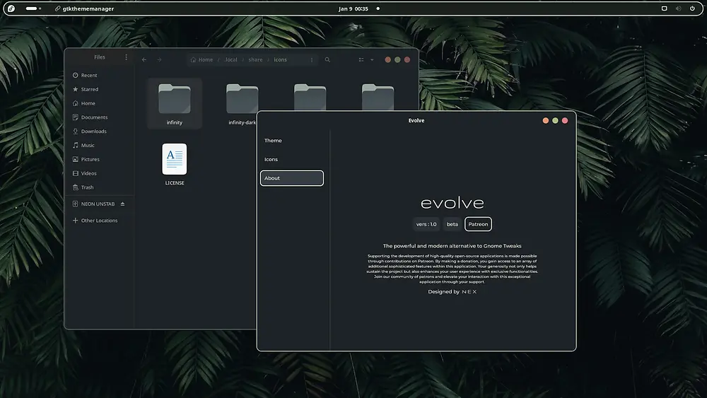
Hasn’t been released fully yet by the developer but looks interesting.
Edit: Video says repo is on its way
Using a YouTube link intentionally— better people redirect to their own choice piped or invidious instance that they’re logged into (various redirect tools available)
Edit: Repo link here https://github.com/arcnations-united/evolve
The 50€ Patreon tier perks include “everything ad-free”. And there’s no repo or source available anywhere.
WTF
He’s Youtuber. Patreon gives his YouTube ad free. Repo is on its way according to video.
on its way
Should be there before release. Shaaaady
But they get that schweet, schweet ad revenue… hatchacha~!
Assuming it’s gpl or something, you only need to provide the source with binary distributions of the product. Anyone in the patreon would have access to the source (I’m assuming)
before release
According to OP it hasn’t been released yet.
It’s available for download. And if you want it ad free, you pay for it.
Pretty certain the ads are in his YouTube videos and not his projecf
So what’s the difference between the paid and the free download links?
I don’t think there is any, he just offered an early release to his Patron supporters (he didnt put the repo up yet)
Weird, the video announcement states the software is FOSS. I think that’s regarding his YouTube content and not this stuff. The video also states github is wip
deleted by creator
GTK4 theming with GUI?
deleted by creator
Can confirm GNOME tweaks does not do that. A note stable solution right now (only color theming though) is Gradience.
Where’s the git repo?
According to video it’s wip/coming
Glad this exists, but I am worried with the way GNOME is going that this might not be worth it in the long run.
Which way is GNOME going? I’m out of the loop.
Gnome seems to be getting better with each update, I’m not really sure what you mean? It’s stable, looks amazing/consistent, has a very healthy app ecosystem, etc.
deleted by creator
GNOME is notorious for being against themes the way Evolve does it, mainly because themes might override default themes set by the app developers. While it does result in GNOME being more polished and coherent, some feel that it’s too limiting, especially with an ecosystem like Linux’s. It’s essentially the trade-off you get.
Libadwaita is notorious for this - libadwaita does not allow theming by default, and apps stick out like a sore thumb on anything that doesn’t run GNOME. Gradience helps match libadwaita apps to a colour scheme, and it’s what I use to make Easy Effects blend as well as possible with KDE (FWIW, Easy Effects has no KDE equivalent).
deleted by creator
Unless you’re writing ruby on rails on a 13" macbook, you’ll run into Gnome’s limitations when working.
Gnome is in many ways so focused that it makes a lot of productivity use impossible. You always have to open the menu to launch software, you’ve got no system tray, and worst of all, Gnome apps are so simplified that you constantly run into the limitations when using it productively.
When working with dozens of windows open at the same time across multiple monitors, I’m a fan of KDE. And KDE apps tend to also have all the extra features I need to handle weird situations, files, and edge cases.
Might I ask what you do for work? I do software development stuff at my job and I’ve found gnome lets me be like 3x as productive as other desktops. The simple desktop experience coupled with the robust app ecosystem simply can’t be found anywhere else. I use like 3 monitors with dozens of apps open as well.
I’m a software dev as well.
But I often layer multiple windows in the same tile of the screen. e.g. I may have the IDE with the software I’m working on in one tile, the IDE with the library source code I’m working with in the second tile, and a live build of the app in the third tile. But I’ve also got documentation, as a website, in the same tile as the IDE with the lib’s source.
Now when I switch between the IDE with the lib’s source, and the browser with the lib’s documentation, I only want that tile to change. No problem, with KDEs taskbar and window switcher I can quickly do that.
But when using the applications menu on Gnome I get a disrupting UI across all screens that immediately rips me out of whatever I was doing.
I guess that’s fair, I rarely need to switch between windows that heavily so workspaces setup with what I need when I need to switch makes vanilla gnome work perfectly for me. Especially since hitting the super key let’s me see everything at a glance. I also hate tiled setups since they make me super unproductive as the windows are more cumbersome when they aren’t maximized or floating.
Something about whitespace and negatives I guess. Same thing that makes libadwaita the nicest ui toolkit to me. Kde was just too busy while libadwaita and gnome struck the best balance between usability and visuals.
I think it’s just a case of different people enjoying different things.
Maybe you should try out some of the most popular Gnome extensions that address those situations?
I tried that, but IMO it’s much simpler and more robust to just configure KDE than to install a dozen Gnome extensions that end up broken after updates anyway.
To each their own, the point is that for people that like Gnome there are options to customize it for many workflows
deleted by creator
Why’d you have to use TC? KDEs dolphin can do all that natively.
Personally, configuring KDE was much simpler and more robust compared to the dozen addons I needed for Gnome, which also broke every now and then after updates.
deleted by creator
Not right now in performance but soon it will be. I definitely think it’s the most coherent. They have a design philosophy that they follow and stick to it. I love gnome
deleted by creator
According to video it’s wip/coming
I don’t use gnome; can someone who does plz tell me what style that is? The color scheme is Everforest, but what’s the rest of the style called? It’d look good on rofi & polybar.
Edit: I guess the theme is also Everforest Dark? I think it’s this one.
Edit 2: Someone has already done most of the work for polybar, rofi, and some other tiling WM tools; dotfiles here. I haven’t tested it myself yet, but it looks pretty good.
Think it’s from this video
Here is an alternative Piped link(s):
Piped is a privacy-respecting open-source alternative frontend to YouTube.
I’m open-source; check me out at GitHub.
YouTube links are fine - I hate those stupid bots that spam posts about such links.
Did you read your own letter? It’s not relevant here.
If you like to tinker with your own system, that’s fine with us. However, if you change things like stylesheets and icons, you should be aware that you’re in unsupported territory. Any issues you encounter should be reported to the theme developer, not the app developer.
I don’t know whether you’re shitting on theme developers or GTK app developers with your comment, but they explicitly state that they think theming is fine, they’re just tired of people reporting theme problems as app problems. It’s a completely reasonable take.
If I were an app developer I wouldn’t want to open a bug report, then spend hours and hours investigating a reported issue, only to find out that my app was never the problem in the first place.
It’s more targeted towards the DE developers.
Some use gnome but with their own theme and it can make normal apps look broken.
You can see this if you use an Elementary OS application while still using the default gnome theme as an example.
Or if you use Pop! Shell, and try to use a normal libadwaita app. (Although Pop Shell has gotten better about how they implement their theme)


