
Lemmy v0.7.40 Pre-Release (2020-08-05)
We’ve added a lot in this pre-release:
- New post sorts
Active(previously called hot), andHot. Active shows posts with recent comments, hot shows highly ranked posts. - Customizeable site icon and banner, user icon and banner, and community icon and banner.
- Added user preferred names / display names, bios, and cakedays.
- User settings are now shared across browsers (a page refresh will pick up changes).
- Visual / Audio captchas through the lemmy API.
- Lots of UI prettiness.
- Lots of bug fixes.
- Lots of additional translations.
- Lots of federation prepping / additions / refactors.
This release removes the need for you to have a pictrs nginx route (the requests are now routed through lemmy directly). Follow the upgrade instructions below to replace your nginx with the new one.
Upgrading
With Ansible:
# run these commands locally
git pull
cd ansible
ansible-playbook lemmy.yml
With manual Docker installation:
# run these commands on your server
cd /lemmy
wget https://raw.githubusercontent.com/LemmyNet/lemmy/master/ansible/templates/nginx.conf
# Replace the {{ vars }}
sudo mv nginx.conf /etc/nginx/sites-enabled/lemmy.conf
sudo nginx -s reload
wget https://raw.githubusercontent.com/LemmyNet/lemmy/master/docker/prod/docker-compose.yml
sudo docker-compose up -d
when federation working?
A while yet, you can track our progress on this ticket, or our recent commits.
I really like the redesigned user profiles, a lot more intuitive compared to when you previously had to scroll all the way to down to reach the settings!
btw do you test builds on mobile?
Thanks! :smiling face:
The whole thing is written in bootstrap to be responsive, so I just use firefox’s devtools to simulate the screen sizes.
ah ok, there’s just generally some alignment issues on mobile, and i’m not quite sure if they’re intentional (which would be weird)
Ah.
I’m not sure what this means, so I’m gonna just create a github issue :thinking face:
Playing around with the new display name option - I noticed it’s allowed to set one starting by @. How can we avoid users impersonating other users?
Hrm,I’ll have to think about that one. Obvi there’s still a hover / click and hold, and you can still see who the real user is. Really I don’t want any
symbols at all, but it was a helpful differentiator.Obvi there’s still a hover
Oh didn’t notice it. Good, good. Maybe forbidding the use of a leading
would be helpful. Not seeing it at the beginning of someone’s alias would be a clear hint the user has a display name set. But I don’t know ifwith the “@” included are here to stay uhYa sounds like a good idea, the no starting
thing. I’ll make an issue for it.
I was going through lemmy’s weblate but I cannot mange to find the string for the “Active” sorting method, and for “Upload Banner”. Missing keys?
Edit: also for “Display name” lol. I guess I simply have to wait for the weblate to sync with the repo, sorry for the impatience
Edit: great update btw!
Honestly the community banner and icon are pretty awful.
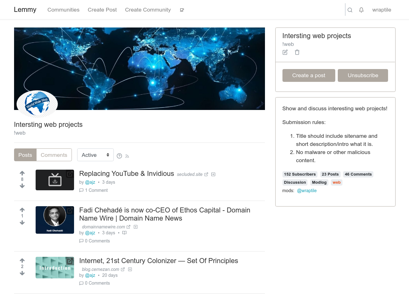
I played around with my community and there’s no way to make it look good and not waste space. It should have been extension of original banner, the one with “lemmy, communities, create post” etc the way reddit does it. Now we have two completely pointless banners that take almost half of a screen.
deleted by creator
I’m not sure what 2 banners. There’s a navbar, and a banner, and reddit doesn’t mix the two either. Yours probably looks strange because you’re using a really tall banner.
Navbar is a banner. The difference is only in semantics but from UI perspective its the same. Community banner and icon should be integrated with “navbar” like reddit does it.
I switched to smaller banner however icon doesn’t scale. Nevertheless I find the new layout is definitely a big step back.
As per pre-release thread people did recommend expanding sidebar instead as banners are just silly waste of space and I think that’s should have been done instead.