

In 1999, as an educational therapist, Dr. Bonnie Shaver-Troup, working with clients, began observing that reading issues masked the individual’s true capability and intelligence.
In 2000, Bonnie theorized that reading performance would improve through use of:
- A sans-serif font to reduce cognitive noise -Expanded scaling to improve potential for character recognition -Hyper-expansion of character spacing, which creates a greater lag time and reduces potential crowding and masking effects
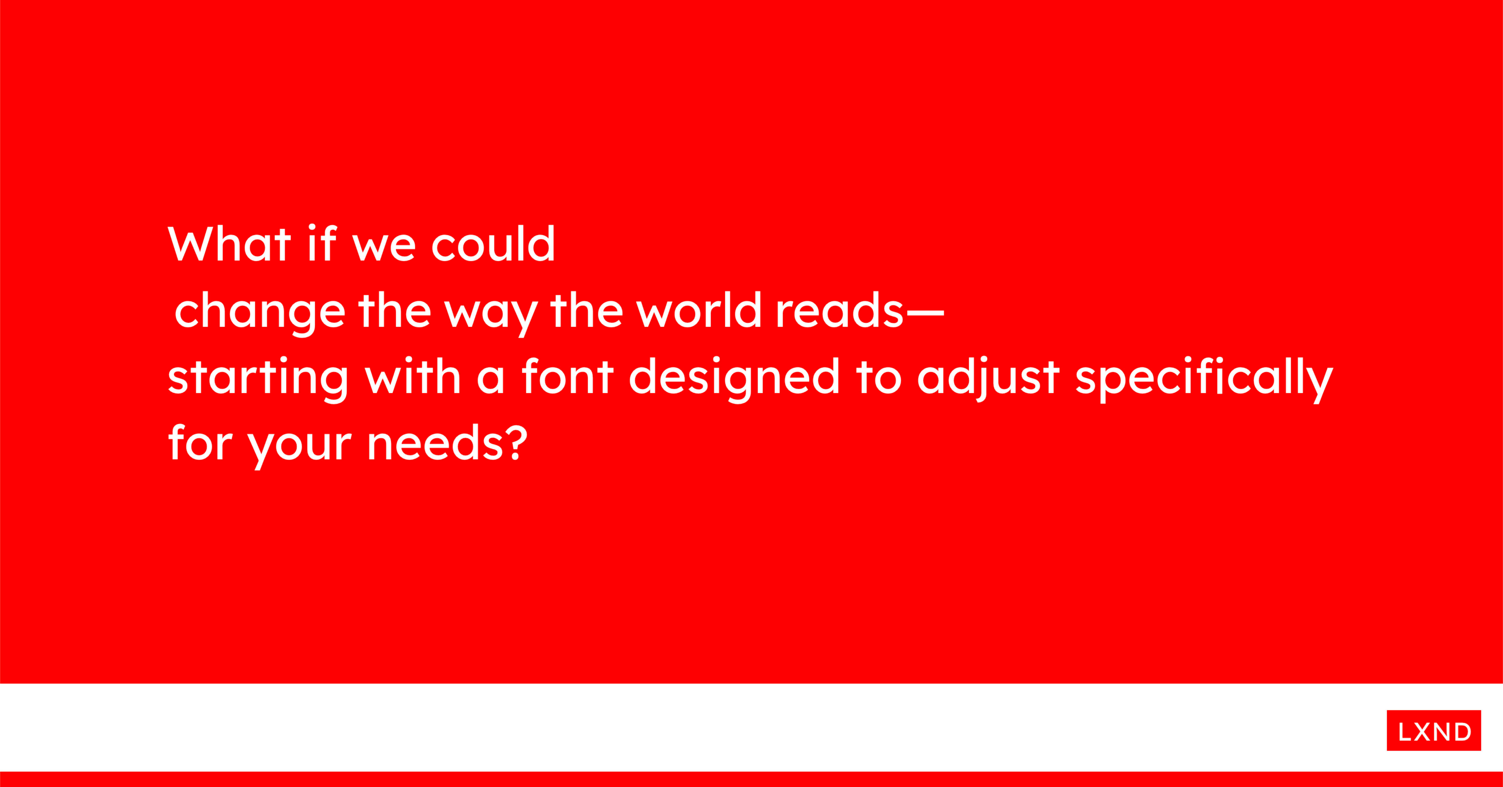
These changes led to the development of seven specially-designed fonts, which create an immediate improvement in reading performance.
This is where Lexend was formed.
[Github] https://github.com/googlefonts/lexend
[Website] https://www.lexend.com/
Noone?
Imo serifs help to read text. It makes it more beatiful and easier to read.
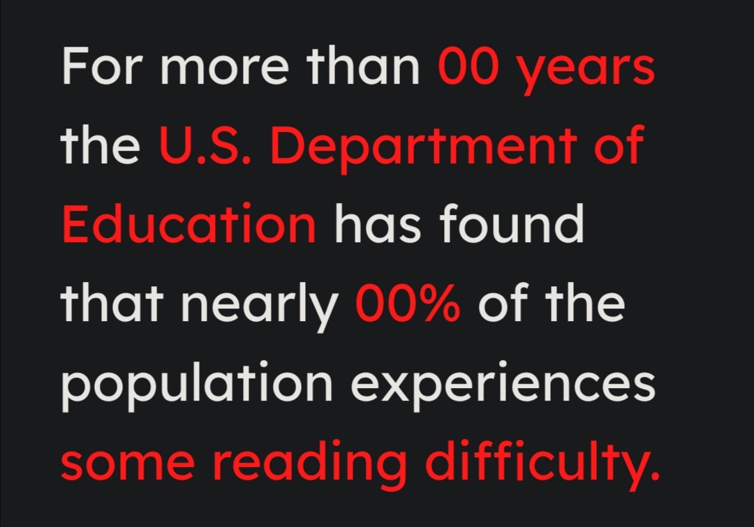
It’s not about reading comfort. It is commonly accepted that sans-serif fonts simplify the reading and processing of information by dyslexic people. This is what the associations that work with dyslexic children choose.
The different studies seem to show that even before the drawing of the letter, what seems to be even more important is the spacing. The spacing between letters, words or lines. As well as the non justification of the text and the short lines.
https://onlinelibrary.wiley.com/doi/10.1002/dys.1527
https://learningally.org/Blog/dyslexia-does-font-really-matter
Thy for the info! Appreciated.
That’s why I wrote “imo”. I do not suffer from dyslexia and I think e.g. “computer modern” with serifs (and without bloody ligatures) is more beatiful and with proper applied spacing, i.e. from tex and not word, it is easier and more comfortable to read. Meaning, even a reader who does not suffer from dyslexia can have an improved reading experience if the font fits better to the likings of the brain.
A typeface designed to aid reading comprehension, but with a single-storey a and a straight lowercase L? I don’t get it.
A typeface designed to aid reading comprehension, but with a single-storey a and a straight lowercase L? I don’t get it.
Lower case “L” is different from upper case “i”:
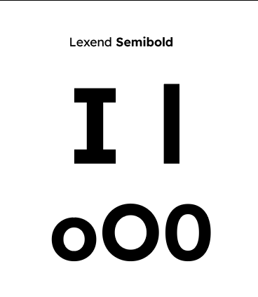
It also seems that dyslexic people prefer round lowercase a… though you are right for some it can be confused with the “o”.
Lower case “L” is different from upper case “i”:
Next to each other they sure are different :) Didn’t know about the dyslexic people preference for round lc a… I just know it’s a no-no for legibility in general.
This looks nice but their website fails to degrade gracefully - this is what it looks like in Tor Browser, for some reason even after I allowed scripts to run:

This looks nice but their website fails to degrade gracefully - this is what it looks like in Tor Browser, for some reason even after I allowed scripts to run:
strange ^^ it works for me under Firefox. It’s probably Tor blocking a resource… or an add-on.
Will try this on my ebook reader. The “noise” of serif fonts is something I have been feeling lately.
Will try this on my ebook reader. The “noise” of serif fonts is something I have been feeling lately.
I hope you will find your happiness.