TrollMEnglish · edit-22 years agoSome sites where to find free or open source fonts, add your own :)plus-squarepinmessage-squaremessage-square2fedilinkarrow-up110arrow-down10
arrow-up110arrow-down1message-squareSome sites where to find free or open source fonts, add your own :)plus-squarepinTrollMEnglish · edit-22 years agomessage-square2fedilink
Joël de Bruijn · 1 month agoB612: open source font, not for cockpits onlyplus-squareinfosec.exchangeexternal-linkmessage-square1fedilinkarrow-up110arrow-down10
arrow-up110arrow-down1external-linkB612: open source font, not for cockpits onlyplus-squareinfosec.exchangeJoël de Bruijn · 1 month agomessage-square1fedilink
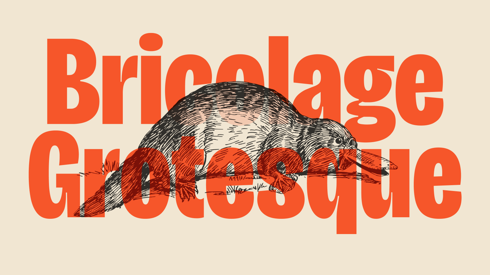
TrollMEnglish · 1 year agoBricolage Grotesque — Free & Open Source Variable Fontplus-squareateliertriay.github.ioexternal-linkmessage-square1fedilinkarrow-up15arrow-down10
arrow-up15arrow-down1external-linkBricolage Grotesque — Free & Open Source Variable Fontplus-squareateliertriay.github.ioTrollMEnglish · 1 year agomessage-square1fedilink
TrollMEnglish · 2 years agoWork Sans (Sans Serif) 18 styles + Variableplus-squareweiweihuanghuang.github.ioexternal-linkmessage-square2fedilinkarrow-up11arrow-down10
arrow-up11arrow-down1external-linkWork Sans (Sans Serif) 18 styles + Variableplus-squareweiweihuanghuang.github.ioTrollMEnglish · 2 years agomessage-square2fedilink
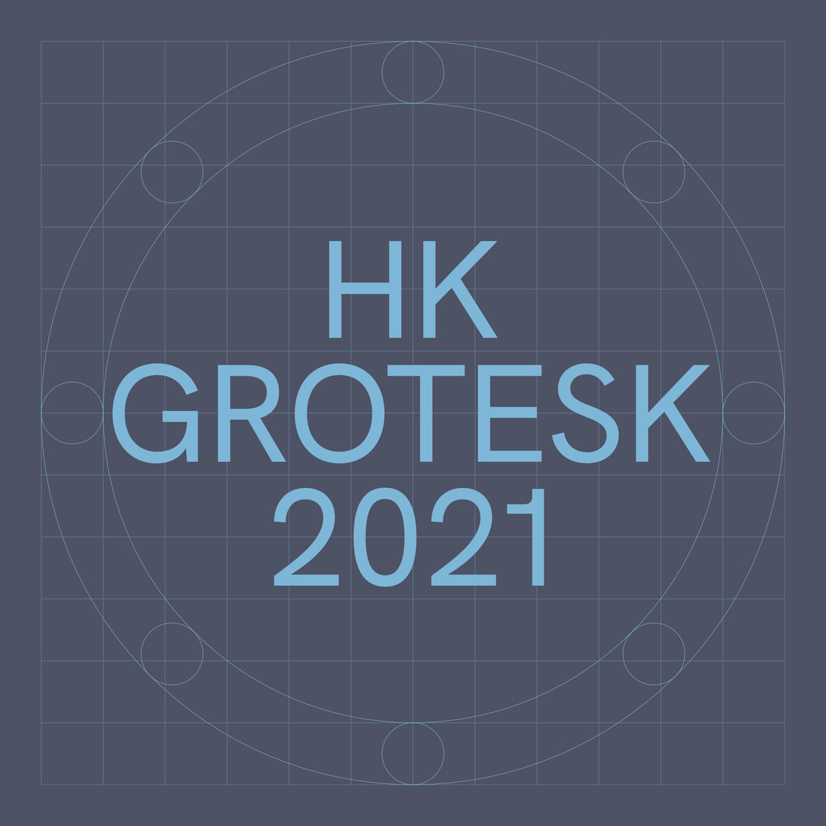
TrollM · 2 years agoHK Groteskplus-squarehanken.coexternal-linkmessage-square0fedilinkarrow-up11arrow-down10
arrow-up11arrow-down1external-linkHK Groteskplus-squarehanken.coTrollM · 2 years agomessage-square0fedilink
TrollM · edit-22 years agoAvara (Serif)plus-squaretypotheque.luuse.funexternal-linkmessage-square0fedilinkarrow-up12arrow-down10
arrow-up12arrow-down1external-linkAvara (Serif)plus-squaretypotheque.luuse.funTrollM · edit-22 years agomessage-square0fedilink
salarua@sopuli.xyzEnglish · 2 years agoIntel One Monoplus-squaregithub.comexternal-linkmessage-square0fedilinkarrow-up12arrow-down10
arrow-up12arrow-down1external-linkIntel One Monoplus-squaregithub.comsalarua@sopuli.xyzEnglish · 2 years agomessage-square0fedilink
kingmongoose7877English · edit-22 years agoPiscolabis - A new OFL-licensed Sans-serif Display font!plus-squarewww.tunera.xyzexternal-linkmessage-square0fedilinkarrow-up15arrow-down10
arrow-up15arrow-down1external-linkPiscolabis - A new OFL-licensed Sans-serif Display font!plus-squarewww.tunera.xyzkingmongoose7877English · edit-22 years agomessage-square0fedilink
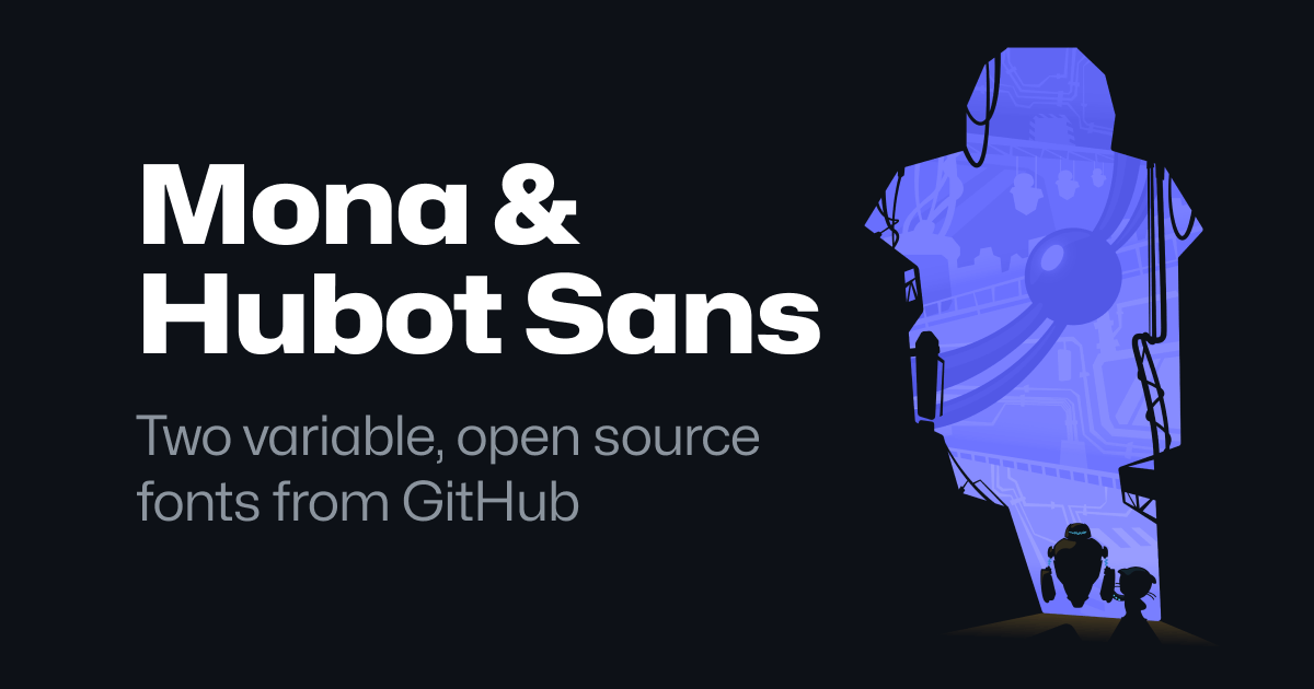
_ed@sopuli.xyz · 2 years agoMona Sans & Hubot Sans (GitHub)plus-squaregithub.comexternal-linkmessage-square0fedilinkarrow-up13arrow-down10
arrow-up13arrow-down1external-linkMona Sans & Hubot Sans (GitHub)plus-squaregithub.com_ed@sopuli.xyz · 2 years agomessage-square0fedilink
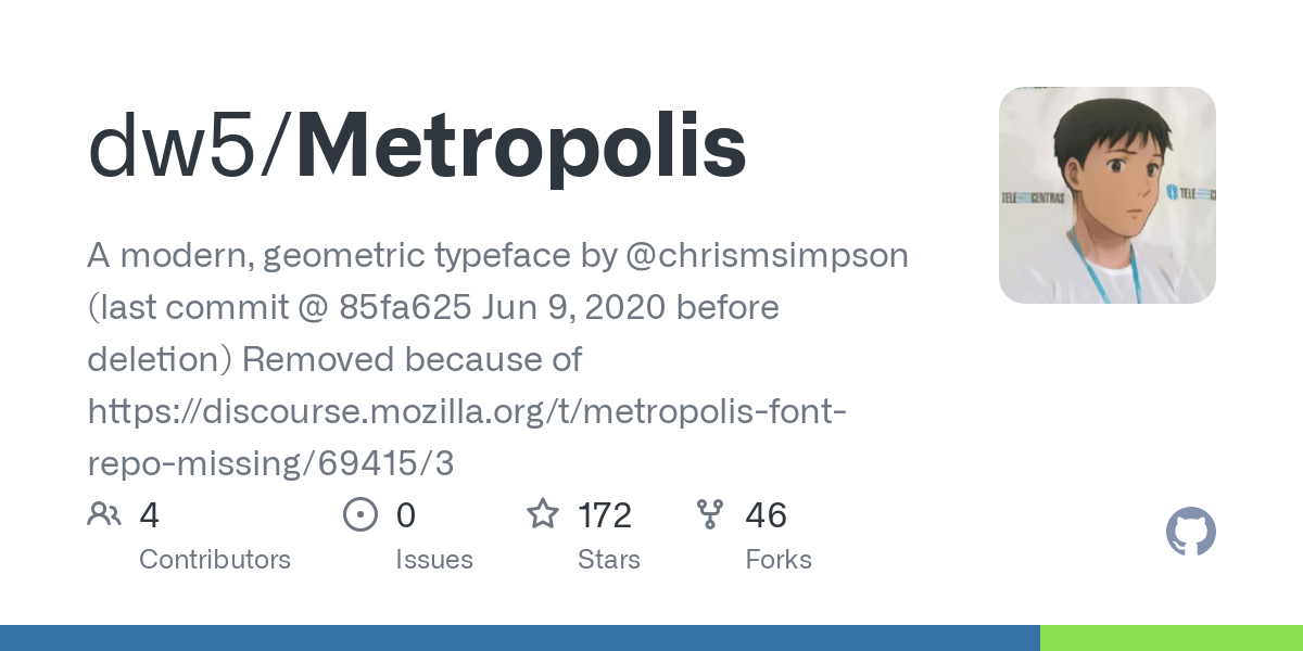
_ed@sopuli.xyz · 2 years agoMetropolisplus-squaregithub.comexternal-linkmessage-square0fedilinkarrow-up13arrow-down10
arrow-up13arrow-down1external-linkMetropolisplus-squaregithub.com_ed@sopuli.xyz · 2 years agomessage-square0fedilink
_ed@sopuli.xyz · 2 years agoDownload the Atkinson Hyperlegible Fontplus-squarebrailleinstitute.orgexternal-linkmessage-square0fedilinkarrow-up15arrow-down11
arrow-up14arrow-down1external-linkDownload the Atkinson Hyperlegible Fontplus-squarebrailleinstitute.org_ed@sopuli.xyz · 2 years agomessage-square0fedilink
_ed@sopuli.xyz · edit-22 years agoGitHub - Clarity Cityplus-squaregithub.comexternal-linkmessage-square0fedilinkarrow-up15arrow-down11
arrow-up14arrow-down1external-linkGitHub - Clarity Cityplus-squaregithub.com_ed@sopuli.xyz · edit-22 years agomessage-square0fedilink
TrollM · 3 years agoGitHub - prodms/max: webfont port of Max Meidinginers Neue Haas Grotesk Proplus-squaregithub.comexternal-linkmessage-square2fedilinkarrow-up12arrow-down10
arrow-up12arrow-down1external-linkGitHub - prodms/max: webfont port of Max Meidinginers Neue Haas Grotesk Proplus-squaregithub.comTrollM · 3 years agomessage-square2fedilink
Valf · 3 years agoUncutplus-squareuncut.wtfexternal-linkmessage-square0fedilinkarrow-up15arrow-down10
Ordoviz · 3 years agoPixtura12 Medieval Pixel Fontplus-squareopengameart.orgexternal-linkmessage-square1fedilinkarrow-up16arrow-down10
arrow-up16arrow-down1external-linkPixtura12 Medieval Pixel Fontplus-squareopengameart.orgOrdoviz · 3 years agomessage-square1fedilink
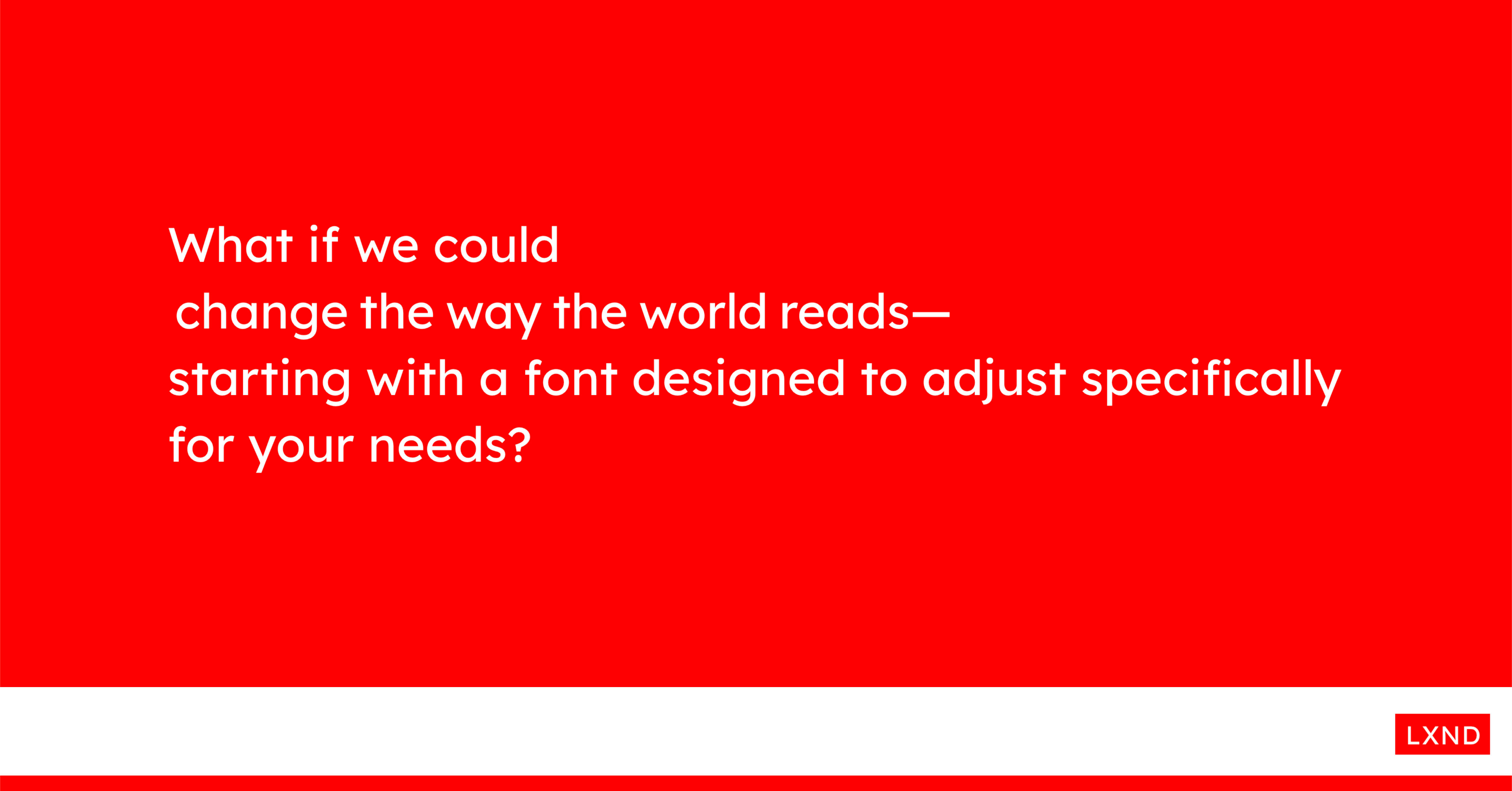
TrollM · 3 years agoLexendplus-squarewww.lexend.comexternal-linkmessage-square10fedilinkarrow-up18arrow-down12
arrow-up16arrow-down1external-linkLexendplus-squarewww.lexend.comTrollM · 3 years agomessage-square10fedilink
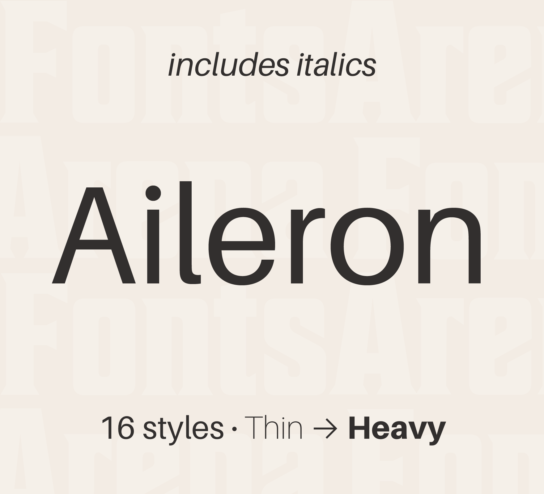
TrollM · 3 years agoAileron (Sans-serif, lineal/neo-grotesque)plus-squarefontsarena.comexternal-linkmessage-square1fedilinkarrow-up14arrow-down11
arrow-up13arrow-down1external-linkAileron (Sans-serif, lineal/neo-grotesque)plus-squarefontsarena.comTrollM · 3 years agomessage-square1fedilink
TrollM · edit-23 years agoChivo (Sans-serif, lineal/neo-grotesque)plus-squarewww.omnibus-type.comexternal-linkmessage-square0fedilinkarrow-up12arrow-down10
arrow-up12arrow-down1external-linkChivo (Sans-serif, lineal/neo-grotesque)plus-squarewww.omnibus-type.comTrollM · edit-23 years agomessage-square0fedilink
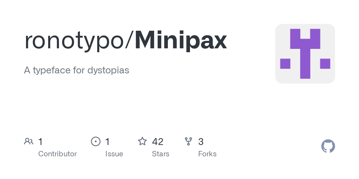
TrollM · edit-23 years agoMinipax (Serif, modern/didone)plus-squaregithub.comexternal-linkmessage-square1fedilinkarrow-up17arrow-down11
arrow-up16arrow-down1external-linkMinipax (Serif, modern/didone)plus-squaregithub.comTrollM · edit-23 years agomessage-square1fedilink
TrollM · edit-23 years agoCinzel (Serif, classical/réales)plus-squarewww.ndiscover.comexternal-linkmessage-square0fedilinkarrow-up16arrow-down10
arrow-up16arrow-down1external-linkCinzel (Serif, classical/réales)plus-squarewww.ndiscover.comTrollM · edit-23 years agomessage-square0fedilink