

- cross-posted to:
- covid@hexbear.net
- cross-posted to:
- covid@hexbear.net
cross-posted from: https://lemmy.ml/post/9825270
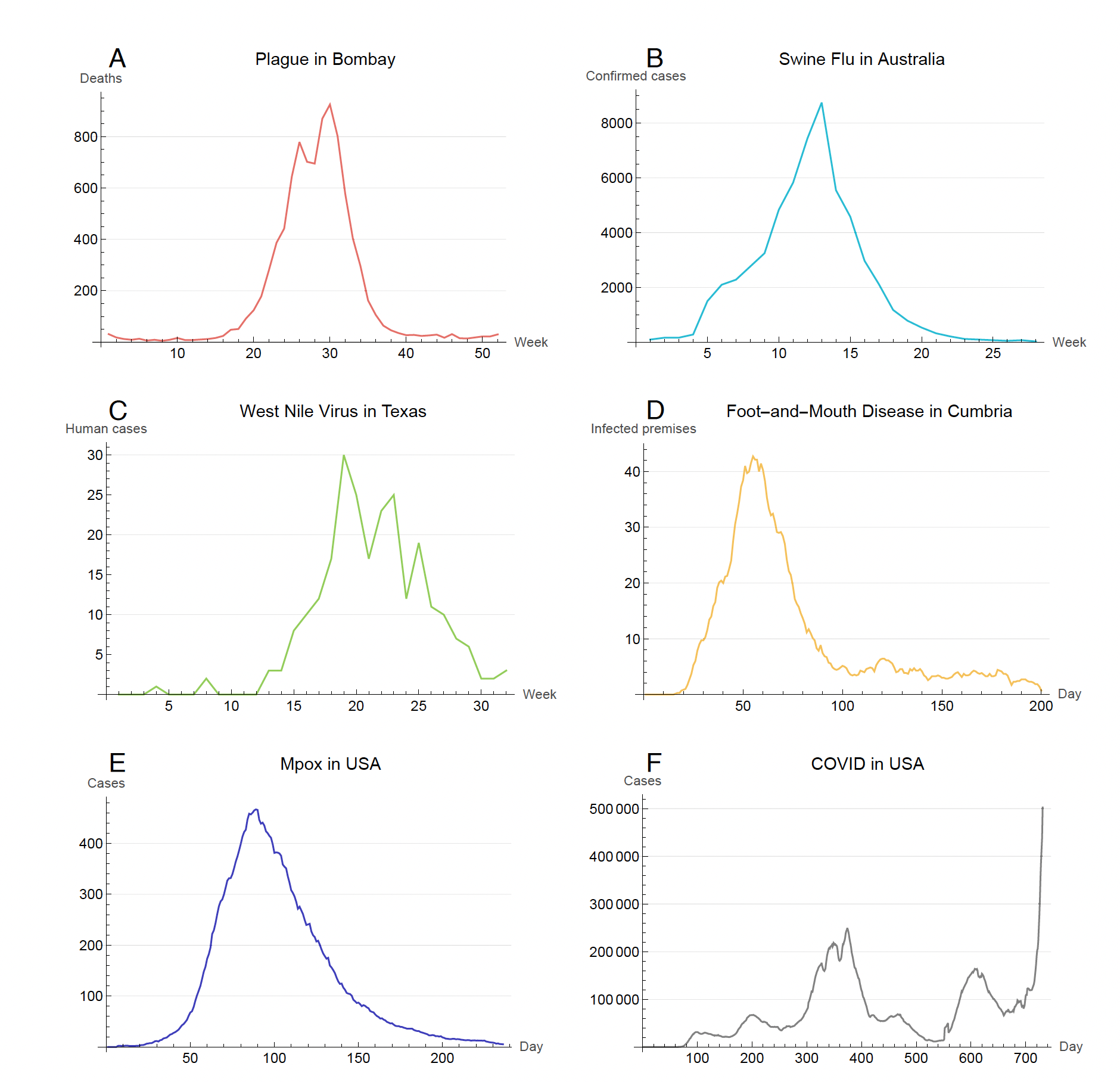
Not the link in the post to the article: http://carlbergstrom.com/publications/pdfs/2023PNAS.pdf
You must log in or register to comment.
deleted by creator
Actual facts:
When you say “actual facts” it sounds like you are saying that the graph is wrong. It’s identical to the data you linked to. The posted meme is likely old or bot-karma because it stops in 2022. It shows that the US had a second, much larger case spike around 700 days into the pandemic.
In that case, why are we even talking, because like all those other graphs, it went down.
Yes, after an anomalous second spike which is what makes the graph interesting. The reasons are well-known and tend to be troll bait.
Im sure I can find lots of graphs that have two spikes to make a point that is also pointless.