
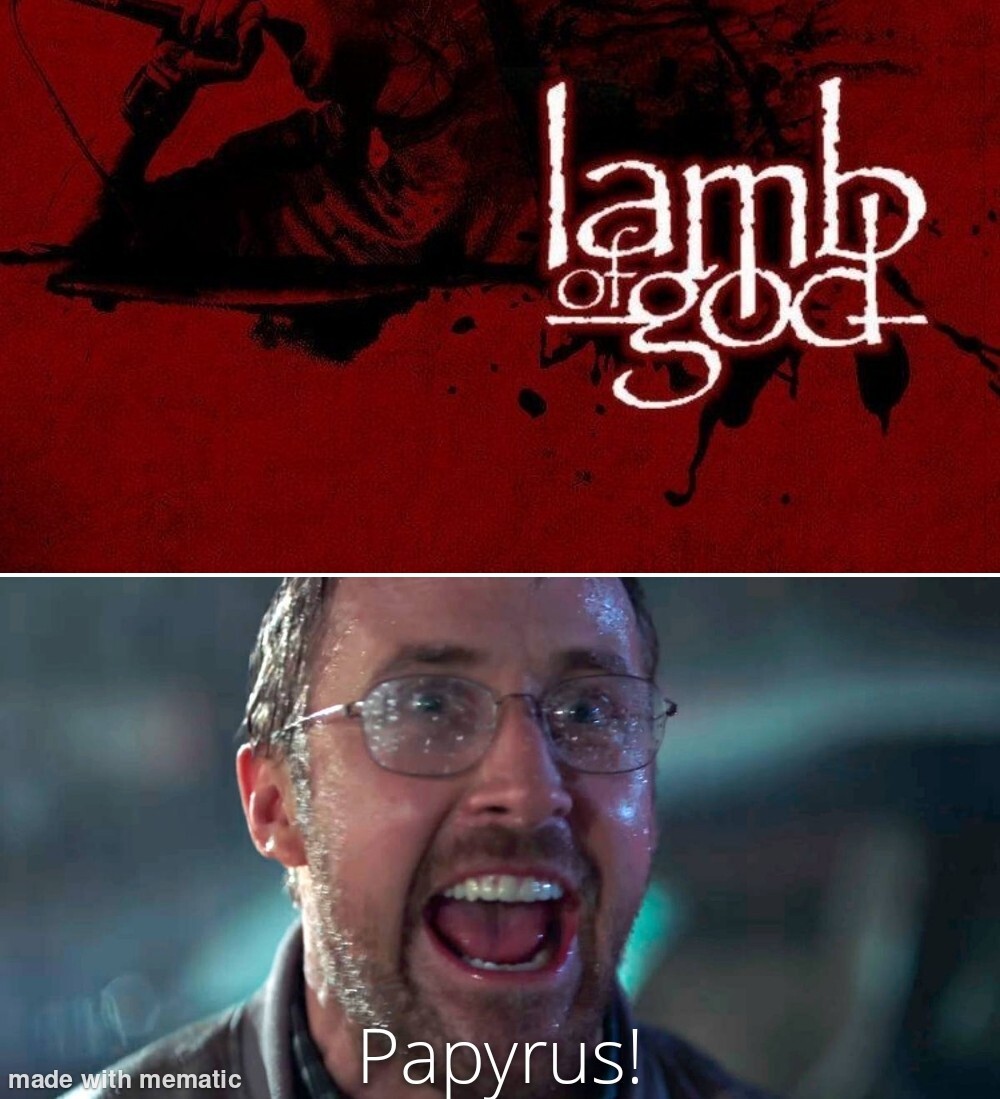
In their defense, with a name like Lamb Of God, it was either papyrus or thorny vines.
“They modified it a bit.”
“Whatever they did, it WASN’T ENOUGH!”
I unironically like Comic Sans and Papyrus. S Tier typefaces.
As a graphic designer hearing people roast comic sans and papyrus to make small talk with me at work gets so god damn old.
Thank you for staying off the hype train. There is nothing wrong with these typefaces.
Unfortunately I even have to avoid them though because they have become the Hitler mustache of the type world. Sure you can say you are rocking the Charlie Chaplin, but everyone from a distance will wonder “why is that dude rocking a Hitler mustache? WTF!?”
I get your point. Garamond memes just don’t hit quite as hard.
yeah, shit tier typefaces
It’s not that they’re bad. With Comic Sans, the issue it how often it’s used inappropriately. With Papyrus I think the issue is it’s too distinctive and too commonly used. Instead of creating the effect it’s going for, its affect instead is to remind you of all the other things you’ve seen that use Papyrus.
They have their place. I won’t yuck your yum.
NYEH HEH HEH!!!
This skit is one of the funniest skits I’ve ever seen and it never, never fails to make me laugh.


