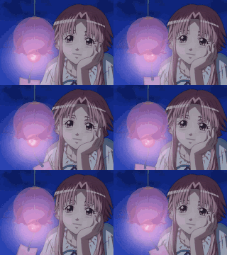
Stumbled onto this shitty game trailer on youtube and instantly clocked it as ai art
Cant really put to words why exactly they’re so instantly recognisable
Something about the wierd sharp lines and doll like faces
in addition to everything else in this thread, ai “”“”“”“art”“”“”" often has this hyper-saturated feel, a bit like some ads or youtube thumbnails, designed to draw the eye to it but just makes everything look too sharp and flat. like the MSG of graphics. not sure how much that makes sense
also how lazy do you have to be to not hand draw/render a chocolate bar? it’s just a bunch of chamfered rectangles! no, instead we get 10 chocolate pieces in 10 different shapes and sizes
MSG is good tho
yeah but it tastes like shit if you just eat a fistful of it
art tends to have detailed focal points that stand out from a less detailed background, places for your eyes to be drawn and rest. ai slop has this weird uniform level of detail all over that makes my eyes vibrate
it’s fine but if you rely on it to make bland food taste OK, instead of making the other ingredients/seasoning shine, it just makes everything taste like MSG. by itself it just tastes like “flavour” without anything behind it. SOOO i guess in this metaphor, graphics that only have “instant attraction” without any thought or concept behind it just has too much AIMSG (adobe instant messenger)
chamfered
thank you for teaching me this word
Basically there’s a lack of intention. Like the hair in that picture, there’s tons of detailed little strands at the bottom. If a human did this they’d probably have one or two strands like that that imply as wispy texture. The ai doesn’t know why details are good, just that they are good and therefore more of them is more good.
For me it’s the weird shamrock hat thing. You’re telling me someone who can draw this well just put some amorphous decoration there with no real detail? It just doesn’t make sense.
everything it ever does has this patina of mid-to-late-2000s-deviantart on which for all I care might aswell be because the deviantart website was easy to scrap for copyright infringement / training data
Everything looks “too perfect”, like a bunch of elements that are each the platonic ideal or textbook photo of the thing. Everything pops out at you, every last thing is the focus, there isn’t really a background built into it.
Also, perhaps as a result of this, the lighting and shading are often incoherent.
AI art reminds me of Mr Beast thumbnails
I believe the word is ‘soulless.’
I don’t think the lines are very sharp at all, if anything the style stands out because it tends to have lots of vague blurry regions, where a human drawn image would have details and texture. Something about AI generated images tends to make them much less detailed, at least with far less recognizable detail, than what humans would draw. And when there are details they’re nondescript.
It’s the “mistakes” that AI makes are completely different from the “mistakes” a human artist would make. Look at the eyes, they are off focus, but in a way that a human artist would notice and correct. Same with the spoon(?) and the hand. It’s just off in a way that wouldn’t make sense for a human artist.
Art isn’t supposed to be symmetrical
Yeah, that too, but I have seen some digital artists make perfectly symmetrical faces before. Though in their case it is intentionally supposed to look weird.
It’s because the way it’s made is the opposite of how digital art is actually made. things like clothing brushes, symmetry and perspective rulers, and textured brushes, just isn’t used by ai obviously. because of that, human made art has a level of cohesion that ai art cannot replicate. this is especially true in shading. while ai might be able to replicate the style of a textured brush, it ends up looking like they used 5,000 different ones for no reason at all. there’s no clear intention behind any of the creative decisions made. even if you think certain things in digital art are bad because the creative decision being made is “this saves time”, it’s still a human making a decision.
so your brain is parsing a jarbled mess, and even if you can’t quite place what about it is jarbled, it’s easy to pattern recognize that sorta nonsense as ai after seeing enough of it
It also falls into the same three categories every time
Bad Pixar, Bad Anime, Bad Corporate Memphis
And don’t get me started on all the weird gibberish text that always shows up
Incredible detail for a piece made without any clear artistic vision? idk what i’m talking about but this feels like i’m onto something
AI art tends to mess up small, repetitive details. The little nubs on the hub of the gear on her shoulder, or on the random plate on her hat. The AI does not understand that these things are supposed to be perfectly identical and symmetrical, so it mixes them up a little bit to make the piece seem more organic.
When a human artist is drawing a background, it will either be (1). Simplified or (2). Full of Easter Eggs. AI will just cram it full of pointless “detail”.
Bleh, symmetry in faces or mechanical objects is something I’m really bad at. Huge amount of erase marks in areas that are supposed to have circles :(
The unintentional asymmetry of it is what always exposes it to me, especially when there’s no weird finger distortion present.
I tend to find AI slop just super overcooked. Because the people who use it lack any sense for what art is, they adopt a “more is more” approach, so the art is always just jammed full of details in every inch, regardless of whether it works in terms of composition or sense, making it look busy and messy. Why is there a random shiny gear over her shoulder? What is the Thing on her other shoulder? Why has the chocolate got shid on it?
Even when the slop generator can prompt things well enough to keep the composition restrained, the rendering of everything will be overcooked. Every artist will skimp on some parts of an image to deal with the focal points, while AI will instead go 110% all out on rendering shading and lighting across every inch of the image again making it busy and messy
It’s easy to clock this shit because it lacks any actual concept of what humans find appealing, because no human is involved at any step (even prompting it, techbros don’t count)
Overcooked is a great way of putting it, tbh
The thing i always notice is how weirdly thin the lines get at points and sort of just disappear into nothing
too much shiny (and oily)


