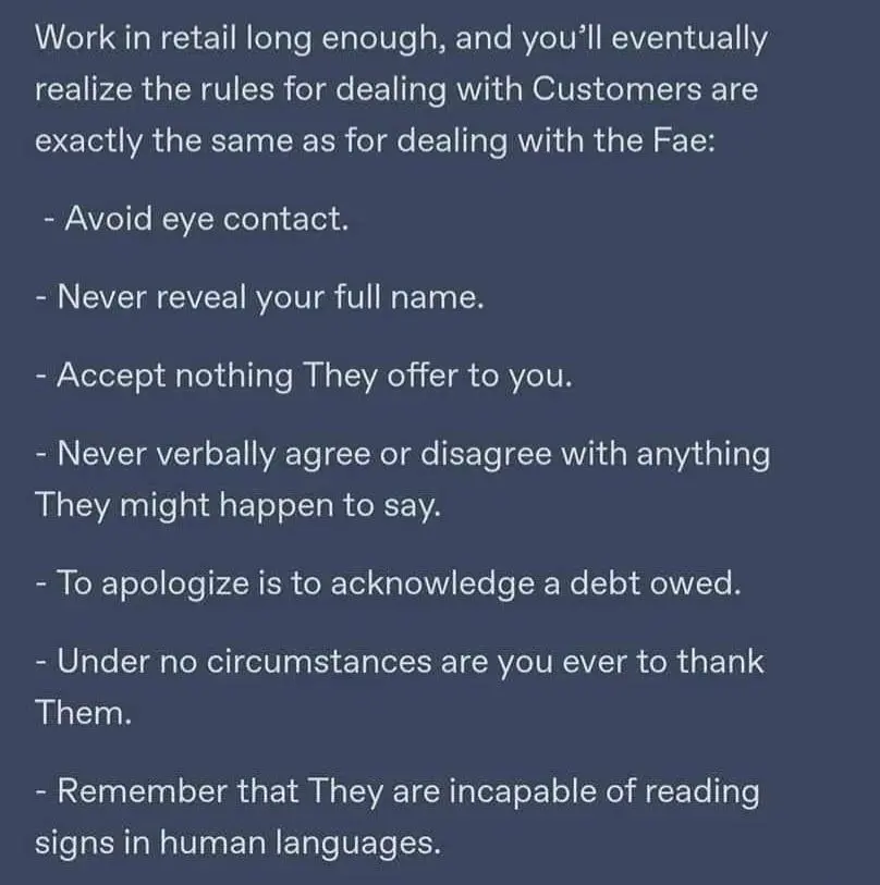
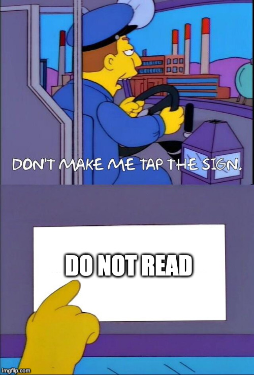
Signs and stuff I can kind of understand. Our world is chock full of things (ads) that try to get our attention at any point. At some point you develop an internal adblock and since 98% is irrelevant it is a reasonable drawback that the remaining 2% gets filtered out as well.
Perfectly fair point. But in business you’re supposed to read emails to know what you’re supposed to do. But no one does. (too many emails)
Menus have the descriptions of what you want to eat but no one reads them (too vain to wear glasses?)
Forget the creative writing work you’ve been doing. I mean. Y’know. That’s a given.
Sign, Sign, Everywhere a sign, Blocking out the scenery, Breaking my mind
But in business you’re supposed to read emails to know what you’re supposed to do.
So often I get a set of instructions that’s missing information, out of date, or deliberately misleading.
I’m often on the line with support walking through the steps and saying “How did you get from D to E?” and then finding out there’s a second secret set of instructions only tech support has - possibly even a different website or application - that they don’t want to tell you about unless you’re talking to an agent for some reason.
Menus have the descriptions of what you want to eat but no one reads them
Sometimes. Often they do not. They also regularly use shorthand or code.
My favorite is a series of red chili peppers next to a menu item. If I order the 1 pepper meal, am I going to be shitting blood for a weak? If I order the 5 pepper meal, are you going to White Guy Spicy it for the table because not everyone looks like they can handle it? It’s anyone’s guess. If I don’t explicitly see the words “peanut” or “shellfish”, am I confident it won’t have allergens?
Why even have a waiter if you’re not allowed to ask these questions, anyway? Just make everything a vending machine.
Ah yes.
Also: instead of googling for the opening times better waste everyone’s time by sending a text or an email to the shop and making them spell it out for you!
Also: if you see the shop is clearly closed, lights aren’t on and you can see the opening times on the door and they say it’s not open but someone is inside better start knocking because surely they wish to serve you.
Also: never read the instructions of a product. Instead complain that it’s broken and demand a new product. Repeat.
Also: if you see a price list/menu/price tag or similar and you accidentally read it, better double check the price by asking “does this item cost what it says here”
Also: “employees only” actually means “for adventurous customers”
Also: if it says push, pull, if it says pull, push.
sending a text or an email to the shop and making them spell it out for you!
That’s because the shops know that no-one reads the website and doesn’t bother to update the opening hours when they change.
This is the PTSD of working with customers talking.
Many of us recognize it well.
I always mix up push and pull. They sound too similar to me and the time it takes me to think what I’m supposed to do, I’m already applying force in the wrong direction (or I conclude that push means to apply force towards me, because I end up mixing them up).
Also: if it says push, pull, if it says pull, push.
If there is a handle I pull, if there is a plate I push.
I hate combo plate/handles
Also a big fan of
if you see a price list/menu/price tag or similar and you accidentally read it, better double check the price by asking “does this item cost what it says here”
Because it happens when management has three different prices and five confusing “discount” offers scattered in line of sight. Is this 50% off or does that happen at the register or does it no longer apply? And you’ve got the same thing on the menu as a side and a meal, which one am I ordering, again?
And
“employees only” actually means “for adventurous customers”
Oh, bathroom for employees only? At every location inside three city blocks? I guess I should just take a crap on the floor.

A significant fraction of America is illiterate. 21% or 1/5. Yeah.
It’s even worse than that:
21% of adults in the US are illiterate in 2024. 54% of adults have a literacy below a 6th-grade level (20% are below 5th-grade level).
So 1/5 can’t read at all, and over HALF can’t read better than an 11 year old.
How does that work out, are there 50% of 11 yo in the USA?
:-) Jk
Nooooooo! IT’s because the DeMoCrAts didn’t address the needs of the working pooooooor! nooooooooooo!
I mean, you think this is happening exclusively in red states?
DC is bright blue and they’ve got some of the worst schools in the country. And if you want to know why…
Michelle Rhee’s Reign of Error
Privatization, downsizing, teaching to the test… Twenty years of NCLB has taken its toll.
Even then, there is something of a silver lining

The advent of modern text communications has created significant social incentives for improving literacy at younger ages.
If reading is the only driver to voting preference, then yes.
Otherwise, no.
Anyone curious, I fact checked this and according to snopes it’s true. This is just sad.
I dont wanna say the average person is stupid but they make it really difficult to not think so.
Call it illiterate tunnel vision or whatever else youd like, but come one.
Heres some personal examples from work:- big neonsign at the door at eyeheight telling people when the store opens, 1 out of 6 people looks at it the rest doesnt even see it, one once was even mad and blew out the doorglass with a kick.
- registers, big neon signs to say "hey douchenozzle, next one this is closed) and even when another worker is waiting and lookin at the person, they still dont get until you loudly talk to them to come to the other one.
- god forbid someone needs something in another part of the store, unless you use children level semantics (go to blue line for example) they never find what they looking for.
those are just my personal examples but outside of that you see it seemingly everywhere.
big neonsign at the door at eyeheight telling people when the store opens, 1 out of 6 people looks at it the rest doesnt even see it, one once was even mad and blew out the doorglass with a kick.
This sounds like real-world banner blindness. Almost all neon signs are ads or usless bling-bling to catch your attention. It’s no wonder people don’t look at them anymore.
when i say neonsign, i meant the distinct color of the store as a border and than black on white text
banner or not, they still missing itWell, did you actually read at least the first paragraph of the Wikipedia article I linked?
they are still missing it
registers, big neon signs to say "hey douchenozzle, next one this is closed)
This is just bad design. Almost comically, your sign shouts, “Look at me, there’s nothing to see here”. You’re drawing attention away from where people should go. Of course this isn’t going to work.
Whoever thought advertising a closed register was a good idea needs to have their idea generator checked.
its not literally a neon sign, when i say neonsign i meant its a very distinct color (and clearly different form an ad) with a very visible font
but even if it wasnt there, it would not make any difference, the 1st register could be broken into thousand pieces and people would still try to use it
TL;DR?
/s
Explain it to me, but don’t use any words

|D30|D|_3 |\|07 |234|)
I should have mentioned no numbers either
[] |<
Is this loss?
:.|:;
Weird, I read anything my eyes set upon without even thinking about it. Why wouldn’t you, unless you’re illiterate?
In my previous job i had to do a lot of coordination via email. I learned very quickly you can only ask a single question per email because very very few people would ever answer more than that. God forbid there was some semi complex task that needs done.
Ha! I just gave that advice to someone on Lemmy a couple weeks ago. They were having problems getting people do respond to stuff at work and I had to explain how the average person can’t track more than one subject in a single communication chain.
There are some levels to “without thinking about it”. You miss some things. You just aren’t aware when you do. Your brain will get tired at some point in the day and will adjust its capacity/willingness to get into detail, unless you’re not human.
Work retail and you’ll see how little people read. There can be a sign in giant huge letters when walking in the door saying “Sale things aisle 7” and they’ll stop en employee right by the sign and ask where the sales things are
21% of American adults are illiterate.
I worked gate security at a baseball stadium. Right next to where I stood there were two huge signs reading “No Smoking” and “No Re-entry”. Guess what questions I got asked all day.

“you free tonight?”
I wish
When what’s written is in a language you can read, what’s up with that? Reading is free, so to speak, and it enables laziness by not having to find and ask people stuff
Reading is free, but my time sure isn’t.
It is really discouraging when I have to wade through ads just to find the portion I am looking to read. If I can’t find the information I need quickly, I just don’t bother with it and go somewhere else.
I’m not going to defend people that are too lazy to comprehend words on a sign.
What I will say, is that it took me entirely too long to look up when I was at the grocery store. One of my first jobs was at a grocery store and it took me far too long to notice the signs.
in my experience, its easy to not notice a sign altogether. too busy looking for some(one|thing) possibly
émail
Probably autocorrect on a french keyboard. It actually means “enamel”
andswer
What did I just read?
None of us know either.
If that’s your choice of fonts, I’m sure as hell not going to read it.
It looks like Helvetica to me. What’s wrong with that?


