any help is appreciated.
Samsung has it on OLED screens.
For OLED it takes very little power to dimmily illuminate a small area of the screen and the rest is the same as it’s off.
So you can do stuff like have a clock always display without having to drain your battery as much as always having the screen “on”.
But this is Apple, so who knows if they mean the standard definition or it’s like Musk’s “full self driving” that cant drive itself.
It’s the same thing. I used to have a Samsung with an always on display and loved it, so I was thrilled when iPhone finally got it after I switched over.
Same deal, OLED screen, you can use it for the clock, date, weather, whatever.
Apple always on = 100% screen brightness 100% of the time.
If you want Dimmed always on, as you described for OLED, that’s a $19.99/month subscription
An Apple expensive joke? What is this, 2011?
2011, whats that, the price of an iPhone? (sorry)
Just following Apple’s lead by repackaging old stuff as new and charging a premium
Always on, idle
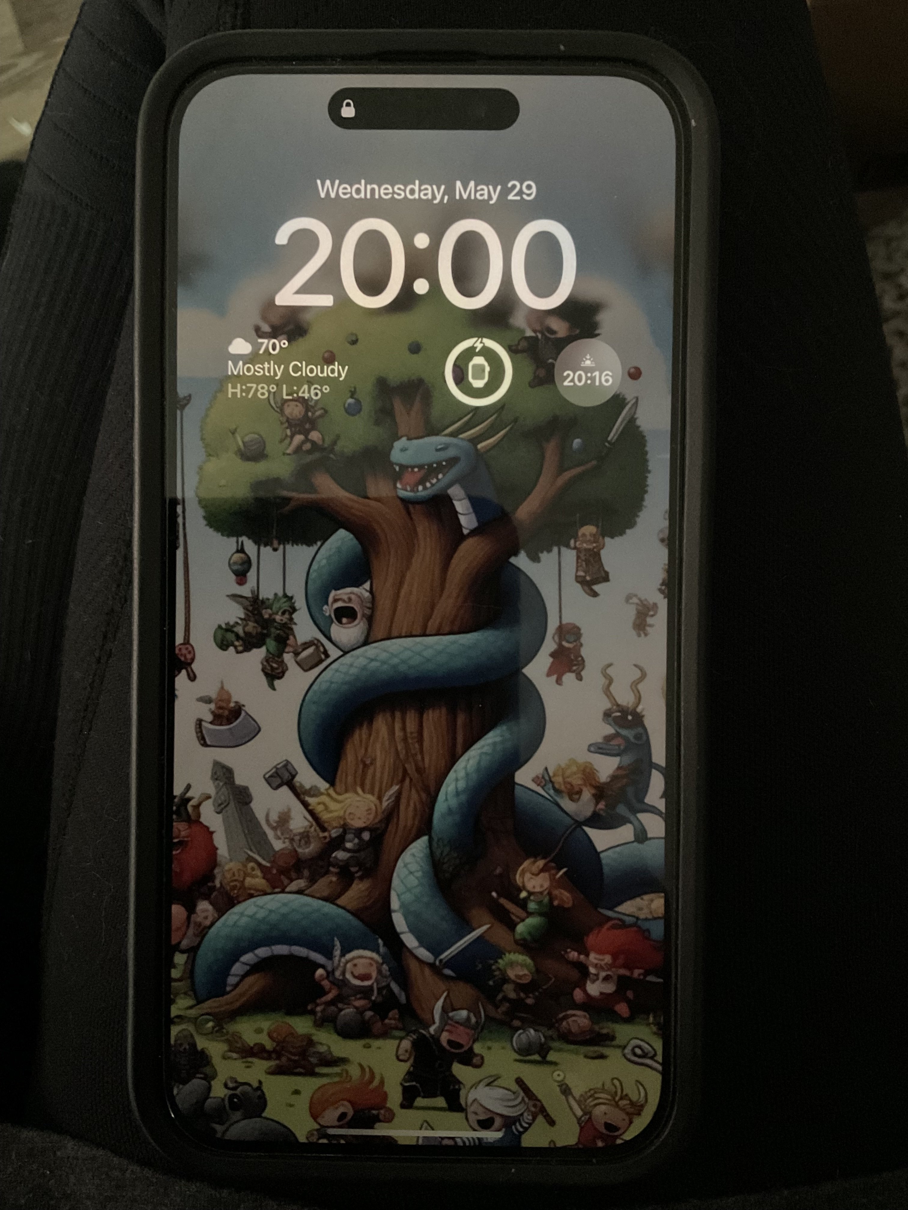
Always on, in use
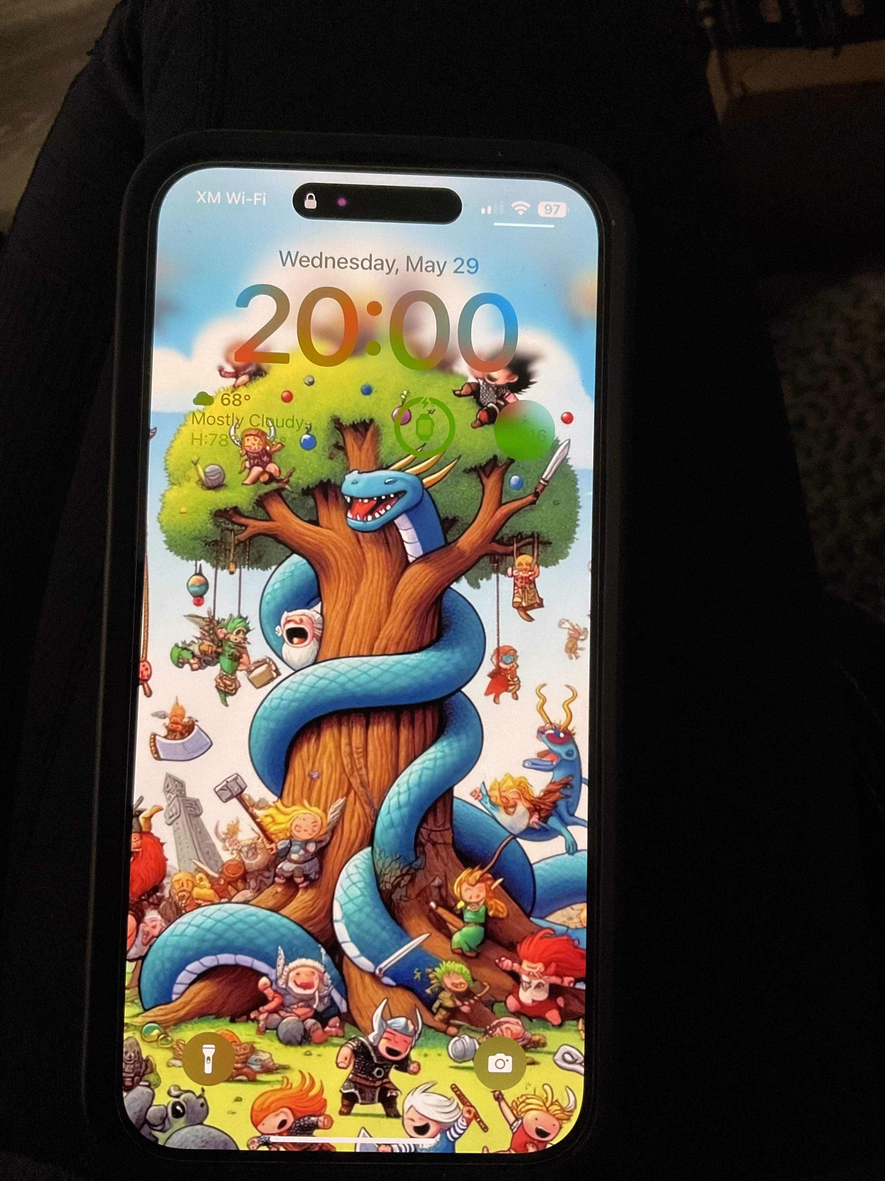
The display runs dimmed unless you’re actively using it. During certain Focus settings, like Bedtime, the display turns off completely unless you wake it intentionally.
Recommend that you go to Settings > Display & Brightness > Always On Display and uncheck “Show Wallpaper”
This will make it so the display is mostly black when not in use. Black pixels don’t use power on OLED screens, so it will help boost your battery life.
Or, leave the wallpaper if you’d rather.
And hide that glorious wallpaper? Pfffft
(Actually kind a jealous. I’m boring. My background is straight black. Mostly on account of icons and readability.) (okay, so I grew up in the 90’s wallpapers aren’t supposed to be fun.)
I grew up in the 90’s wallpapers aren’t supposed to be fun
I, and my child self fooling around in Windows 3.11 back in the day, beg to differ.
That wallpaper is freakin sick, dude
Ah, thanks. It’s absolutely not mine and I can’t give credit because I honestly can’t remember where I appropriated it from but it’s cartoon Ragnarok. It’s cropped down a bit on my phone otherwise it scales a bit weirdly but this is the whole thing.
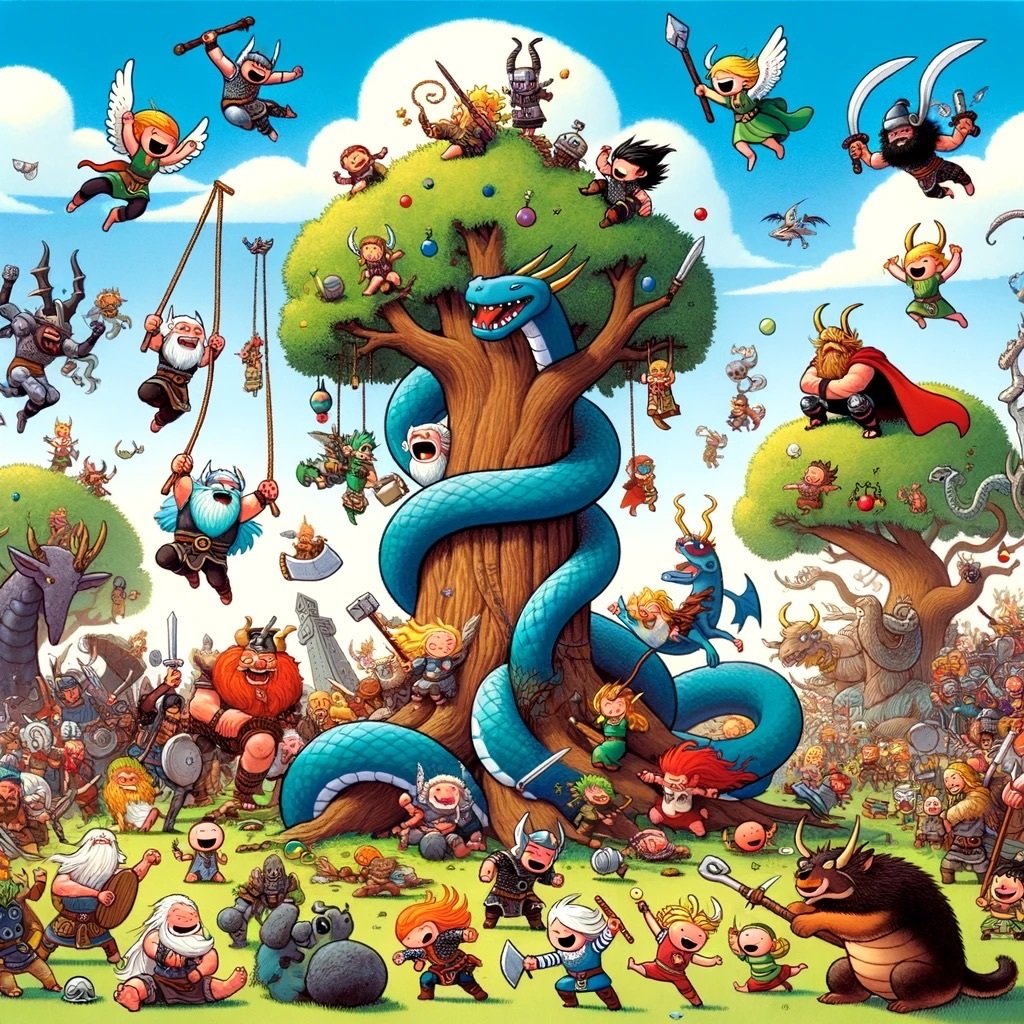
Did you zoom in? It’s AI crap that doesn’t make sense once you’re close.
That is very good AI art, if it’s AI art. Pretty sure it’s Norse mythology inspired- I think the snake is Jormungandr and the lil dude with the hammer is Thor. So it might be AI making the art weird or it might be the source material making the art weird lmao
They legit don’t have any faces or arms. That “Thor” has a weird, flesh coloured, Megaman buster-shaped appendage, no eyes and a gaping hole of a mouth.
It’s not obvious at a glance, but each of those “characters” are amorphous blobs. Seriously, zoom in even a little, it’s really strange to look at.
I appreciate the poster demonstrating always-on to OP, and I’d never criticize them for using this wallpaper, but the only way you can call this “very good AI art” is by glancing at a thumbnail and moving on.
I just assumed it was a weird minimalist style or a terrible quality photo making it look weird, honestly. I didn’t examine it closely.
Looking at it on desktop, wow the faces are awful.
follow up dumb question: can you turn the function off?
Sure can. Settings > Display & Brightness.
sweet. thank you.
For sure, glad I could help!
Curious if you have any thoughts on the benefits of the 15 pro vs the base 15 iPhone. If you think it’s with the extra money? Especially in respect to the camera.
I’m a “use what works for you” kind of person. I’ve been using the Pro Max iterations of the iPhone lately because mainly I like the camera. Having my phone with me out on a hike is better than hauling an extra piece of kit and I like having a bigger screen because I’m middle aged and I have to do the holding everything 2 feet away arm extension to read. Realistically, there’s nothing I would call a major difference among the models.
thank you for the link.
Perhaps “always-on display” is clearer? Keeps it from turning off when idle
The ol’ Battery Burner feature.
deleted by creator


