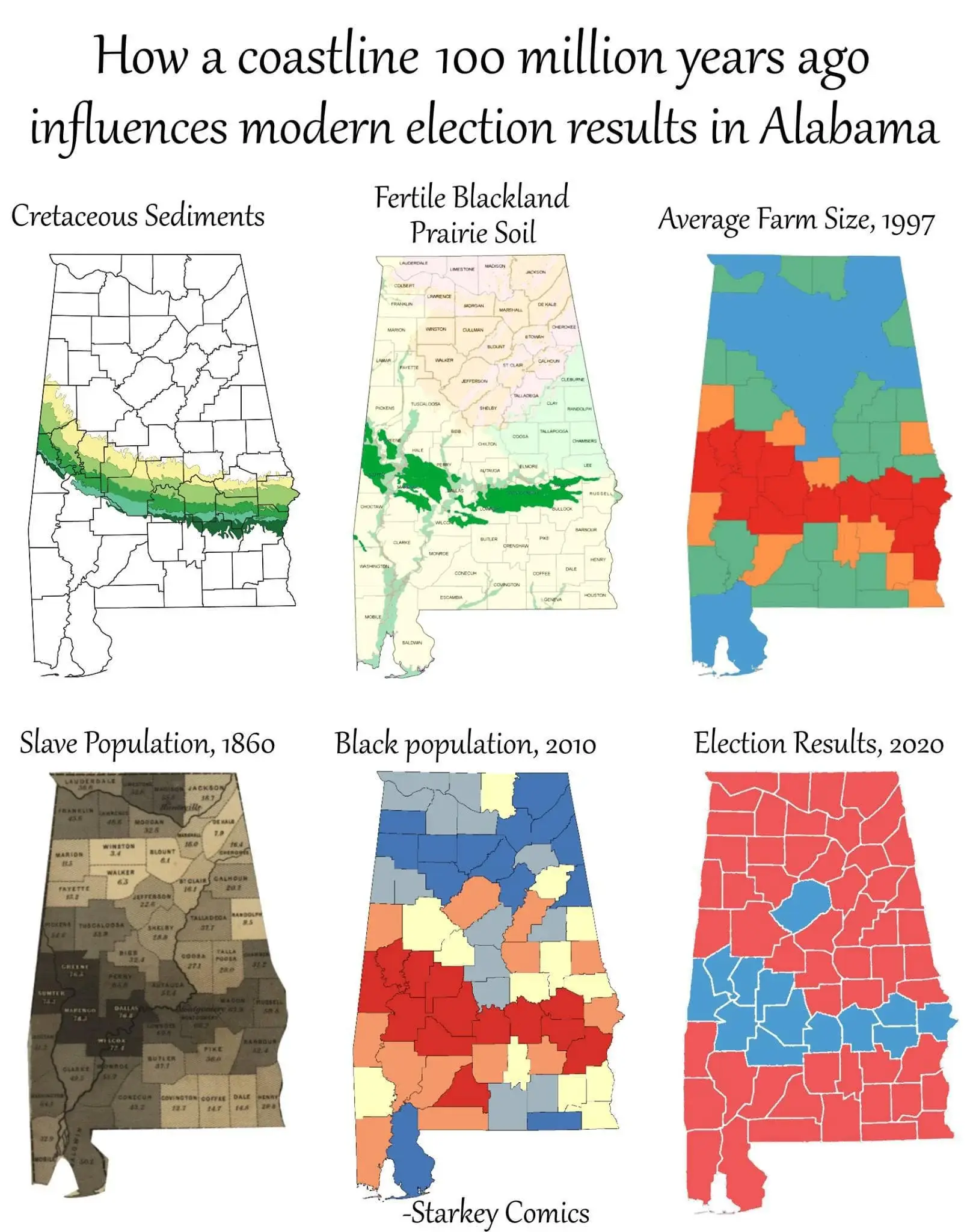
I don’t see a reason why average farm size for a county should correspond to a specific soil type. There are different kinds of farms and different fertile soils. It seems like a specious link between facts, if we even take such a statistic at face value.
Plus none of this was determined. Europeans chose to come here in the interest of increasing their wealth. They weren’t drawn here because it was the only fertile land in existence. To even get to farms in 1997 you have to go over centuries of human choice and struggle. And then you need human choice to go from having agriculture to having slaves. Then you need choice to go from slaves in 1860 to their children being unable and/or prevented from moving. And then even more choice to go from the demographics of an area to a parties.
People just see graphs/charts and go “This must be meaningful.” Infographics were a tragic mistake.
Yes, farms will be in areas that can sustain farms, that is a tautology, not an insight. That’s why the correlation breaks down. If farms = slavery = democratic majority, then all agricultural areas in the US would be democratic. They are not. It’s vulgar materialism. Someone is working backwards from the conclusion and being sloppy with the details.
We’re pattern seeking creatures. Someone created a pattern for us to follow. Because the pattern seems to follow in the correct order, we accept the pattern. But the correlations are ultimately specious. The data points are picked with purpose. The map at the end doesn’t make sense if you consider all the actual farmland in Alabama. But the author isn’t trying to be accurate, they’re trying to make a point about history. But their point isn’t proved by the thing they’re using to make it.
Yes, we are products of history and our environment. This infographic doesn’t really do a good job of saying that though. It’s just presents wrong information in a way that makes people draw a simplistic conclusion that can be construed as scientific history.
The point is that plantations lead to large farms, because in many cases the land holders kept the land and switched to sharecropping instead of slavery. I would be curious to see the data but I suspect that the smaller northern farms are newer and were perhaps not viable until fertilizers.
But they’re not newer than slavery, which is why the slavery map has density in the north. That matters to the ultimate point that fertile soil = large farms = slaves = high black population = democratic majority. Because in this case it’s fertile soil = not as large farms = slaves = low black population = republican majority.
How can the size of the farms be relevant if both large and not large farms result in different black populations and therefore party majorities? In this case the most relevant statistic to the party is race. The proximity to agriculture means nothing outside of ‘people live near agriculture and some of them may be democrats’


I don’t see a reason why average farm size for a county should correspond to a specific soil type. There are different kinds of farms and different fertile soils. It seems like a specious link between facts, if we even take such a statistic at face value.
Plus none of this was determined. Europeans chose to come here in the interest of increasing their wealth. They weren’t drawn here because it was the only fertile land in existence. To even get to farms in 1997 you have to go over centuries of human choice and struggle. And then you need human choice to go from having agriculture to having slaves. Then you need choice to go from slaves in 1860 to their children being unable and/or prevented from moving. And then even more choice to go from the demographics of an area to a parties.
People just see graphs/charts and go “This must be meaningful.” Infographics were a tragic mistake.
Yeah, correlation doesn’t imply cusation, but there is a correlation. Why might that be so?
Rich soil => plantations => large farms
seems plausible
There are more farms in the north though.
https://alabamamaps.ua.edu/contemporarymaps/alabama/agriculture/number_farms_07.jpg
Yes, farms will be in areas that can sustain farms, that is a tautology, not an insight. That’s why the correlation breaks down. If farms = slavery = democratic majority, then all agricultural areas in the US would be democratic. They are not. It’s vulgar materialism. Someone is working backwards from the conclusion and being sloppy with the details.
We’re pattern seeking creatures. Someone created a pattern for us to follow. Because the pattern seems to follow in the correct order, we accept the pattern. But the correlations are ultimately specious. The data points are picked with purpose. The map at the end doesn’t make sense if you consider all the actual farmland in Alabama. But the author isn’t trying to be accurate, they’re trying to make a point about history. But their point isn’t proved by the thing they’re using to make it.
Yes, we are products of history and our environment. This infographic doesn’t really do a good job of saying that though. It’s just presents wrong information in a way that makes people draw a simplistic conclusion that can be construed as scientific history.
The point is that plantations lead to large farms, because in many cases the land holders kept the land and switched to sharecropping instead of slavery. I would be curious to see the data but I suspect that the smaller northern farms are newer and were perhaps not viable until fertilizers.
But they’re not newer than slavery, which is why the slavery map has density in the north. That matters to the ultimate point that fertile soil = large farms = slaves = high black population = democratic majority. Because in this case it’s fertile soil = not as large farms = slaves = low black population = republican majority.
How can the size of the farms be relevant if both large and not large farms result in different black populations and therefore party majorities? In this case the most relevant statistic to the party is race. The proximity to agriculture means nothing outside of ‘people live near agriculture and some of them may be democrats’