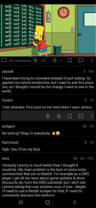
I have been playing around with the Jerboa UI to make it a bit more usable for my style.
Since I would call some of these UI adjustments significant to the original design and I have used a couple different libraries I don’t think I should create a pull request for them but I might need to see.
- Changed the theme to an
amoled darkstyle. - Fixed the weird font scalings for comments.
The comment (markdown) text fields were set to scale to x1.3. I am sure this was probably to fix something somewhere but it made the comments way to big for me and restoring it caused no ill effects from what I can tell on my phone. - Fixed the
flash bangtransitions. Optimized for the dark theme. - Activity transitions changed for proof of concept but work pretty well so far for my style.
- Comment cards made significantly more compact.
- Comment toolbar (voting options) are now hidden as they take too much space for my liking. Clicking the comment shows/hides the toolbar.
- Collapsing comment chains now collapses smaller with a better indication of being collapsed.
I am sure there are other items I adjusted as well and there is always more to do, although I figured I would put this out there and see what the feedback is like.


Ah i see. It’s significantly smaller (maybe 45% the size)
I am less worried about the image size then the really large comment text though, but I will see if there is a workaround I can help out with.
What a pain this has been
From left to right: Android image before, android image after (full scale), Render in the web.
I mean realistically there should probably be a thumbnail and then an expanded view on click.
Or better yet completely hidden and images disabled. Whats stopping someone adding horrific images as a commenter and forcing everyone in the thread to view it?
I agree with you for this exact reason. Lemmy has had its share of trolls in the the past who have abused this feature by posting scat porn in random threads. It makes browsing Lemmy in public scary.
Plus, it makes it easier for people to just spam emotes or GIFs that ultimately lessen the quality of discussions. I’ve seen many Reddit threads that are just:
Looks like larger images scales to the width of the comment block to the above image looks good on the app