
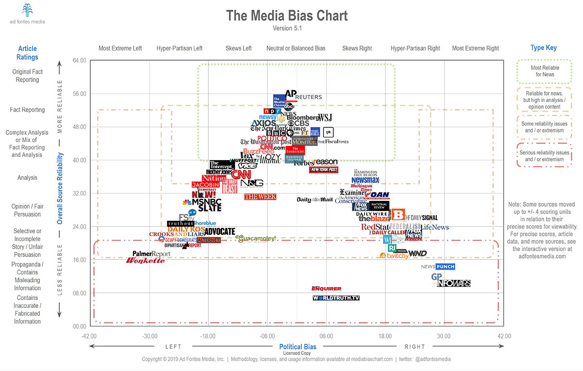
This Interactive Media Bias Chart® is a data visualization that displays measures, generated by analysts and staff of Ad Fontes Media, of news (and “news-like”) articles and sources. It reflects our most up-to-date ratings of all our rated articles and shows over time.
Yeah this chart is pretty garbage. I really don’t want news from.seemingly 'unbiased" sources which are apologists for reactionaries and conservative.
Apparently in response to this Alex Jones.published this chart lmao