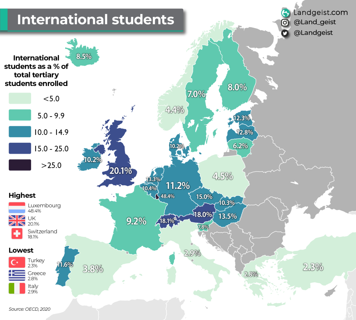
That’s only 1/2 the stat though…
What countries are the international students coming FROM?
How do they even define “international students”? Surely it’s not people with an Erasmus or a semester abroad, the numbers are too high for that.
Is it simply student with a foreign nationality?
Probably what it is. Someone on a student Visa or some such.
Following from that - suppose we had that to/from flow data, how could we plot it in an elegant way ? And could imagine more dimensions - for example relative weight of factors influencing choice of where to study?
You’d want a 2nd chart I’d think with the #1 “from” country for each European country.
#1 would bias towards bigger countries. Migration flows are often shown as a circle plot - but not so easy to read as a map, and lose spatial relations.