kernelPanic to Data Is Beautiful · 1 year agoInternational students in Europelandgeist.comexternal-linkmessage-square6fedilinkarrow-up179arrow-down12
arrow-up177arrow-down1external-linkInternational students in Europelandgeist.comkernelPanic to Data Is Beautiful · 1 year agomessage-square6fedilink
minus-squareJordan Lund@lemmy.onelinkfedilinkEnglisharrow-up1·1 year agoYou’d want a 2nd chart I’d think with the #1 “from” country for each European country.
minus-squareBen Matthews@sopuli.xyzlinkfedilinkarrow-up2·1 year ago#1 would bias towards bigger countries. Migration flows are often shown as a circle plot - but not so easy to read as a map, and lose spatial relations.

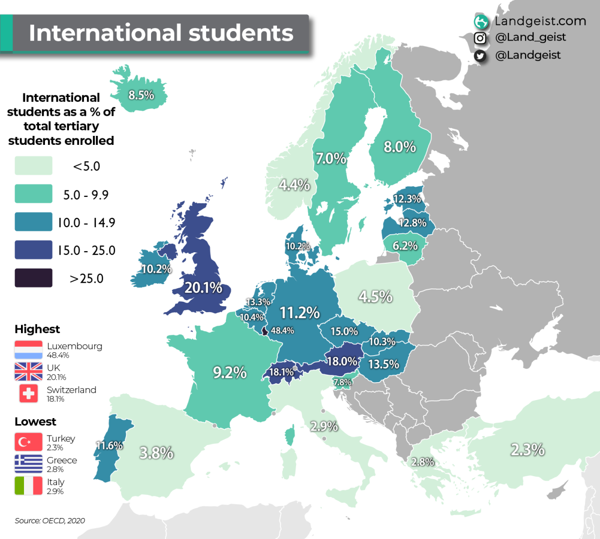
You’d want a 2nd chart I’d think with the #1 “from” country for each European country.
#1 would bias towards bigger countries. Migration flows are often shown as a circle plot - but not so easy to read as a map, and lose spatial relations.