

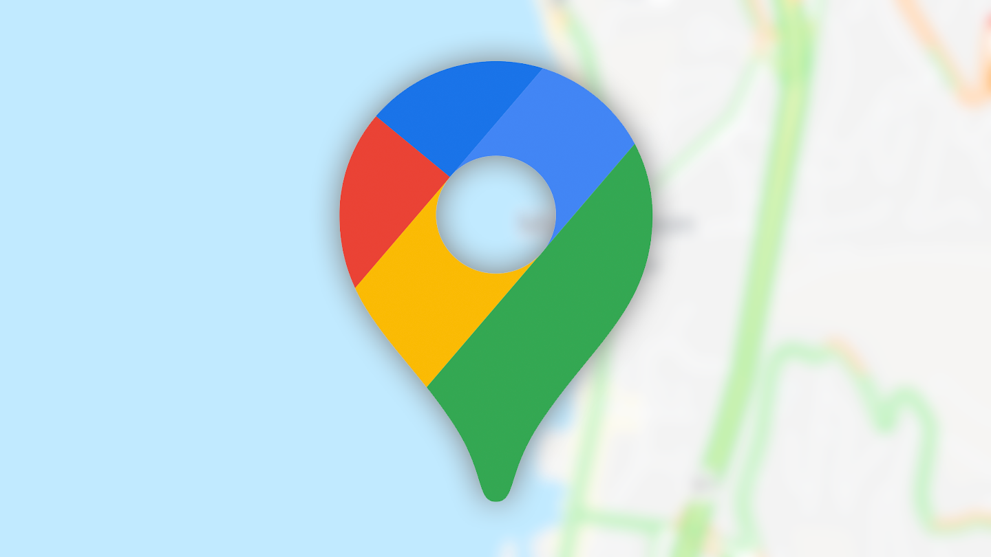
It looks pretty weird. The colors were a signture Google Maps feature.
Yeah, I agree. They’ve made slight shifts over the years, but I feel like this looks enough like a different maps app.
I also feel lots of pieces of it include bits of the apple design that make their maps harder to read.
Google doesn’t need to change their color pallete, they just need to stop tossing 400 advertising pins everywhere you look.
I felt that Google Maps has been getting ever harder to read. The palette had moved towards a grey-on-grey scheme with very little contrast. This new scheme looks less distinctive… But I think that’s a good thing given how hard it was too read the old one sometimes
It’s weird that they’d want to copy from Apple in particular considering how bad that maps app is. Odd choice, even with the usual “can’t think larger thatn US” attitude Google management suffers from.
Except that Apple Maps are much easier to read.
They look like OSM now.
Can someone put an archive link? It tells me to disable my adblocker, but I don’t use an adblocker, I just set Firefox to disable tracking cookies
There is nothing huge. Google adjust colours of some objects on the map a bit.
I told it I turned off my ad blocker (though it was still enabled) and it let me proceed
The yellow highways turning blue makes them harder to see :(
I wondered why there was a sudden change in my map. I opened the settings but couldn’t find anything different.
That’s most probably a good thing. I don’t really see how a new colour scheme could be more atrocious than the current one.
I was wondering how I could have missed this but then I realized I always have traffic view enabled so roads are either green, yellow, or red. Ends up looking basically the same as before.
I use dark mode so nothing changed lol
Not opposed to some extra options, although it’s a little hard to distinguish between the green and the water in some of them