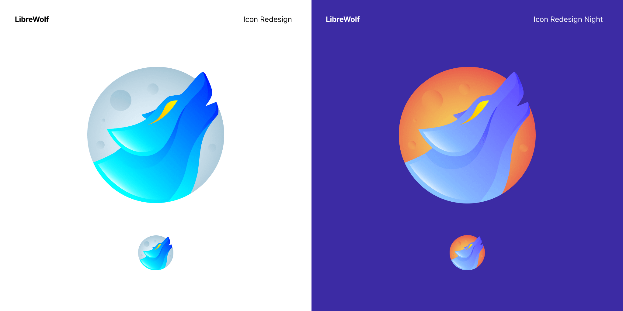
I like the moon in the background and I like that it is stylistically similar to the Firefox icon. My only complaint is the eye, not really a fan of the swoosh effect on the eye.
Agreed. I don’t like the eye either, makes it look too edgy for my tastes. Other than that it’s pretty neat.
Are there currently plans to bring librewolf to android?
That’s basically what Mull is.
And Mull is awesome.
The refresh rate doesn’t bother you? If I could crank that up I’d love Mull.
Oh cool I didn’t know about mull thanks
Yes Please !😃
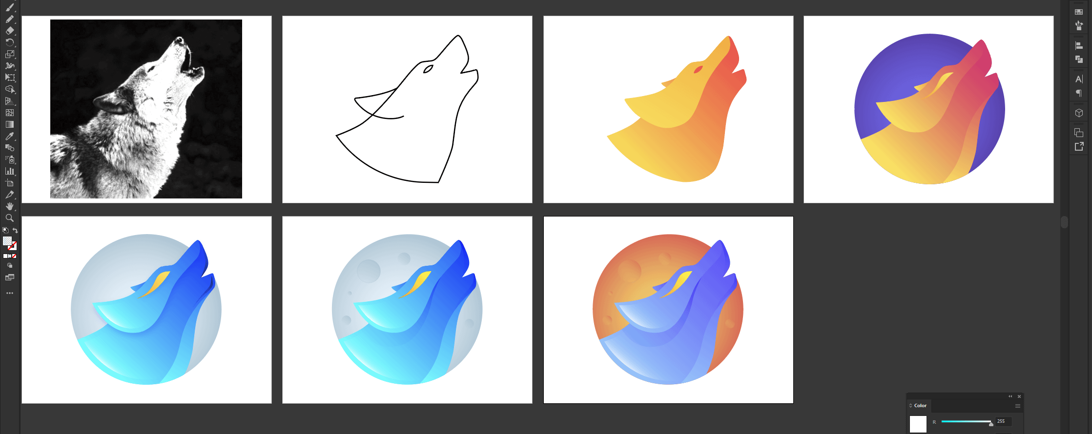
We can agree the actual LibreWolf icon is kinda basic,this looks really good and i wanted you guys to see it too! the download link is: https://drive.google.com/file/d/1z3IlSucvao6D7QDWTN5sCBRNR-6ub9s5/view?usp=sharing
Someones should upload it to the GitLab(i dont have account) so devs can see it
Personally I would make the moon blue and the wolf white, that way it still kinda looks like the original icon while being more modern.
Looks great!
I would be more interested into a theme design for librewolf i’ve only found one so far.
For the icon I personally like the minimalistic clean design of the LibreWolf icon which speaks for the clean & optimized browser you get when you install it.
Love the icon design
Most look very similar to the logo of kde amarok. Well, all wolf’s heads in a circle, looking to the right, will.
@Lyxea I love it!
it looks too edgy


