

- cross-posted to:
- movies@lemmy.world
- comicbooks@lemmy.world
- cross-posted to:
- movies@lemmy.world
- comicbooks@lemmy.world
You must log in or register to comment.
Click for video.
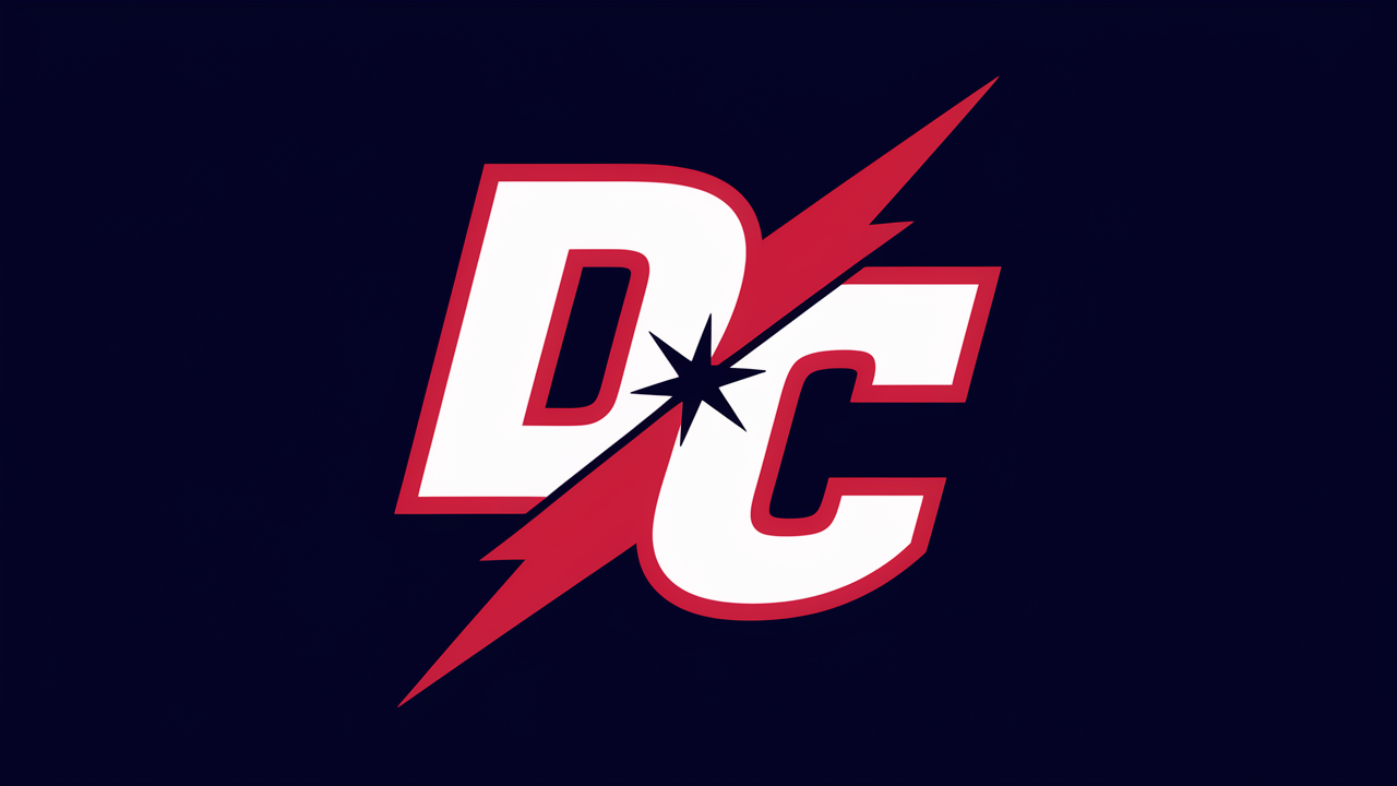
Can’t find a comparison with whatever the old logo looked like but apparently they hopped on the nostalgia train (just using an old logo) much like Pepsi did recently if I remember correctly. It’s a safe and boring bet, I guess and follows that trend of a lot of big movies being remakes and continuations of already polular ones.
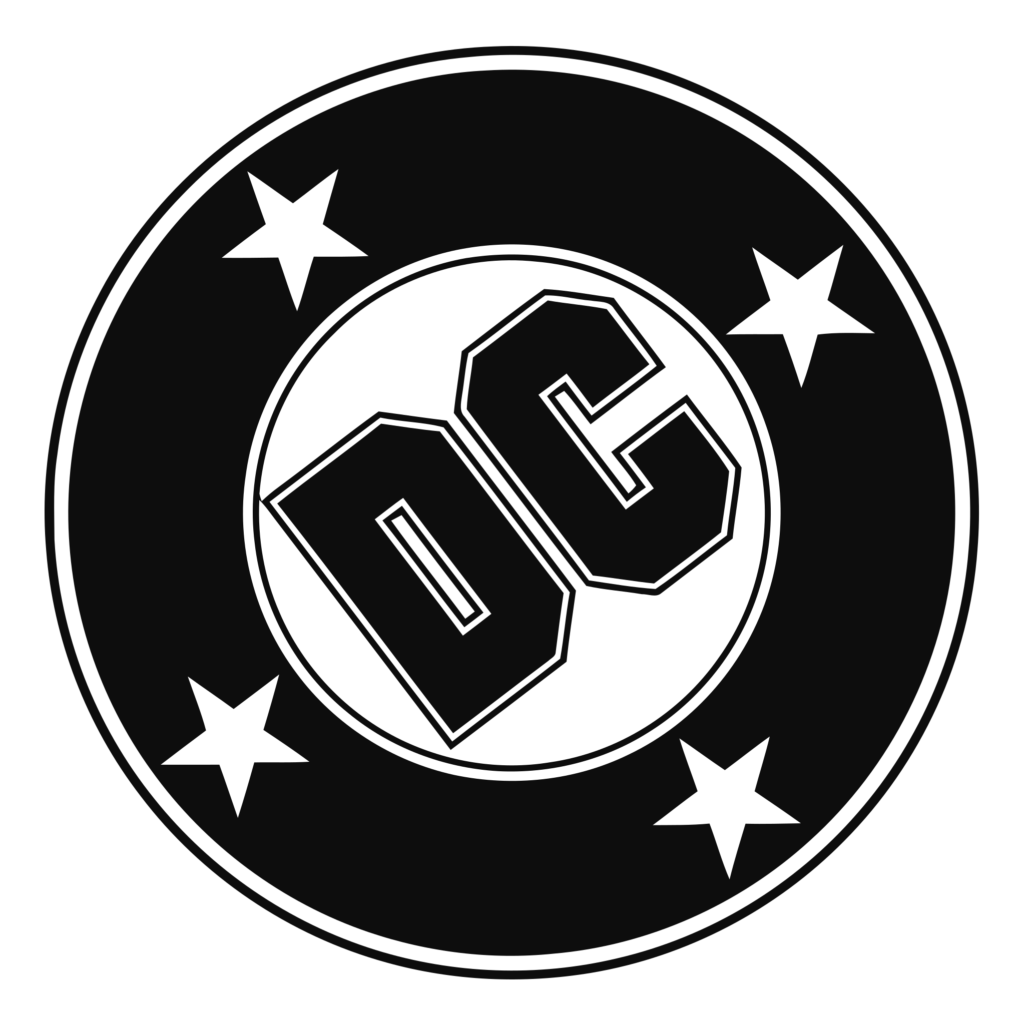
This was the logo they used from 1977-2005:
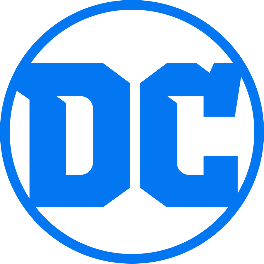
And this is the current logo they’ve been using since 2016:
Ah, so that was it? I really don’t like either of them, I especially dislike that the “new” one is tilted so much. I would either tilt ot 45° (so the stars are like a compass) or just 10 or 15 but this looks really off, like it’s somehow printed wrong.
