- cross-posted to:
- movies@lemmy.world
- technology@lemmy.world
- cross-posted to:
- movies@lemmy.world
- technology@lemmy.world
deleted by creator
This is the best summary I could come up with:
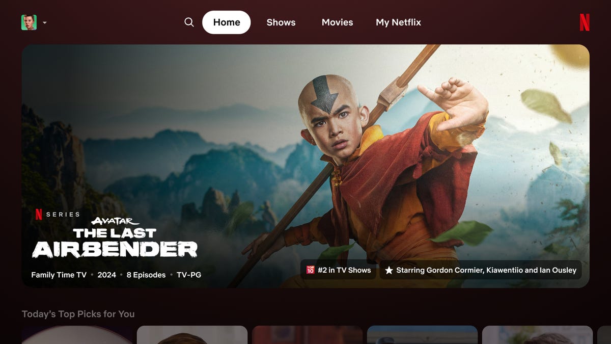
Hang on each tile for a beat, and it will start playing a clip from the show or movie while offering users a text description along with more info, like the total runtime.
Netflix’s senior director of product experience, Pat Flemming, told Gizmodo the streamer wants to make navigating around the app far easier and cleaner.
He said that in Netflix’s product research, they found users were doing “gymnastics with their eyes,” where they had to look all around their screen for each show or movie’s description, trailer, ratings, and so on.
The “New and Hot” tab will still appear in the mobile app, but Netflix hopes the new version will simplify things enough that it can cater to folks who have no idea what they’re about to watch each night.
Will Netflix eventually add more tabs like “Sports” and “Games” to the top bar to go along with “Shows” and “Movies?” That’s “TBD,” Flemming said, though he said, “you’re thinking about it in a very intuitive way.”
The new app version is being tested by a select few subscribers who will offer feedback before Netflix thinks about pushing the update more broadly.
The original article contains 666 words, the summary contains 193 words. Saved 71%. I’m a bot and I’m open source!
Lol. It’s the AppleTV app design.


