Why in the name of Deity do those shirt designers always insist on illegible novelty fonts that look like garbage? Just put Helvetica or Futura or, heck, OCR-B on there, make sure the kerning is correct, and be done.
My theory is that designers are extremely afraid that someone might notice that many areas have had enough design already and don’t really need a redesign every couple of years.
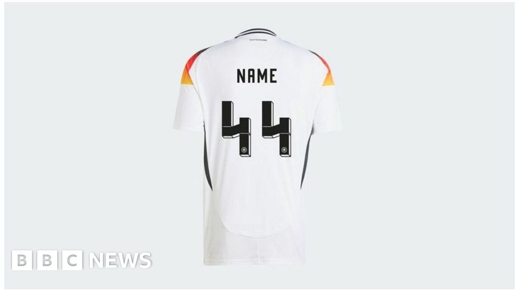
This. Most redesign is for re-selling, often with no improvement
I’d prefer Comic Sans