- cross-posted to:
- worldnews
- cross-posted to:
- worldnews
You must log in or register to comment.
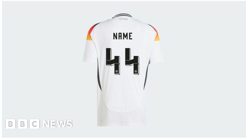
That font’s 4 looks super weird though. From the thumbnail I immediately saw the SS bolts without even reading the title.
Same, I thought it was an April Fools’ joke at first.
Vendor doesn’t sell item anymore
The BBC: BANNED
Why in the name of Deity do those shirt designers always insist on illegible novelty fonts that look like garbage? Just put Helvetica or Futura or, heck, OCR-B on there, make sure the kerning is correct, and be done.
My theory is that designers are extremely afraid that someone might notice that many areas have had enough design already and don’t really need a redesign every couple of years.
This. Most redesign is for re-selling, often with no improvement
I’d prefer Comic Sans
Should also ban 88
I vote that we only use binary to be safe.
In binary the eight letter of the alphabet is still the eight letter of the alphabet.
deleted by creator
Wasn’t that designed like that intentionally? Was there any word on this from the typography designer?..
Poor Lewis Hamilton fans. Or is this for football only?
Just this specific design of football shirt, because the font Adidas used makes this look like the SS symbol.
Of course football kits don’t usually go up to 44, because there aren’t that many on a team even accounting for reserves.
This only exists if you buy a custom shirt with a custom 1-99 number on it and a custom name at the top. I can see how it didn’t get spotted sooner.
The pink is only the away colour? What a shame