I prefer the old list view design with lines separating each post. Maybe an option to change font weight would be nice.
Oh man, I don’t have the alpha, but getting rid of that one would make me consider switching away.
Yeah the posts/comments tabs have smaller fonts which is hard on my eyes, but the rest of the changes look good.
The small font for tabs is a bug, and not intentional design.
Thanks, glad you all are on top of the app!
Now to find something like rtv in the terminal for lemmy…
We’ll fix those eventually as part af a larger rework of font sizing. Sounds easy, but android does not make it easy for you to use a base custom font size.
I hear you. I’ve done a few android apps. No worries, it’s just a bit uncomfortable ATM. Android is such a different platform haha.
Can we stop tryna reinvent the wheel and just use a normal upvote/downvote system?
When the next Lemmy version is released, it’ll have much more fine-grained vote display settings. See here.
Can you expand? The comment/post scores UI changes? Dessalines changed the default for that, it a setting with lots of options, but persistence isn’t implemented yet so it isn’t exposed.
On my app it’s now a percentage instead of just numbered arrows.
Like if I had 10 upvotes and one downvote it’ll show the total score with a 90% next to it
Great work comrade
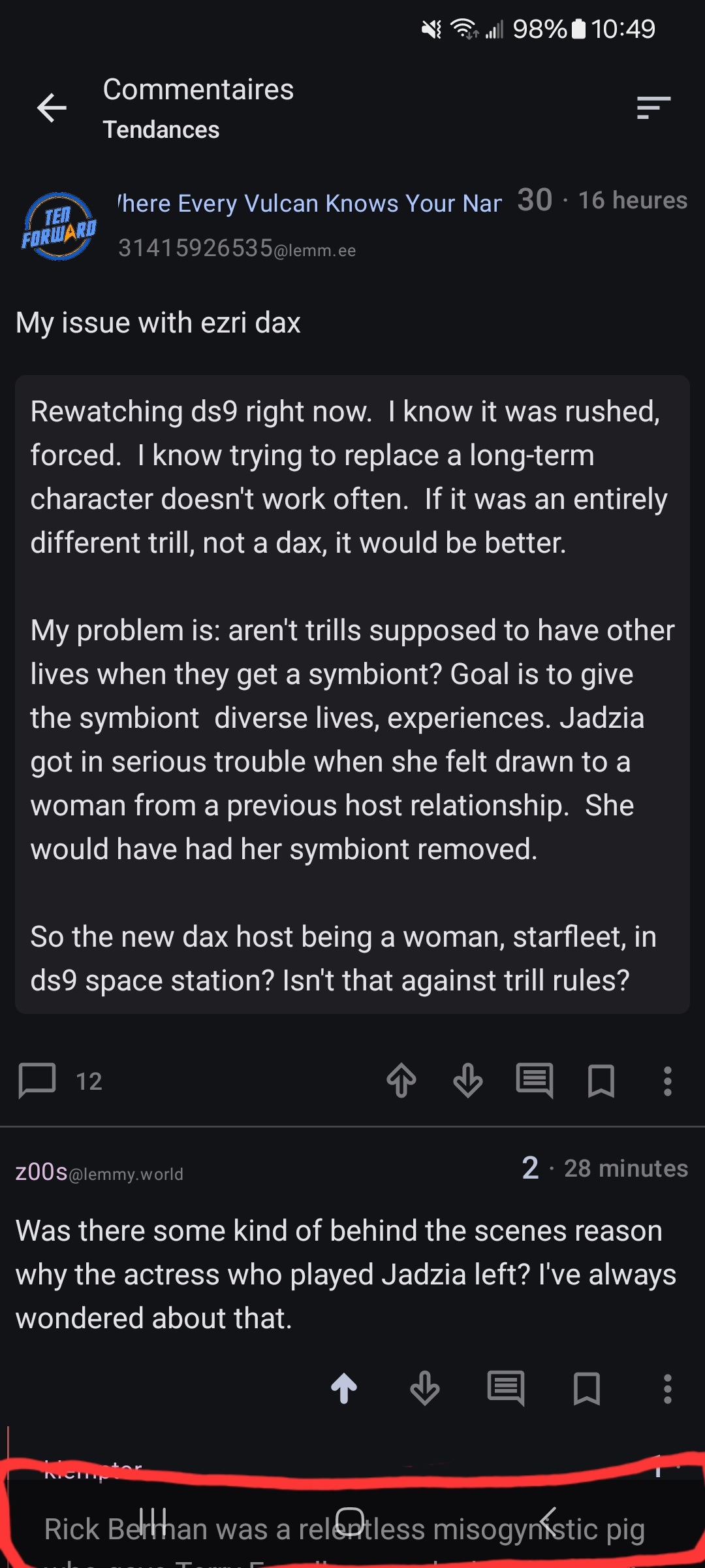
I like it, thank you! Can we suppress the overlay seen below?:

It doesn’t show when scrolling posts, just when viewing comment sections.
That’s not intended, what android version do you experience this?
It’s Android 14; OneUI 6.0
Yeah I manage to reproduce it, I’ll fix it by next release.
Thank you :)
Should be good now with this new release, thanks to MV-GH.
Cool, thanks!
Anyone else having issues with strikethrough formatting? It still shows the tildes and the word gets smaller and lower.
Like
thisYes it’s a problem, mainly due to us not finding good sample plugins for our android markdown library, markwon, in the same way there are great plugins for the js equivalent, markdown-it.


