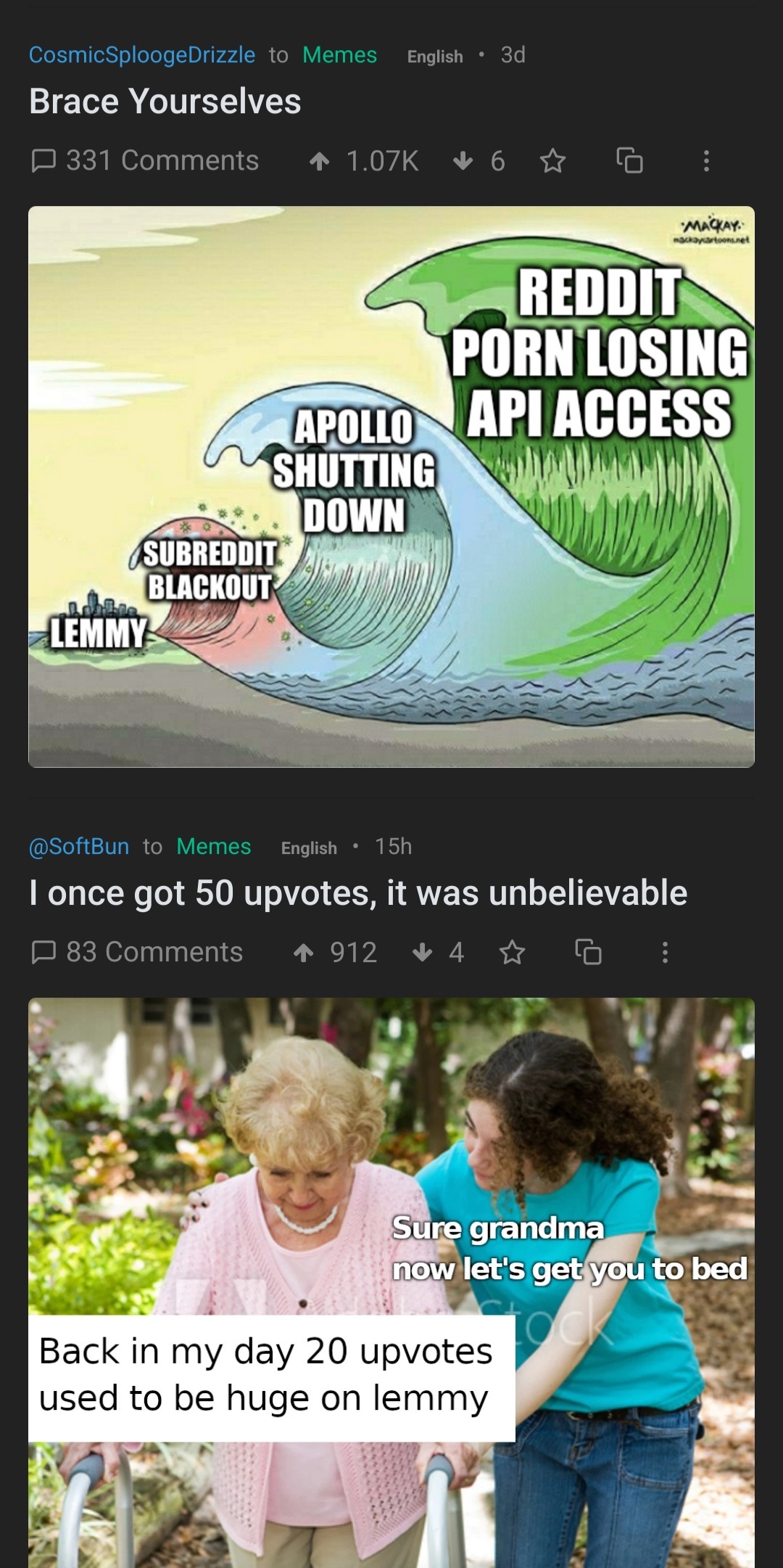
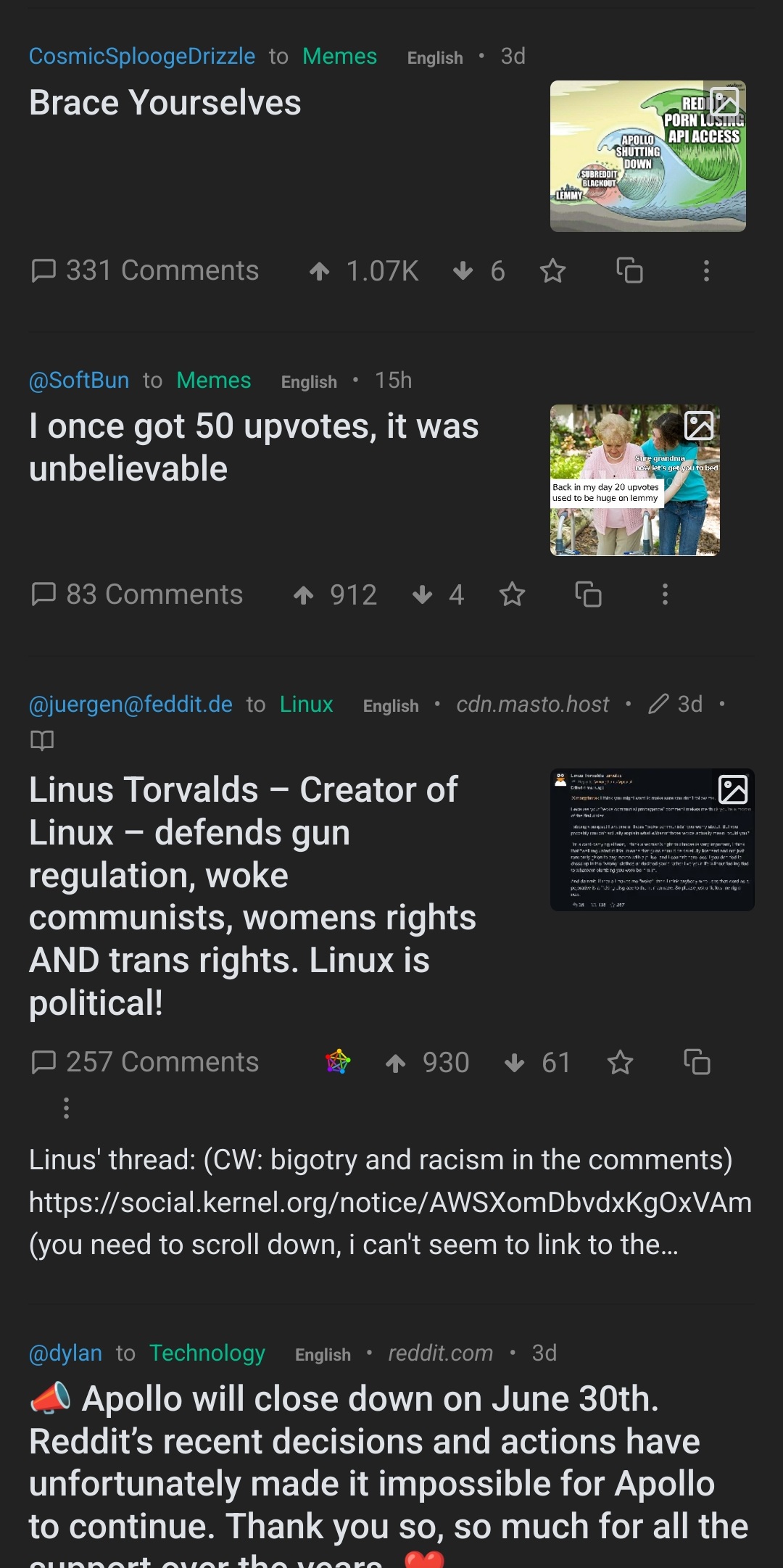
Hello, new to Lemmy. I’m using a mobile browser, and currently when I want to expand images in my feed, I manually click the icon on the top right of each post. Is there a setting that I can configure so that it will
look like this by default,

rather than this?

Given that the fediverse is very likely to have an enormous influx of users straining the infrastructure, automatically expanding images beyond the thumbnail would compound all the instances, so I don’t think that I would recommend making that available yet, or at least until some more maturity has been developed into the platform and architecture. I love the idea, and I also find it annoying to have to manually open each of them, but maybe a bit of a slowdown on the doomscrolling is a good thing.
I see. Yeah I kinda get what you mean. Thanks for the reply.
> but maybe a bit of a slowdown on the doomscrolling is a good thing.
Lol
deleted by creator
Could you give more info on how to do that? Or maybe point me to somewhere I can find more info on it?
deleted by creator
Looks like I’d have to find the element ID of each image and pass it to the function. Even then it seems like it’s only applicable for desktop browsers.
Either way, thanks.
deleted by creator
I think Jerboa just stretches the thumbnail into a card-type view. So that likely doesn’t impose any extra load on the serving instance. Sadly, it doesn’t animate GIFs, though, even once you click into a post.
Will give it a try


