
I have been playing around with the Jerboa UI to make it a bit more usable for my style.
Since I would call some of these UI adjustments significant to the original design and I have used a couple different libraries I don’t think I should create a pull request for them but I might need to see.
- Changed the theme to an
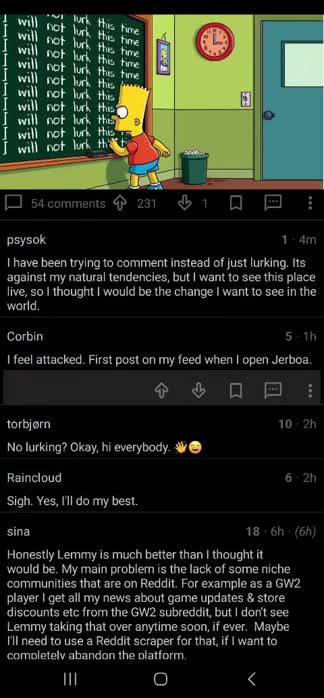
amoled darkstyle. - Fixed the weird font scalings for comments.
The comment (markdown) text fields were set to scale to x1.3. I am sure this was probably to fix something somewhere but it made the comments way to big for me and restoring it caused no ill effects from what I can tell on my phone. - Fixed the
flash bangtransitions. Optimized for the dark theme. - Activity transitions changed for proof of concept but work pretty well so far for my style.
- Comment cards made significantly more compact.
- Comment toolbar (voting options) are now hidden as they take too much space for my liking. Clicking the comment shows/hides the toolbar.
- Collapsing comment chains now collapses smaller with a better indication of being collapsed.
I am sure there are other items I adjusted as well and there is always more to do, although I figured I would put this out there and see what the feedback is like.
Looks great!
Make sure you open up some PRs for these if you haven’t already.