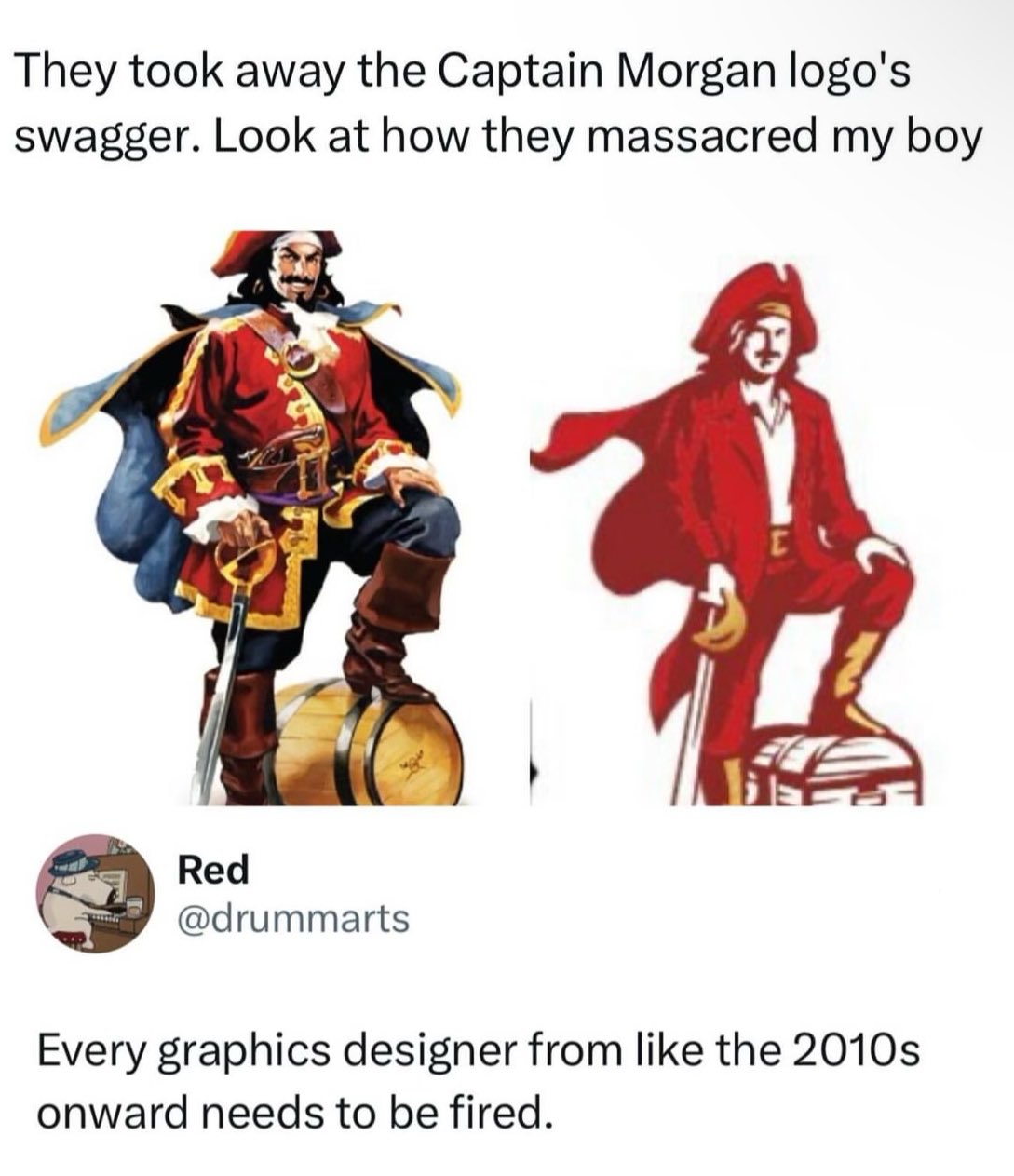
I kinda agree with it from an ease of printing perspective and easy perception from a distance, but they completely changed the proportions and got rid of the contrasting dark blue/red color-scheme that would catch people’s eyes. Looking at them side by side I’m still not convinced they’re even the same company, and that’s a failure for brand recognition in my mind which is the only reason logos even exist.


I kinda agree with it from an ease of printing perspective and easy perception from a distance, but they completely changed the proportions and got rid of the contrasting dark blue/red color-scheme that would catch people’s eyes. Looking at them side by side I’m still not convinced they’re even the same company, and that’s a failure for brand recognition in my mind which is the only reason logos even exist.