And don’t get me started on modern conveniences.
Watching through TOS now - it’s still so much fun! The characters, philosophical stuff, and dialogue are what makes Star Trek great, not the effects.
The random zoomed in solo shots of kirk in too much make up with clearly different lighting than the wider context shot…gd I love TOS
Back when everybody had to get their close-ups, lol. I think it was partly because TVs were small back then, and they wanted to show off clear shots of the stars.
My favorite is how every woman they meet gets the same shot, but with that “Vaseline smeared on the lens” effect.
Devil In The Dark is still a top Trek episode for me, and I actually like the space battle in Balance Of Terror much more than the finale battle in Wrath Of Khan.
I was blown away by how good Balance of Terror was on my current rewatch. The tension, the strategizing - this is the kind of action that I find exciting.
All of the “submarine combat but in space” tricks were so good. It’s one of my favorite depictions of space combat in any TV show. Visual media rarely replies on tricky cat & mouse space fighting.
deleted by creator
RIP Robert :(
It actually looks crisp on Netflix.
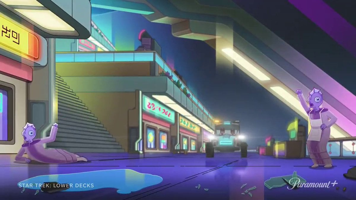
OK check out the aliens in Manhunt (S2E19) and then tell me he’s wrong
The fish guys? I love those things.
Antedians

Yeah, he is right. Season 1 is 36 years old and they didnt have a lot of faith that the original series wasnt a fluke, it does look stupid and cheap.
But if you’re going to let that put you off, you’re missing out. Its amazing despite the fact it isnt super polished, not because of it.
It’s not the show that’s the problem. It’s your nephew.
Okay, related note, I’m going to be hanging out with my 13 year old nephew this weekend. He has never seen any Star Trek. What episode for any series would you suggest to start him out on?
Trying to think of something that will grab his attention and pull him in. All my favorite episodes are ones like Measure of a Man, but I think something with some action would get his attention better.
Fist Full of Data’s, then an early Q episode to transition from silly to serious
Yesterday’s enterprise was the one that got me into TNG as a wee lad. It has action, character, and raises deeper questions with a good scifi premise.
Just pick one of the original series
Honestly maybe an ENT episode. They are modern enough not to look “old” to a kid and then you can transition to other stuff when he’s on board.
Maybe episode 7, “The Andorian Incident”. It’s got Jeffery Combs and a decent amount of action.
Just pre-screen ENT episodes to make sure there isn’t too much decon room screen time.
Are thirteen year old boys not the target audience for the decon room scenes?
Sure but no teen likes sitting through a racy scene while watching with adults.
Just throw the whole nephew away
Imma be real, I find a lot of TNG ugly. The interior of the Enterprise-D looks like it was designed by the same people who design chain hotels. The lighting everywhere is blaring. The bridge has a weird layout. The uniforms are ugly. It’s a great show, but I don’t enjoy the aesthetics. It’s not about the ability to make modern effects, but the aesthetic choices.
Voyager to me defines a better look. The interiors of the ship have more blues, metallics, and cool grey tones. The lighting is more subdued without being grimdark. The Voyager or DS9 era uniforms both look much better.
DS9 was intentionally ugly, and I don’t mind. The station isn’t supposed to represent Federation aesthetics, and it goes with it. Even so, the dimmer lighting makes it less overwhelming.
TOS people now might say is ugly but I give it quite a pass due to the age. The uniforms don’t look great on close inspection, but I still like them more than the TNG ones. The smaller bridge feels cramped compared to TNG, but it again makes sense for the setting.
It is. Honestly its the worst series I’ve watched


