

At least they weren’t claiming to be the design experts.
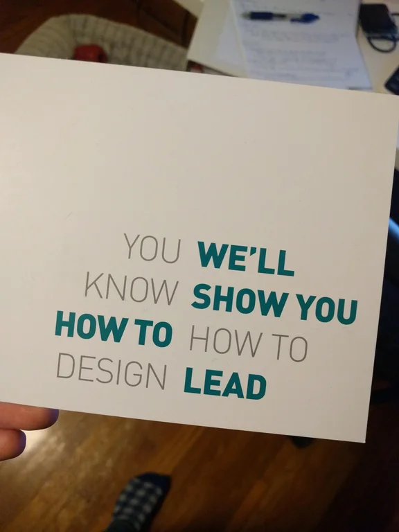
This is great design, the deliberately ambiguous text placement catches the eye of designers, who it’s clearly targeting, and it’s still plenty legible.
Is this the IRL version of “The easiest route to an answer to a question, is just to state something online”?
Risky. I didn’t look at this and became compelled to go in person to correct them. Something unique about the online world that invites responses and correction.
The goal is to
-
invoke the impression that you are completely inept and fail at designing
-
???
-
profit.
I think the message (it’s too explicit to call it an implication) is that the customers are designers, they know design better than the advertiser here, who is likely selling some sort of management class.
Yup. Cash in on that pity.
-
please don’t
For whatever reason my brain ignored a bunch of words and immediately read it as “we’ll show you how to design lead” (with “lead” being read as the metal). I was extremely confused, but less confused than when I realized how it was supposed to be read.
God… I can imagine a class about how to teach employees called “How to How To”
Maybe I should show you how to design instead.
To be fair, they didn’t say they knew how to design.
I immediately got it and I still have a headache.
I actually like this one since you can either read the left part, then the right one, or one color then the other
Am I having a stroke?
Ha, it can’t be that bad! Look, you just have to read it wit-
has a stroke
If you can lead through the seizure, you know the procedure.
Plumbum!? I barely knew 'em!
If the "how to"s were swapped it’d still be pretty “don’t dead”, but at least vaguely sensible. No idea what the fuck they were going for with that swap
It’s still not fantastic, but it is better.
It’s worse; it’s plain and boring. Nothing about it attracts attention. The seemingly incongruous first version draws your attention.
It often doesn’t have to be fancy. Boring is good. It’s tried and tested to work.
Sometimes it’s about getting the message across as coherently and quickly as possible.
Modern day humans have very low attention spans (think about the frustration you get after a website hasn’t loaded after 5 seconds!). If I have to try and figure out something and it takes me longer than a second to do so, I’m gone.
But if it’s an ad for an agency that provides a service I’m looking for, and they have a banner that looks simple and clear like this, I’m liable to notice and give them a call.
I mean legibility, but I agree. We wouldn’t even be having this conversation had it been aligned like my image.
I got near the bottom of this reading left to right before thinking about what it was saying cause the whole I couldn’t even figure out what the fuck was going on
This is actually genius design. Bravo.


