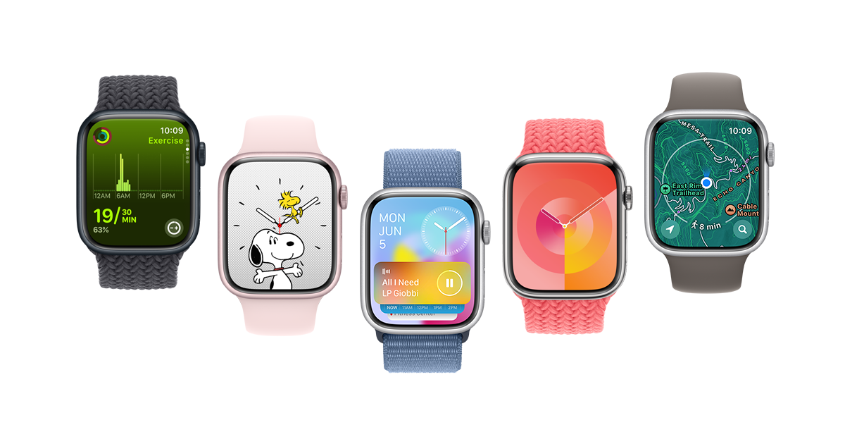
What are your thoughts on the new watchOS 10? So far it seems OK to me, but I am missing the edge-to-edge screen swiping to change watch faces, why was this removed?
I love the widgets. I always used an ugly watch face because it supported a bunch of complications, and now I can use one of the nice analog ones and still have all of that information right at hand. Wish there was more third-party support for them but presumably that will come.
Agree with you that I miss swiping from face to face. I used that a lot. And it’s not like swiping horizontally does something else now.
I personally can’t have enough widgets on the screen depicting statuses. I don’t want to interact with the screen to see if I received a new message, check how long the timer is running, what temperature it has out side, water temperature, etc.
 They removed the space between the heart rate reading & the BPM label. Looked down and briefly thought my heart rate was reading 948! I’m hoping they release an update to put the space back in.
hmm, yes that does reduce readability especially at a quick glance.
deleted by creator
Need to press longer now for swapping watch faces, as though you wanted to edit the watch face
I REALLY like this change. I had a lot of accidental face changes. This will save me from that.
Ugh I HATE this change, never experienced that and now its just super unintuitive. Glad you have a good experience but this should be toggleable.
deleted by creator
Hmm, double clicking the crown used to jump back to the last open app. Not sure if they removed the ability to do that or changed the shortcut to something else? I used that all the time to flip between the timer and workout apps.
All UI is scaled down. On the same watch screen it looks less readable.
Pro
- new watch face modular ultra. Lots of complications. I love seeing statues without having to interact.
- app overview. Much better in that new vertical layout than one large area.
Cons
- I have the feeling some apps take a second longer to load. But that might be just a feeling or dependant on initial startup.
- the weather app is totally bloated and with an awful usability. No UI indications for horizontal swipe nor tap gesture. Lots of animations and colors. Needs lots of exploration and time to understand. I mean: it’s the weather!
Overall I think it the visual refresh throughout the is very nice.
I have 2 major gripes:
I really like being able to quickly swipe around to different watch faces. This should be brought back with a control center toggle. So those who get lots of accidental swipes can lock it down. Sometimes I would get them too but not as frustrating as the loss of quick swipe for me.
Second, the changes implemented as a result of widgets. Getting to widgets is just a simple swipe up! Oh also just a simple scroll up with the crown! Why does this need two different ways to access from the watch face? This has resulted in loss of old function on the side button. It also has resulted in loss of function with the Digital Crown: for example on the metropolitan face you could play with the height of the numbers with the crown.
I really hate that you can’t swipe for watch faces anymore. So stupid, I use it almost every day.
Also the weather app is not really user friendly.
deleted by creator


