Hi. I have been a MessagEase user for ages - started out using it on a Palm with a pen, though I liked Fitaly slightly better in those days. But since the release of its Android app, I’ve been a full time MessagEaser. Well, I just bought my Thumb-Key licence today and thought I’d chime in here to try and convince you to take ThumbKey a few steps further beyond the performance that was possible with MessagEase. Perhaps, you could agree to provide users with one or more experimental layouts to try out some of these ideas?
I think that you have begun to move in the right direction by splitting vowels and consonants in the tap positions between the two sides of the keyboard, well done! However, I feel that there is a good way yet to go towards a maximum-efficiency layout for dual digit use. Here are my mid- or long-term suggestions - the results of many hours spent thinking about what my ideal mobile keyboard layout would look like:
A. Get rid of the spacebar to:
- free up two extra tap keys by putting space on a regular-sized key. The keyboard would then become a simple 4x4 grid and two mid-frequency letters (D and L are the obvious candidates) could thus be tapped rather than requiring a swipe.
- place space more efficiently. Space is the most frequently typed character and hence should be under one thumb’s home position rather than in the most remote location on the keyboard! Ideally, space should be in the home position of the vowel thumb to maximize alternation (space-consonant bigrams are much more frequent than space-vowel). Displacing E from the home position may seem counterproductive, but I think it would be worthwhile. Some testing may be necessary whether space on vowel thumb’s home and E in a neighbouring position really works better than E on vowel home and space on the consonant thumb’s home position, though (This assumes almost all users always press space with the same thumb anyway rather than using whichever side is optimal with the current large spacebar.)
B. Really (!) optimize for two-digit input: MessagEase was designed with single-digit input in mind. Hence all the most frequent swipes either move into or start from the center of the keyboard (the assumed home position of the single finger used to operate the keyboard). While your move to split vowels and consonants to optimize two-thumb or tumb + index finger operation has some merit, you have not tackled this central problem. If there are now two home positions (one per digit), then the most frequent slides should be grouped around those two positions rather than the center of the keyboard. Furthermore, this should be done in a way that maximizes alternation. To see how the split should be done, we should look at a physical keyboard layout that maximizes alternation, with Dvorak being the most prominent example. Such a layout will mostly only have very low frequency letters (j, q, z, x), punctuation and the semi-vowel y on the same hand as the vowels. A Thumb-Key layout should do the same as alternation is even more important when using only one digit per hand as opposed to five. The most glaring transgression against this approach in the current (English) Thumb-Key layout is the positon of the frequent letters L and D on the vowel side. If I do the same swap of L and D to the vowel side with Dvorak on an online simulator (Oxey’s Layout Playground), overall alternation is reduced by around 14%, quite a significant amount. If we add B, F and P - which also seem to be intended to be swiped by the vowel thumb in Thumb-Key, we have reduced alternation by 23%. Hence, I suggest that the (non-outward) slides on N and T and the leftish slides on H be used for the most frequent consonant slides in general and that in particular, L, D, B, F and P are put somewhere on the consonant thumb instead of their current positions on the vowel side. After these changes, if the vowel thumb is used to press space, it will still be used more than the consonant thumb. This would have the added benefit of fixing some bigrams that are currently very uncomfortable as the two thumbs get into each other’s way when typing these, like MB, MP or LK.
C. Push for even more speed and comfort by allowing output of bigrams (or possibly even trigrams) with a single slide: I posit that a slide is faster than tapping and then tapping again in a different location with the same finger. So, for example, if we were to put the TH bigram (both letters to be printed in sequence automatically) on a slide somewhere, using that slide would be quicker (and arguably more comfortable) than typing T then H with the same thumb, even with these letters’ neighbouring tap locations. If the taps are further apart, the slide will win by a larger margin. The payback becomes even greater if one of or even both the letters in the bigram are on themselves currently produced by slides. Since the changes outlined under B. will leave some blank slide locations on the vowel hand, the obvious candidates for bigrams to put into slide slots on the vowel side woulde be the most frequent diphtongs - OU, EA, IO, IE and AI (in that order). OU is particularly attractive since it is the most frequent one plus U itself is on a slide. Entering OU via a single slide would be faster and more comfortable than the current tap, then slide. For the consonant thumb, I think we should add the very frequent TH on its own slide, plus ND and NG, both of which are frequent and currently require a tap and a slide to input. LD is also a good candidate even though it is not that frequent since it currently requires two slides to produce.
Sorry for the long rant, but it is a complex issue. Please do let me know if you’d like me to submit a layout file containing some of the features of the kind of layout I’m suggesting.
Thanks!
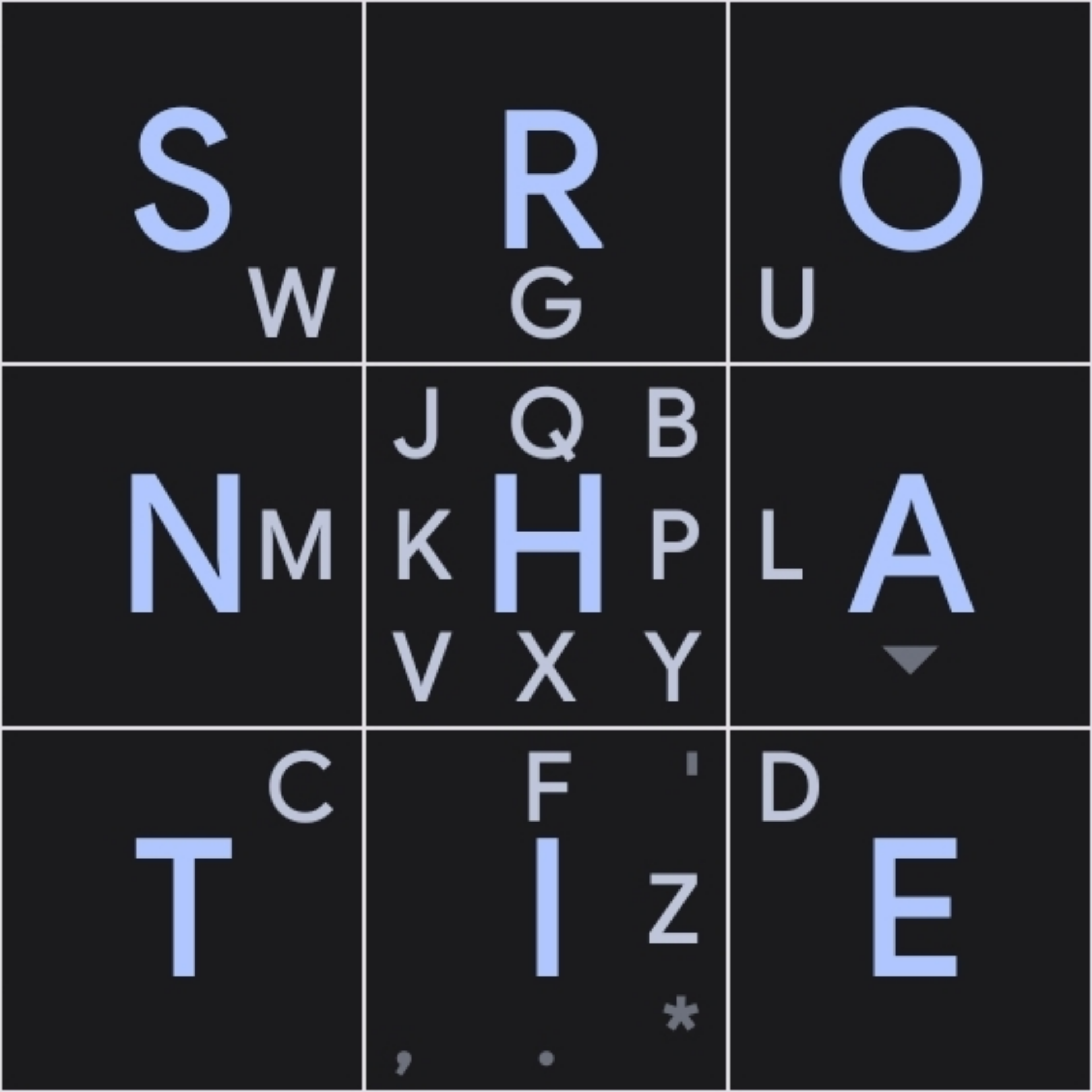
I’d love to help you iterate a layout based on your B point. I made one based on those ideas with Keyboard Designer and definitely noticed improvements over the original MessageEase layout, but I’d like to get your input too.
That’s the layout I made. I took Dvorak as a starting point, then applied your ideas where I saw fit, and later swaped a few keys around. Holding
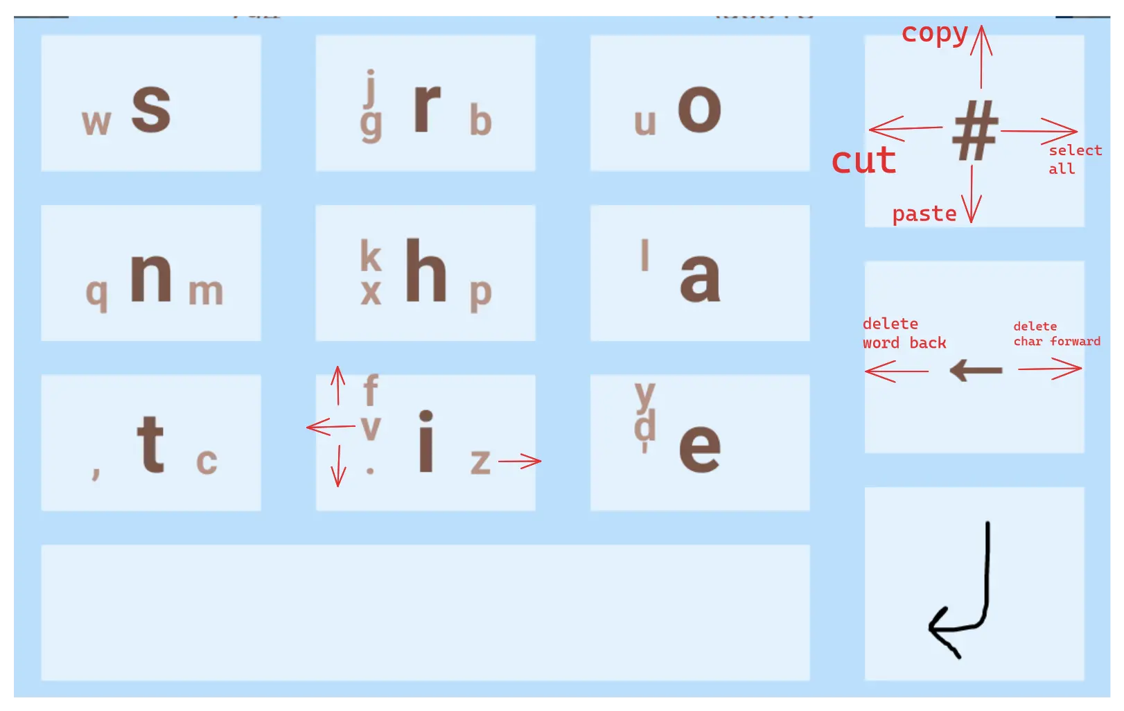
#opens the keyboard settings btw. I find it a lot better to have larger backspace, symbols and enter keys than having a dedicated settings key (that I accidently press way too often in Thumb-Key)Bear in mind Keyboard Designer doesn’t allow actions on diagonal slides, so that’s why you might notice them missing
Have you improved on this design?