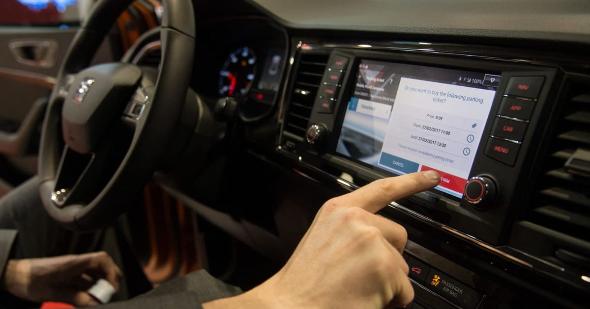
Carmakers are equipping their latest models with fancy touchscreens, but that could cause problems with Europe’s largest car safety authority.
The European New Car Assessment Programme (NCAP) is revamping its rating system starting Jan. 1, 2026 to mandate that five of a car’s primary controls — its horn, windshield wipers, turn signals, hazard warning lights and SOS features — will need physical buttons or switches.
Car models will have to comply to get NCAP’s coveted five-star rating. The scheme is voluntary but is heeded by most automakers because it’s closely monitored by consumers.
Belgium-based NCAP says that purely digital controls are a potential safety issue.


Newer Teslas don’t have a turn signal stalk. They’ve put the turn signals on capacitive touch elements on the steering wheel because of course they have.
Thank god mine still came with a turn signal stalk. I’ve sort of come to terms with most of Tesla’s touchscreen-only shenanigans but adjusting the AC or just changing the station still seems like an unnecessarily complicated chore. Worst is windshield wipers though, I don’t want to tap through three menus or even talk to my car to just turn the damn things on because the rain sensor doesn’t seem to do jack shit in a Tesla, yet here I am.
That’s because they saved 70 cents and don’t have rain sensors, they use “AI” image recognition to detect rain and snow.
It works as well as it sounds.
Even though it’s capacitive I would call that a physical button in this context
Unless you can tell the turn signal has been activated without looking and can hear it function, (and if you turn off your radio, you can actually hear the flasher unit work also), I would argue a capacitive switch provides little to no touch or sound feed back just like the touch screen on your phone. And needing to look else where to visually verify, then you have taken your eyes off the road and potentially can find yourself injured or dead in an accident.
Good points. I don’t (and never will) have a Tesla so not sure what the feedback mechanism is. But I think the idea of this law is to keep those controls out of touchscreens and easily accessible which the capacitive buttons do (even if they’re not the best). If teslas have buttons with their extremely minimal interior then I would assume all other cars do too. Maybe this law is to just preempt any future cars from not including them.
You and me both on the Telsa. I ain’t spending that kind of money to think I’m cool. At half the cost, I’m in. Until then nope.
You maybe correct about the aim of the law. But I’m leaning more towards a not very well written regulation created by people who pay someone else to do the driving for them.
“capacitive touch element”. Wow you tried really hard to not call it a button.
It’s still a dedicated space which isn’t behind a screen or more importantly a menu. it’s a button
But it arguably lacks the physical response of a button. When in doubt you still have to look at the screen. If it has some kind of haptic feedback it might be the same.
Capacitive touch also can be activated by accident by simply grazing the control while push buttons require force to actuate, making them much less likely to be activated accidentally.
It has a physical response. Haptic feedback, audible and visual response.
Putting it on the wheel purely to be different is a bad design no matter what you call it. You’ve turned a critical control into a tiny moving target. People having trouble locating them and have to take their eyes off the road is a common complaint about these things.
And, FWIW, I absolutely consider a capacitive sensor distinct from a physical button. An arbitrary flat spot on the steering wheel is substantially more difficult to locate and identify by feel. Especially when your hands are moving around the wheel while doing highly uncommon things like, I don’t know, steering.
I’m not arguing that it’s good or bad, that’s not part of my point at all. My argument is under these proposed rules it’ll be considered a button in a court
From the article:
Call them whatever you want, they’re literally one of the things NCAP is identifying as a problem and considering in their safety ratings.