Hi!
I’ve (already) opened the issue on GitHub and that can/should be kept for the final technical specs.
https://github.com/dessalines/thumb-key/issues/602
I’d like to open the thread here to work out and discuss any details.
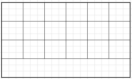
The layout would use the full width and is suited for two-hand typing:
Some of my immediate questions would be:
- Does this fit the idea behind the ThumbKey app? It is for thumb typing, after all.
- How to get a good layout? The hype is on AI but people have been doing this through trial and error for a while now.
In regards to the exact placement, I find it hard to combine the outright principles (optimizations) behind Dvorak and Thumb-Key, especially the two-thumb layout. They all have their issues they are trying to resolve.
I prefer the alternating keys to rolling-keys. Especially when typing on a screen. That makes Dvorak a better fit than other layouts.
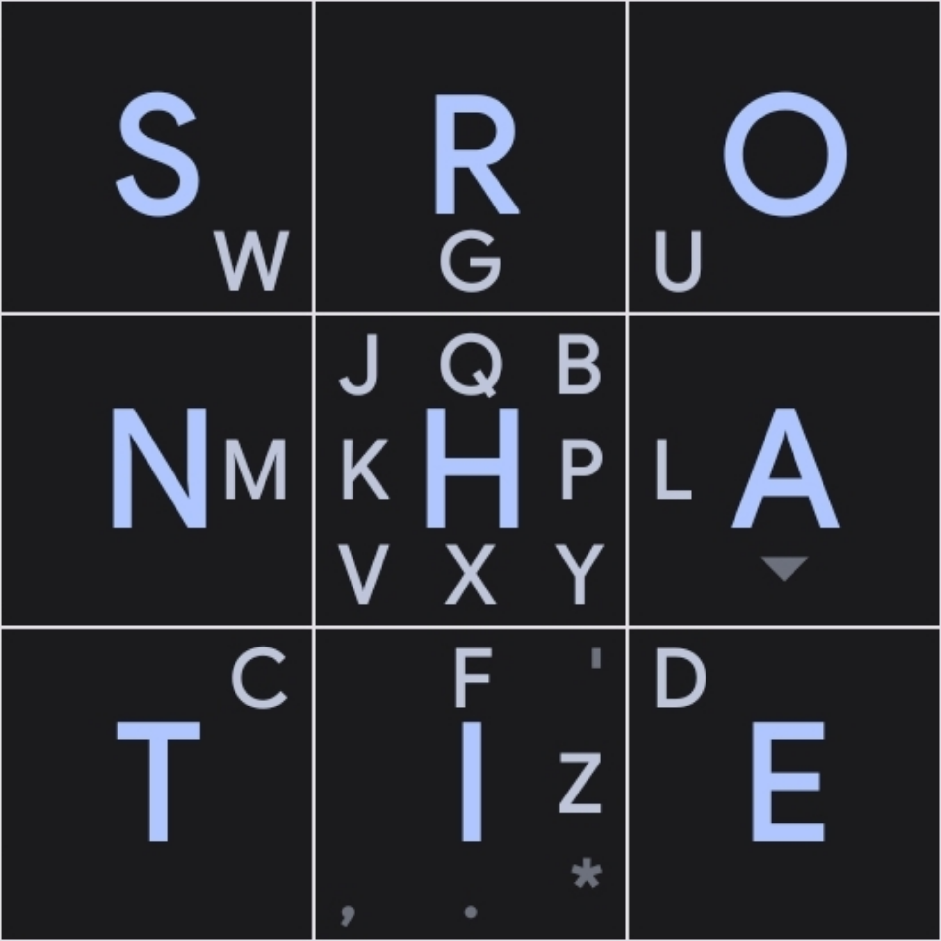
Dvorak layout, when preparing for Thumb-Key, ends up being like this
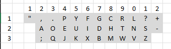
I’d be targeting Dvorak layout but the principles are the same for any layout to be applied to this frame.
Isn’t this essentially a duplicate of https://github.com/dessalines/thumb-key/issues/592
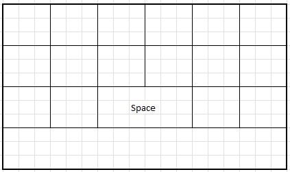
Perhaps we could use the idea behind the two-hand layouts and have two identical 3x3 grids. However, this layout is having the last column squashed on my phone and is not that practical. I think we could remove the middle row to gain space. There are only 2 keys in the middle row that are actually useful. The third - backspace - is completely redundant as it appears three times on the screen. Reducing Space to 2 slots would also provide one extra slot.
One possible way to place the space key:
This would be a good starting point if creating a new layout instead of adapting an existing one (like Dvorak).
Pros:
- That would eliminate the need for the bottom row, which traditionally hosts the key.
- special characters and options can be placed as swipe keys
Cons:
- space is also needed for other special characters, which need to move to the main 3x3 grids
- special characters can’t be placed in the middle duo to symmetric even layout
- the characters from the bottom row need to be jammed into the top two or elsewhere
How do I pick the most-common letters from the middle row when those are the most common letters overall?
The data from Letter Frequency Analysis of Languages Using Latin Alpha, should provide some ideas as to which keys to have as touch-type (as opposed to swipe-type). However, Dvorak uses the most common keys as the middle row, so they should all be displayed. We need to define a new “middle row”, I guess.
@dessallines, what were your guiding principles in positioning the keys? I guess we could use the same, just adapted for the two hands.
OK, got the gist from the ReadMe. For two hands, I think focusing on the bottom and right is not the “right thing to do”, so perhaps a different two-hand layout would be preferable to duplicating the single-hand layout.