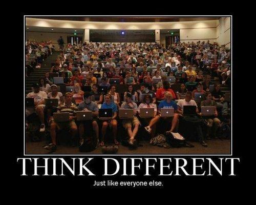
Bronco1676 to memes@lemmy.world · 1 年前Think differentimagemessage-square30fedilinkarrow-up1246arrow-down143file-text
arrow-up1203arrow-down1imageThink differentBronco1676 to memes@lemmy.world · 1 年前message-square30fedilinkfile-text
minus-squareAldehyde@kbin.sociallinkfedilinkarrow-up20·1 年前Because of how thin the modern screens are nowadays. Iirc, the logo would shine through and make a bright spot on the screen if made on modern macs.
minus-squareNaoPb@eviltoast.orglinkfedilinkEnglisharrow-up2·1 年前My iBook G4 just used the screen backlight for the logo. It was kinda dim compared to my 09 Macbook but it still lit up. Though I guess ambient light might be an issue as someone mentioned.
minus-squareRed@reddthat.comlinkfedilinkEnglisharrow-up2·1 年前Yep! Some of my old Macs had LCD fading right in the middle where the logo was. Was Hella annoying

That was a cool design. Idk why they axed it.
Because of how thin the modern screens are nowadays. Iirc, the logo would shine through and make a bright spot on the screen if made on modern macs.
My iBook G4 just used the screen backlight for the logo. It was kinda dim compared to my 09 Macbook but it still lit up.
Though I guess ambient light might be an issue as someone mentioned.
Yep!
Some of my old Macs had LCD fading right in the middle where the logo was. Was Hella annoying