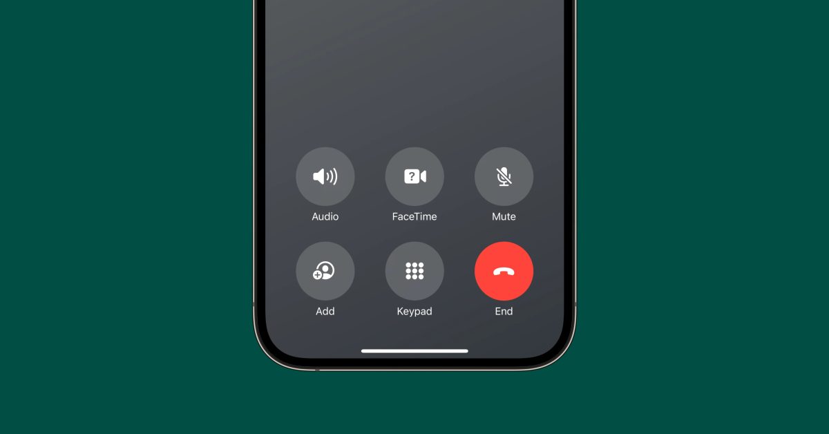
I don’t understand why the button couldn’t have remained in the middle of the screen. It makes sense in the middle, being such an important button. It’s easy to reach no matter which hand you use to hold your phone. It’s the norm and people are used to it.
The only justification for its having it on the right side I can think of is that the button ends up exactly where you drag to answer a call, so the answer button turns to an end call button.
Which leads me to my real gripe with the slide to answer and button positions. If you swipe as a reflex but it’s button displayed you actually end the call by mistake.
Only explanation I can think of is that phones before touch screens used to have the end call on the right.
Or, you know, you slammed the the bit you held into the body of the phone with a satisfying “pling”.
Now get off my lawn.