- cross-posted to:
- tesla@lemmy.world
- technology@lemmy.world
- cross-posted to:
- tesla@lemmy.world
- technology@lemmy.world
There is a discussion on Hacker News, but feel free to comment here as well.
I love both the twitter poster and the writer say “the buttons defeat the point of minimalism” which is incredibly false. It could be minimalist to remove the display… which would get rid of all of your controls and functions. The point is having a vehicle with less clutter that requires your eyes to be off the road.
The point is having a vehicle with less clutter that requires your eyes to be off the road.
Is it? Frankly, I don’t think so, given how closely this resembles stupid design trends elsewhere.
The problem is that people interpret minimalism to mean whatever they want. In Tesla’s case it means no buttons but tons of functions just hidden in sub-menus. In some it means an array of buttons each only doing one thing. There’s a good mix between them, but minimalism doesn’t mean removing everything or creating only one “thing” it means maximizing how little you actually need. Some buttons (like defrost, temp control, gear position, windshield wipers and others) are actually necessary and therefore removing them isn’t minimalism but simply just absence.
I’m aware of the ambiguity behind “minimalism”. My point is that they likely didn’t think on usage (“less clutter that requires your eyes to be off the road”), and instead were following the trend of minimalism being interpreted as removal for the sake of removal - that you see in other industries too.
They had no real consideration of minimalism. They had a big touch screen and didn’t want to spend money on buttons. Minimalism was the justification as a matter of marketing.
I hate how minimalism went from “don’t add fluff” to “remove features”.
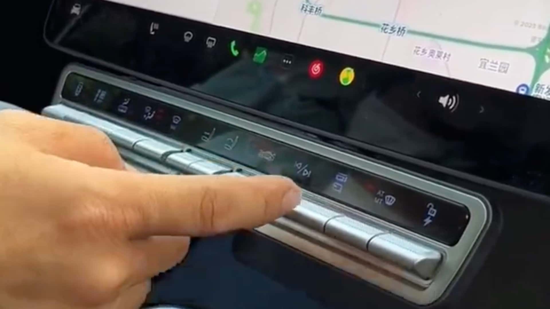
That’s the case here. What is wrong with physical buttons? Acc. to the text, the car owner is adding ones “that provide quicker access to some of the vehicle’s essential functions”. So why is Tesla removing them on first place?
I don’t even own a car for at least a decade, mind you, but you see this cancer elsewhere. It’s [early? current?] GNOME 3 with stuff like this, this and this, it’s my microwaves having 10min/1min/10s buttons instead of a 0-9 numeric pad, analogical clock faces without even hour marks… on the surface this shit might look like “LESS IS BERRUR LOL LMAO”, but it’s actually adding complexity to what matters, the interaction between the user/owner and the program/object.


