- cross-posted to:
- artdesign@jlai.lu
- cross-posted to:
- artdesign@jlai.lu
You must log in or # to comment.
A bit, maybe, but damn this is such a Guardian article.
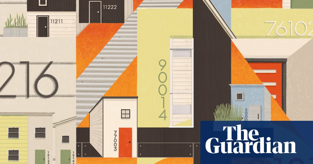
The Neutraface font family, which was released in 2002 by House Industries, a US type foundry, seems to be a favorite of designers and developers, particularly when it comes to house numbers.
For many of these professionals and tastemakers, the minimalism of Neutraface – with its thin, pointy, attention-grabbing lines – adds whimsy and elegance to a building. At the same time, as Neutraface house numbers have become too commonplace to ignore, some now associate them (along with gray paint jobs) with neighborhoods overtaken by construction and renovations.
That association also lends itself to other dystopian connections: cheap fixer-upper jobs done on the fly, rent hikes and people being displaced from their longtime homes. Whatever the meanings people make of these house numbers, Neutraface now seems both indivisible from – and an indicator of – the constant changes of our nation’s screwed-up housing market.