- cross-posted to:
- androidauto@lemm.ee
- cross-posted to:
- androidauto@lemm.ee
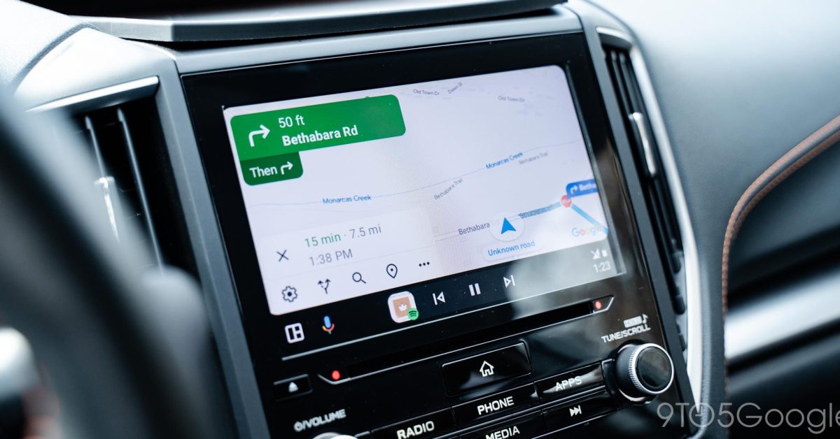
Google Maps is preparing two updates including an Android Auto redesign that’s rolling out now.
Attached to recent Google Maps updates and independent of your Android Auto version, a new design for the Maps app on Android Auto is rolling out. This new design adds a sidebar to the Maps experience in your car where controls live.
Where previous designs showed map controls off to the right side when you interacted with the map, but this new design constantly shows these controls. You’ll see zoom controls, the ability to chance the map’s orientation, adjust what directions are said aloud, and access settings. All of those controls are shown on a translucent bar on the left side of the screen.
Android Auto has some pretty crappy bugs right now and has since at least January for me.
Running at SPF instead of FPS until I close and reopen maps. The biggest bug is the menu bar at the bottom stops responding unless I reconnect.
I’ve tried wired and wireless. Reset phone and car to factory defaults. Using S21FE on a Peugeot e208. I see similar reports on Google forums and that other site and no fixes.
It showed up on android automotive today too
So, like Apple Maps.
That’s annoying, I assumed this was a bug. I spent 5 minutes trying to find a way to hide this.
Why would I need zoom icons on a touch screen with pinch zoom?
Aftermarket head units aren’t all capacitive (so they can’t do multi-touch)
I agree about the zoom buttons. But the rest looks quite handy. Changing orientation and (un)muting took too much interaction and therefore attention.
Using pinch zooming while driving seems impractical. Easier to just hit a button.


