
Really thought the old one was much cooler, does anyone else agree?
I mean it is what it is ultimately but I always thought the older one looked much cooler. While the new one looks very flat and plain.
What do you guys think though?
Old:

New:

Chocolate starfish
and the hotdog flavored water
From a “distance” it looked like a black hole. Quite iconic. I get the OCD kf having a cohesive icon set, but … my 2 cents is that it was easily identifyable.
I mean we’re not going to have a cohesive icon set since user created communities will always be varied. That kind of order only works on instances like Beehaw where there aren’t varied local communities. So in that sense recognizable but also varied logos make more sense on the majority of Lemmy instances.
I always thought the OG one kind of looks like a fish eye.
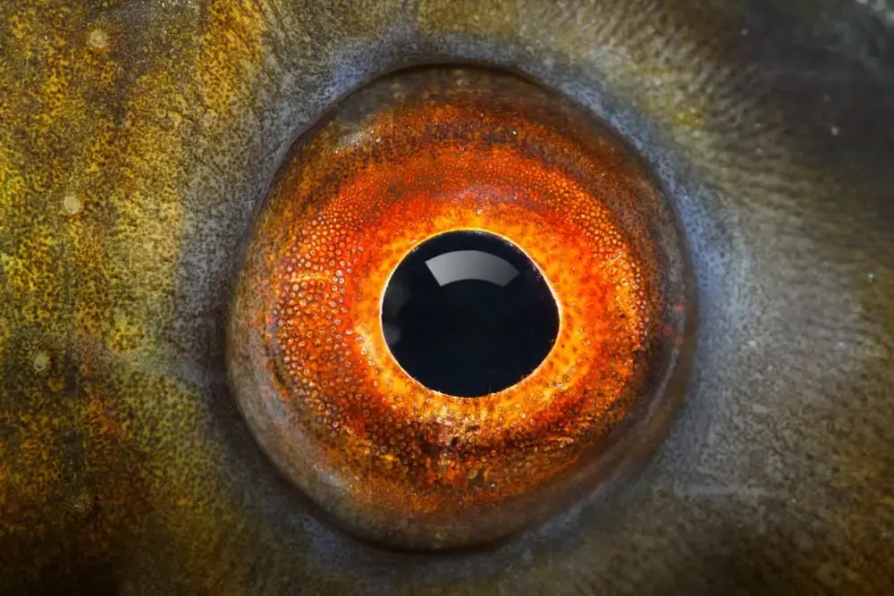
It kind of does. Maybe it could be an abstract mix of both an eye and also a black hole. Unless I remember wrong they did that in the intro to the Cosmos, they had an eye and faded it into an image of a black hole with an accretion disc around it.