- cross-posted to:
- creative@beehaw.org
- pixel_art@crystals.rest
- cross-posted to:
- creative@beehaw.org
- pixel_art@crystals.rest
cross-posted from: https://crystals.rest/post/43561
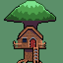
Once again I am doing character art for my redesign. I really don’t work this large, the biggest I get is 100x100. This image is 150px x 150px
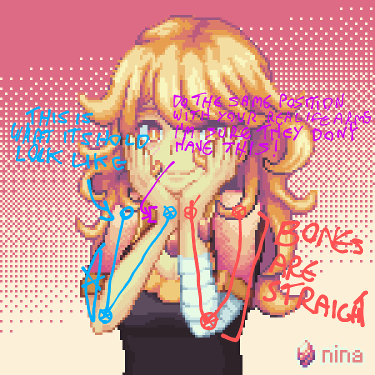
Lighting’s great, colour’s great, everything’s great. But those arms man, they scare me. I would suggest sketching her body first, then do the rest, her anathomy is a tad bit messed up
What about the scares you?
They look strange, thats what i mean
What about them looks weird?
Their anathomy
What part of the anatomy? If you know something is off, why can you not point it out? I see nothing wrong with the arms, I’d like help in knowing what is wrong.

1st(in red): bones are straingt
2nd(im blue): this is what it should look like
3rd(in purple): do the same position with your real life arms, i am sure they don’t have this.
To be clear, in the third i’m refeering to the straing part the arrow points at
You do know that arms are more than 2 static sticks with a hinge right?
Sweet! Good job!


