Repubes are working hard to get those numbers up in the US
The scale on the y axis, that’s a logarithmic scale, is that right? The way it goes 0.1, 1,10
(I was good at maths but never kept it up after school, so not sure if this is the right terminology)
It’d be interesting to see the same data shown on a normal scale, because my initial reaction was to be slightly horrified that the day 1 figure didn’t seem to have fallen much at all, only to then notice the scale.
You would not see anything on a linear scale except for the large values near day 1 and then it goes down to essentially 0.
Ah ok, thanks.
Chance of death approaches zero the older you get.
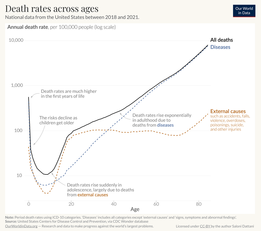
I know that this was probably a joke, but here is how the full curve looks like:

https://ourworldindata.org/how-do-the-risks-of-death-change-as-people-age
(As in the original post mind the logarithmic scale on y-axis)
In Texas it’s up
Death rate per day: 10
per 1000 births
Removed by mod
I would strongly guess the gap between 1941 to 1951 and (to a lesser extend to 1961) is due to the introduction of antibiotics.
I do wonder what’s going on in those cases where it crosses back over the previous decade’s line for a period (like 3mo for '71 and '61). The rest still looks better but what happened to the 3 month olds?
Tried posting a screenshot of image one but sync won’t let me.
Seems in 2022 there actually was a pretty noticeable increase in us infant deaths…
Just a note that the article is for specifically England and Wales, and does not include the US.
It would be interesting to see average data from all countries with universal health care compared to the US though…
Also your image isn’t loading :x


