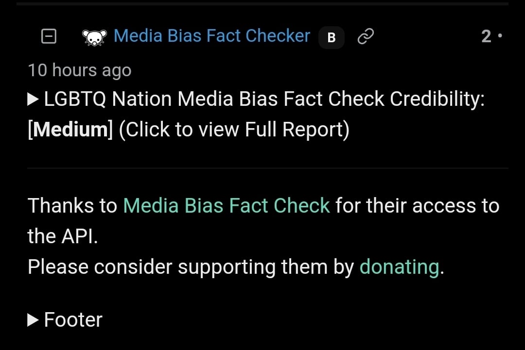
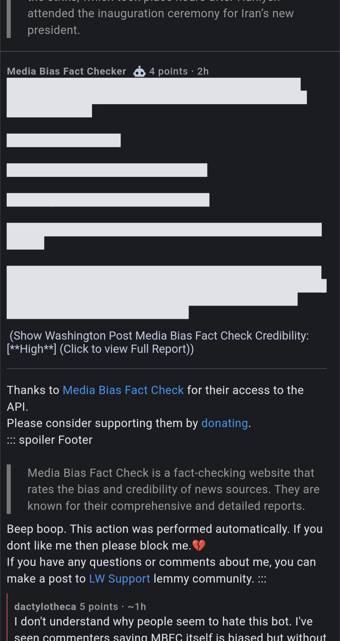
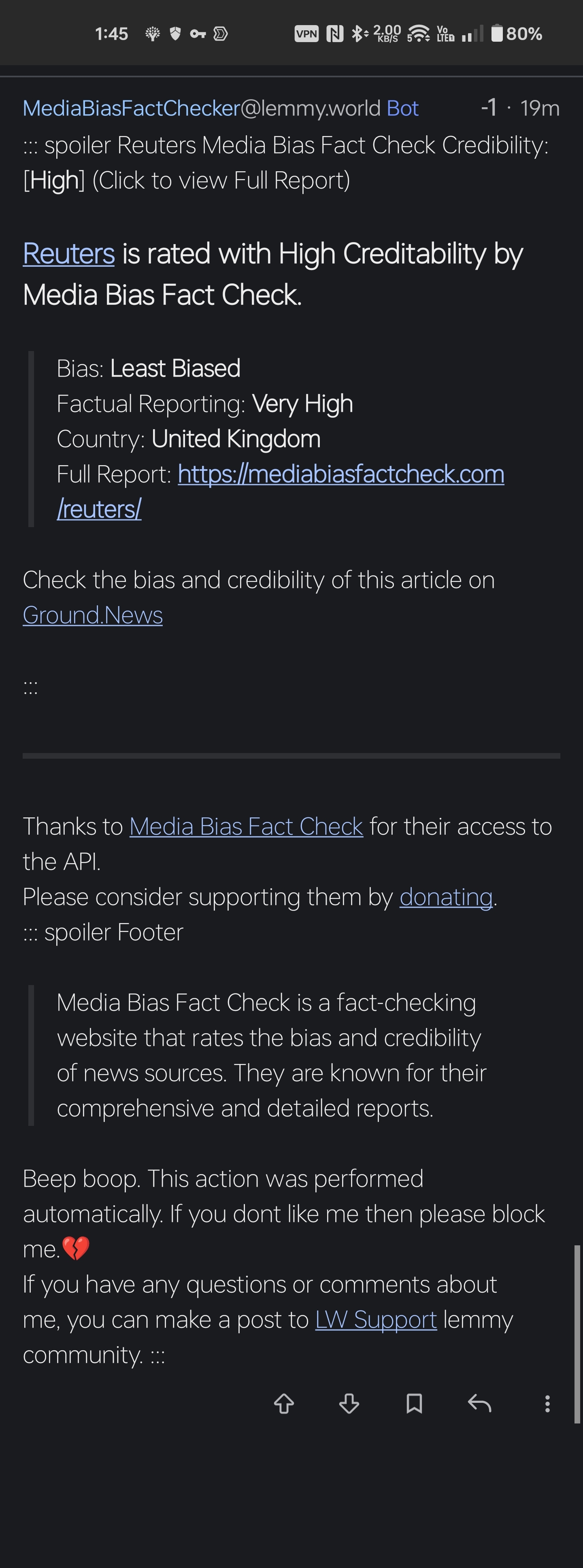
And possibly other clients?
Could you adjust the formatting a bit?
The whole lower part of the comment could be a “More info” link to a page where these details are explained instead appending them to every comment. Cheers!
The whole
lower part of thecomment could be a “More info” link to a page where these details are explained instead appending them to every comment.FTFY. Excellent concept but terrible formatting; the wall of text is way too much. Just tell me “this media outlet’s alignment is ____, click here for more info.”
In normal Lemmy markdown, that’s sorta how it’s supposed to be. The type of spoiler tag it is using is one of the “click to expand” types, so the comment would only show the spoiler comment rather than the full body of the spoiler text.
Screenshot example from mobile browser:

Yes! I agree
Looks absolutely nasty on Connect as well. As much as I appreciate the thought and time put into this I really think the developer should change the format of the comment. Clearly many clients implement the spoiler feature differently and it’s an unfortunate reality of writing any frontend facing code that things don’t look the same everywhere, whether due to bugs or stylistic choices of the client app. Kinda sucks because it looks great on the web client.

I recommend raising this issue with the app developer.
Reported here: https://lemmy.world/comment/11472024
Looks fine in Thunder
This is sadly some issue where Apps dont have Markdown feature sync with the Website.
We will think about reformatting it. But for now you can block the bot if it is disturbing your view.
Thanks.The bot’s info is nice and I appreciate your effort. The wall of text is a turnoff for humans in-general, as we are lazy skimmers. So the text being formatted so densely trains users to automatically ignore it, thus reducing the bot’s intended purpose - to supply users with extra info about media bias. (which we desperately need on sites like lemmy)
If there’s any possibility of reformatting so your intentions can more broadly affect the those platform, then I think your goals would be more effectively achieved.
Again, thank you for the bot.
It’s formatted properly with Lemmy markdown. This is on the Sync developers to handle a very common feature in Lemmy properly.
If you have a better format we will gladly accept it. But for every other non App UI it works perfectly as the spoiler hides everything away into few lines.
I think it’s a great addition, but it sure does eat up a lot of space. Any way it can be condensed to the absolute basic information?
This is what it looks like for me on Boost:

I get that it’s a mark down problem with the app, but perhaps it can still be condensed?
Sry this is a app issue. For now block it until the app developer syncs up the markdown to match lemmys
Yeah, I’m gonna mention again in the app community, but this doesn’t seem high priority. It’s been mentioned many times before and affects all kinds of areas where spoiler tags are used. 🫤
Yeah we are sorry for the inconvinience.
Thanks, I’ll block it for now. Hopefully won’t miss a post saying it’s all good now 😅.
I will ask the lemmy sync to implement the spoilers.


