
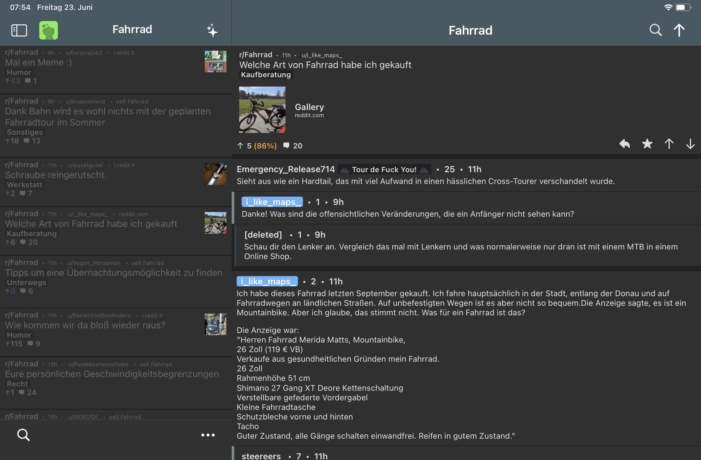
When using an iPad in landscape mode, text lines in posts and comments are very wide. An option to reduce the width of the posts and comments to about 1/3–1/4 of the screen width, like Apollo did by default, would improve readability. Please consider this layout option if there is support for it.
Thanks a lot for your work on this app!
You must log in or register to comment.
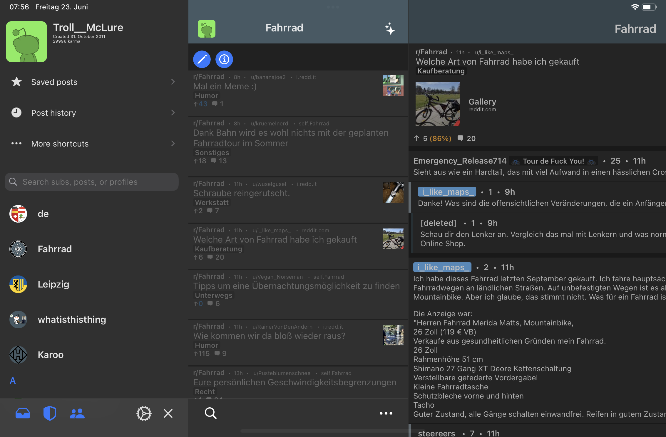
Ideally there would be (optional) columns, like slide_ios did on the iPad:
And when swiping from the left you even got the subscribed subreddits (“Traverse” view in Memmy):
Seconded! I switched back to wefwef for now, also because of community icons and placement. But I’ll be checking Memmy often for updates!

