
Hi, Thanks for all the tremendous feedback yesterday. I tried to take that into account and add some of the more requested features. Things to look forward to in this release would be: Improved search options (with tabs for posts, comments, communities, user), user notes section which lets you add global tags to users that only you can see, and report options to comments and posts. I tried to address some of the bugs reported too, and hopefully settings should be working as expected through the upgrade.
What’s new
- Added indicator of how many unread messages you have in your inbox
- Added ‘Open’ option to the about instance page
- Searching for a community with a !community or !community@instance format will now take you there directly
- Added total user counts to the about instance page Added new search page
- The info bar on posts now displays above the image when ‘Title about image’ setting is active.
- Added user notes (option on the user pages in the top right)
Fixes
- Replying to a comment should now more reliably show that comment
- Card views and lists now use even less memory
- Fixed a left side padding issue in list views when there is no thumbnail
- Fixed user profile ‘Joined at’ dates to be more accurate
- Better handling of different aspect ratios for the user avatar in the drawer header
- Adjusted some divider spacing on the post details page (reduced some unnecessary white space)
- Hide read posts no longer applies to the ‘Saved’ page
- Toast colour now matches theme
I’m continuing to monitor a subscription issue where some of them don’t show up, I added some retries if the API call fails and more error handling.
Links:
-kuroneko
Honestly, I installed Connect while I waited for my Reddit app to be ported to Lemmy.
Now? I think I might stick with Connect altogether. The speed of development, listening to requested features, and communication is unreal. Every time I think of a nice feature that would take 2 months to show up on other apps, I come here and see an update saying that it’s been added. I’ve only been here for less than a WEEK
Yeah, I know what you mean, it’s going to start getting a bit too good to leave…
I’m doing the same thing. Connect is as good if not way better than anything coming. It’s great to watch the new features get added and refined.
Is anyone checking that this dev isn’t actually three bots in a trenchcoat? The updates are suspiciously frequent and high quality.
(Thanks a lot, dude!)
If that’s the case then I welcome our new short overlords.
It’s like Brandon Sanderson took a break from writing a-novel-a-day to develop an app…
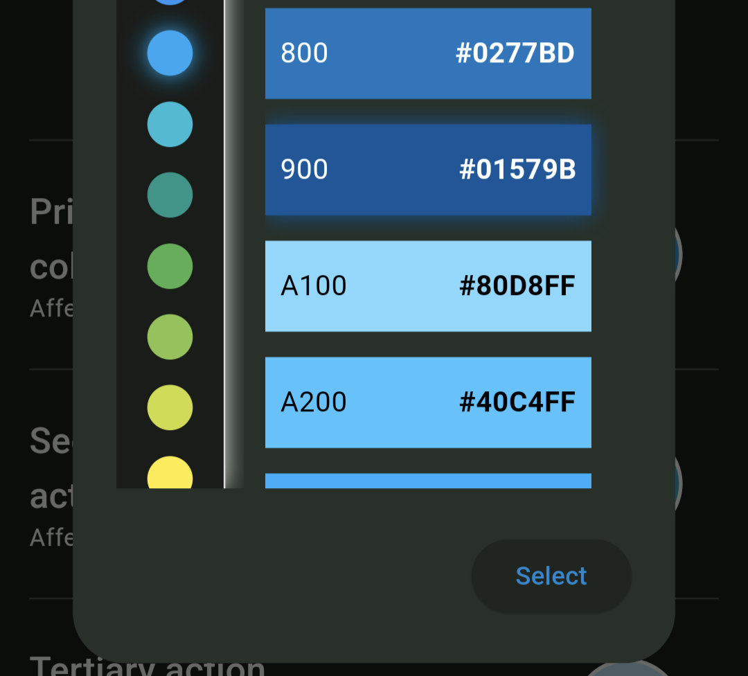
Theme colours are still unfortunately not wanting to stick. If I change the colours and tap save settings, then back out to the main settings menu and tap save settings there the colours immediately get reset to default.
Regardless of being stuck on the not so nice default colours, this is definitely the best Lemmy app of all the ones I’ve tried and solidly in the daily driver spot. It doesn’t feel like an app that’s only been in development a few weeks.
Thanks for the feedback! I see a couple issues relating to themes that will be fixed in the next release (tomorrow)
Yeah, I’m having some issues with the settings as well, not only just the theme colors, but most of my other settings also keep reverting back to the default settings. I can change all my settings to what I want, close the app, then a few minutes later open the app, and most all the settings have reverted back to default. I’m on the current version, I’ve cleared the cache on the app, and I’ve even uninstalled and reinstalled the app, but nothing has helped.
It seems to work for me…
Are you picking a color in the right column? If you’re only choosing one of the ones on the left, you’re only halfway to choosing the theme color.
Yes, they’re changing and will stick until I either hit save settings in the main settings area or restart the app. Seems like other settings aren’t saving either, like default sorting.
Yep, background settings still not resolved. Every second time you save the settings, everything returns to default settings
Alright, I see it now.
It appears that you can pick your colors once. Then they’re stuck on whatever you picked the first time.The theme colors save correctly if you pick save settings on the theme settings screen. Then you can back out of everything and you get what you want.
If you also Save Settings on the main setting screen, though, your changes then revert.
The info bar on posts now displays above the image when ‘Title about image’ setting is active.
Thank you for this! It’s amazing how quick you are to implement feature requests. We appreciate all the hard work.
Great update as always, love seeing it getting better and better with tones of features:)
Small visual issue, the is no space between the user name and the tag, dunno if it would make sense to visually (color or style) difference between the name and tag
Good feedback! I tried making it italic but it’s not very distinct. I’ll change it to a different color in the next update.
Yea I guess that would be better, BTW is it possible to highlight new comments? I see there is a new comment but finding can be hard
I was considering requesting making the tags more visible, since I’ve been making a lot lately and don’t want to be a bother, but it’s already a done deal. 😆
The user notes and new search function are awesome, thank you so much!
Thank you for your work. It’d be great to have an option to have all comment replies collapsed by default.
Thank you so much for the mark as read while scrolling. I loved that feature on relay. It’s awesome having it here now too. Especially useful considering Lemmy is still growing, so being able to hide posts is awesome for coming across fresh content!
Maybe it’s being caused by something else but it seems like points are being added again. Post or comment tallies 2 for me.
Edit: Only happening on posts.
Nice update!
[Feature request]
Can you please add active user for a community in the subscription view. Something like below.

Thank you. Great app so far.
A feature i would love to see,an up an down arrow at the bottom to jump to the next parent comment.
Searching works great. Thank you.
Thank you very much. I like how some of my requests were listened to :)
Nice work. Profile image still an issue. Everything else looks great.
PS: I like my toast dark. Thanks.
I was actually noticing that my profile image no longer has those “flat spots” on the top & bottom of the circle. So it does seem to be improved.
The right quarter is missing on mine (flat). It’s annoying but doesn’t affect performance of course.
Yep, I see now… looks like your image isn’t square like mine, so that’s likely the issue. Would need to crop a lot more out to make it nice & circle’y.
There is no option to edit within Connect and the image looks great everywhere else. The image is square (rectangular actually).
Thanks! I see this too, will have it fixed in the next release (tomorrow).
Awesome! I’ve been switching back and forth between WefWef and Connect, and this update so far this update is the best between them :)