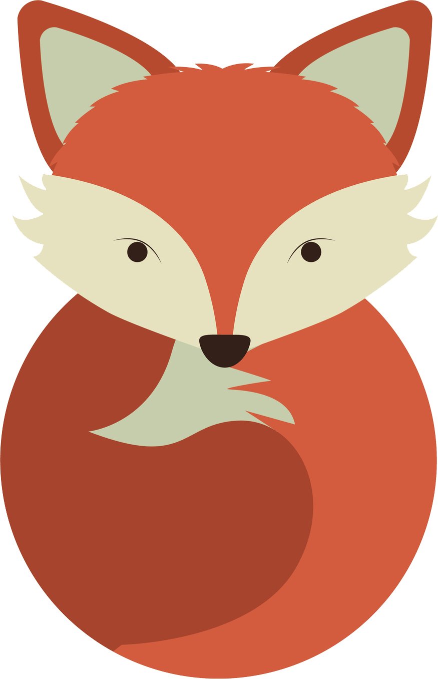
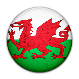
I always love having more icon options. If I’m being honest, I think the placement of the ears should move so that it looks less like a ram. But I do like that it’s a different angle than all of the the straight-on icons.
Thanks for the feedback 😁 I’ll look at it
I love it!!
I really liked the right one - cute and fancy! Great work
Left one
I think I like the current one better, but those are some pretty good looking icons as well
Much better than the current one can’t wait until custom icons are implemented
Beautiful
I think these both have a slicker and more polished feel than the existing icon. Not to say the existing one is bad.
Woah this is really great, would you be able to join the discord? Gavin and I would love to talk with you about these
They look really good 👏🏻


