

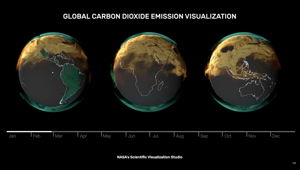
The role of industrialized countries in polluting the planet is made visually obvious.
You must log in or register to comment.
I don’t quite understand this visualization. I was expecting the end of the year to roughly match the beginning of the year, but it didn’t. I’m wondering if these are cumulative net emissions?
That seems like an odd way too visualize this because eventually everything becomes opaque and you can’t see what’s happening. I would’ve expected something more like daily net emissions. Something so we could see how net emissions change over the course of a year instead of how they accumulate over the year.
germany and china are the biggest vape smokers among countries lol
