The UI overhaul is now stable.
I miss the green steam UI
I had a kneejerk “naur” reaction because I hate change, but then I realized oh, it is nice.
the cloud notepad sounds interesting and i’d love to see what it all looks like on deck once i use it again
I just opened it to grab Deep Rock Galactic and my jaw dropped
Rock and Stone!
I like the changes generally but they’re not that big. It’s an evolution rather than a revolution, and thats the right approach.
However I do find the Controller set up tool (for mapping buttons etc) to be trash now. The older version was far far better.
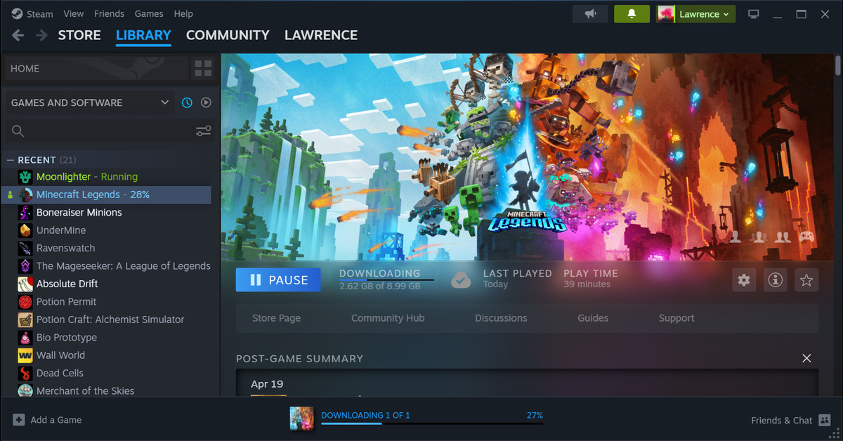
I love the new overlay UI while in game. The menus are smaller and take up less screen space so you don’t have the annoying problem of UI elements overlapping each other, unless it’s by user intent. When steam needs to open a chromium browser in the overlay, now there’s properly a tab feature and URL bar, which is HUGE when you’re trying to browse discussions or guides. The design and gray nature means it’s not difficult to read and is in line with the library UI update which has cleanly smoothed out the feeling of disconnect these past few months. Overall, props to the UI/UX people working behind this update, it looks great and functions even better!
Just gonna salute the Metro Skin devs for giving us a great skin that helped keep Steam looking modern for so many years before this update.
I quite like the new design, I have to say
I love your profile pic.
Been using their beta version for a few months now, because I knew it would come with a new UI and it looks nice :)
I find the new UI to look nice and easy on the eyes overall. I don’t know if adding shelves in library was something I could do previously but with this update it stood out and I liked that I could just setup my own shelf of favourites.
The only thing I don’t like is when I mouse-over the main pages, the menu that pops up doesn’t match at all. Other than that it’s a good update.
I hate the update. It looks too much like a mobile UI.
It’s gotten so much more vibrant and colorful over the years. I kinda miss the clunky grey on grey era
Same here. The old army green Steam was synonymous of my time in Counter Strike: Source back in the day. The server list was integrated into Steam instead of in-game too.
The new design is almost 100% success in my eyes. The controller input UI is the stain on Steam UI/UX department. It is simply nothing but a downgrade from the classic UI. Technically not a part of this update, but it was all informed by the steam deck overhaul. So I count it as the only miss out of this whole wave of updated looks.
I think it looks nice.
Everything just has a more “clean” look.
Look forward to playing around with it.
The redesign seems fine, but it’s definitely a little half-assed. Did anyone else notice the iOS-inspired toggles in settings? Still, it’s really nice to see some movement on the design after years of looking almost completely the same. Almost everything looks pretty modern now, it’s just inconsistent.
I’m going to guess that’s a spin-off of work they did for the new Steam Deck (and now desktop) Big Picture mode, and a lot of that was influenced by mobile interfaces. Which one turn influenced each other but mostly lead back to iOS.